
QD
Services
Visual Identity | Packaging
F&B
OD is a contemporary dining brand built around bold flavour, effortless familiarity, and a sharp sense of character. Rooted in comfort yet designed for the modern urban palate, the brand balances warmth with wit, creating an experience that feels approachable, memorable, and distinctly its own.


Appetite for Identity
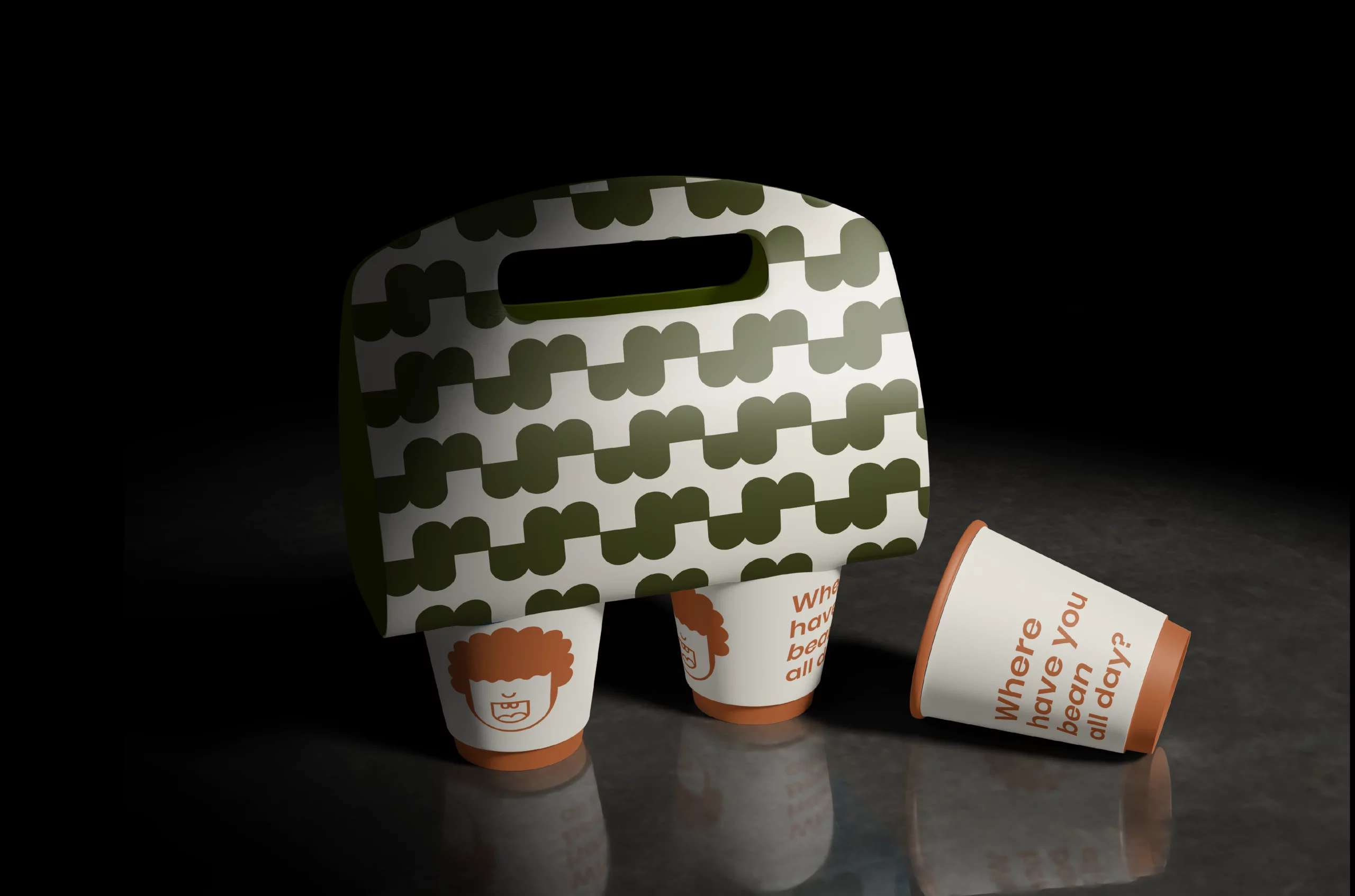
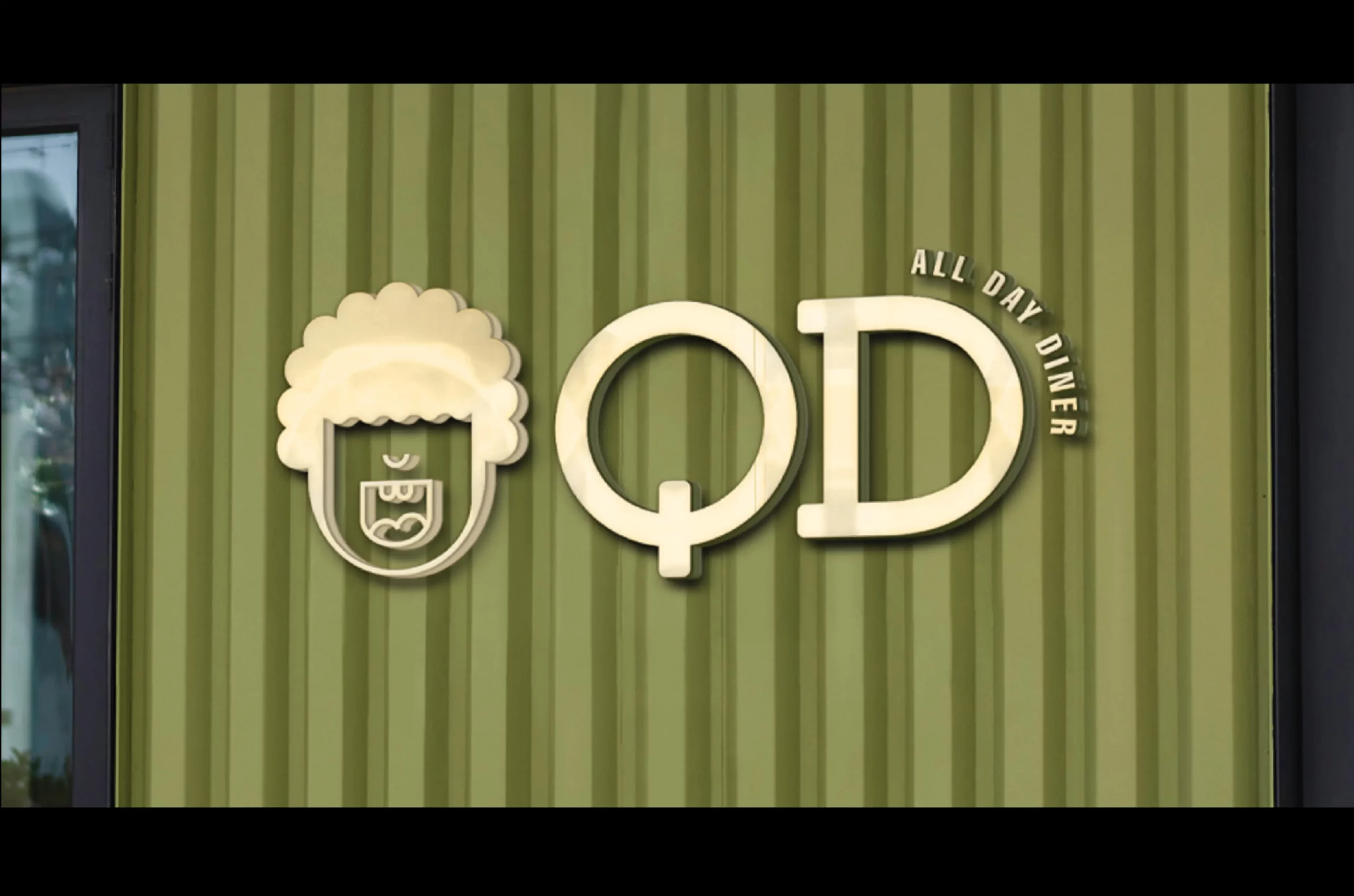
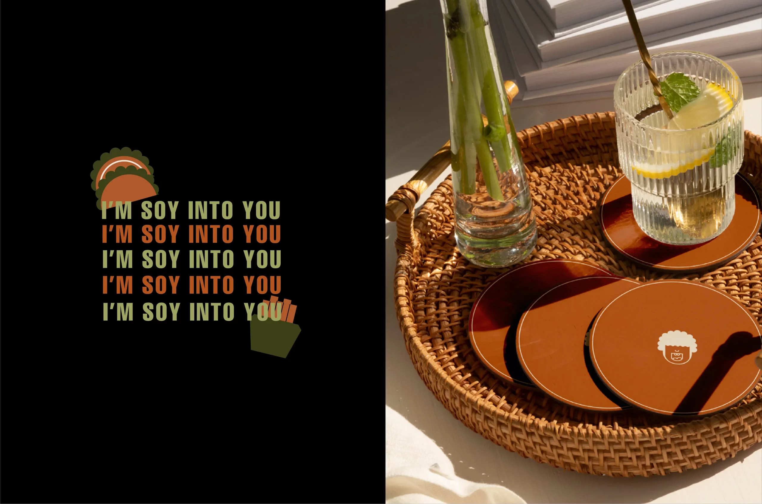
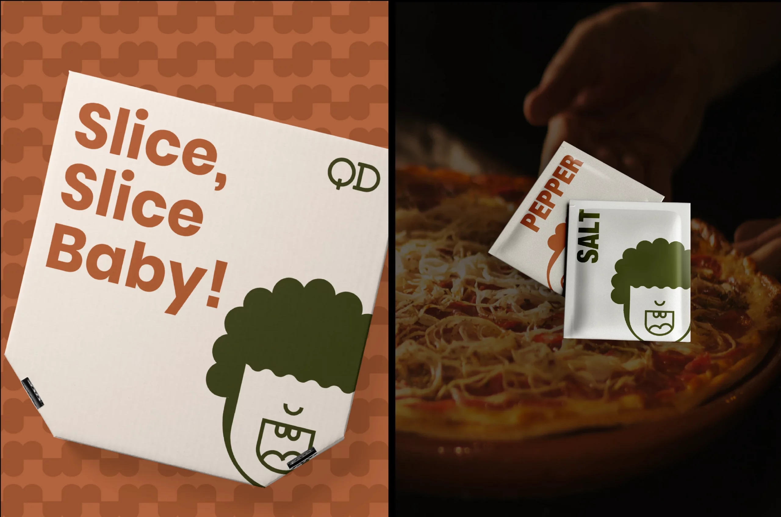
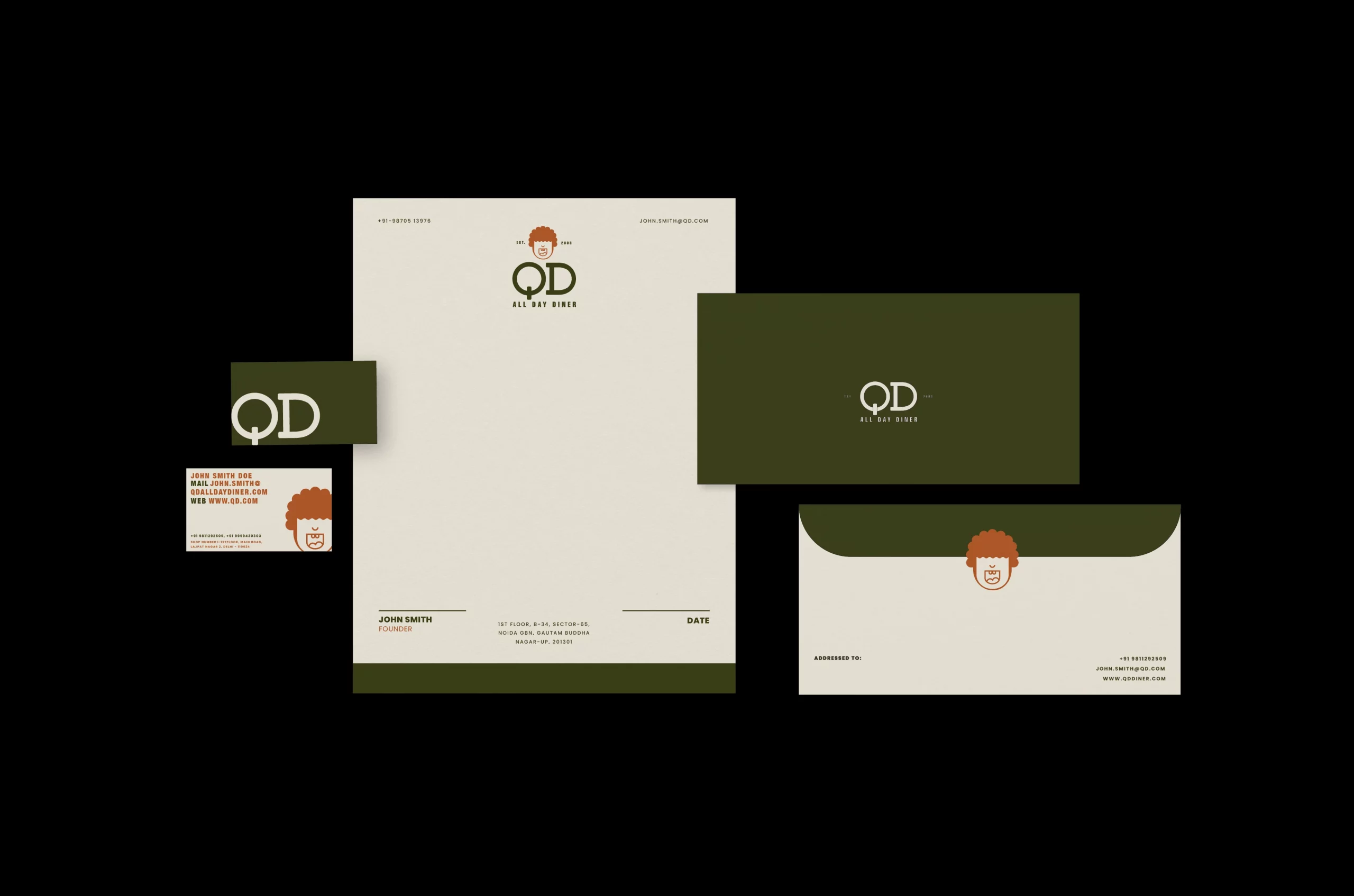
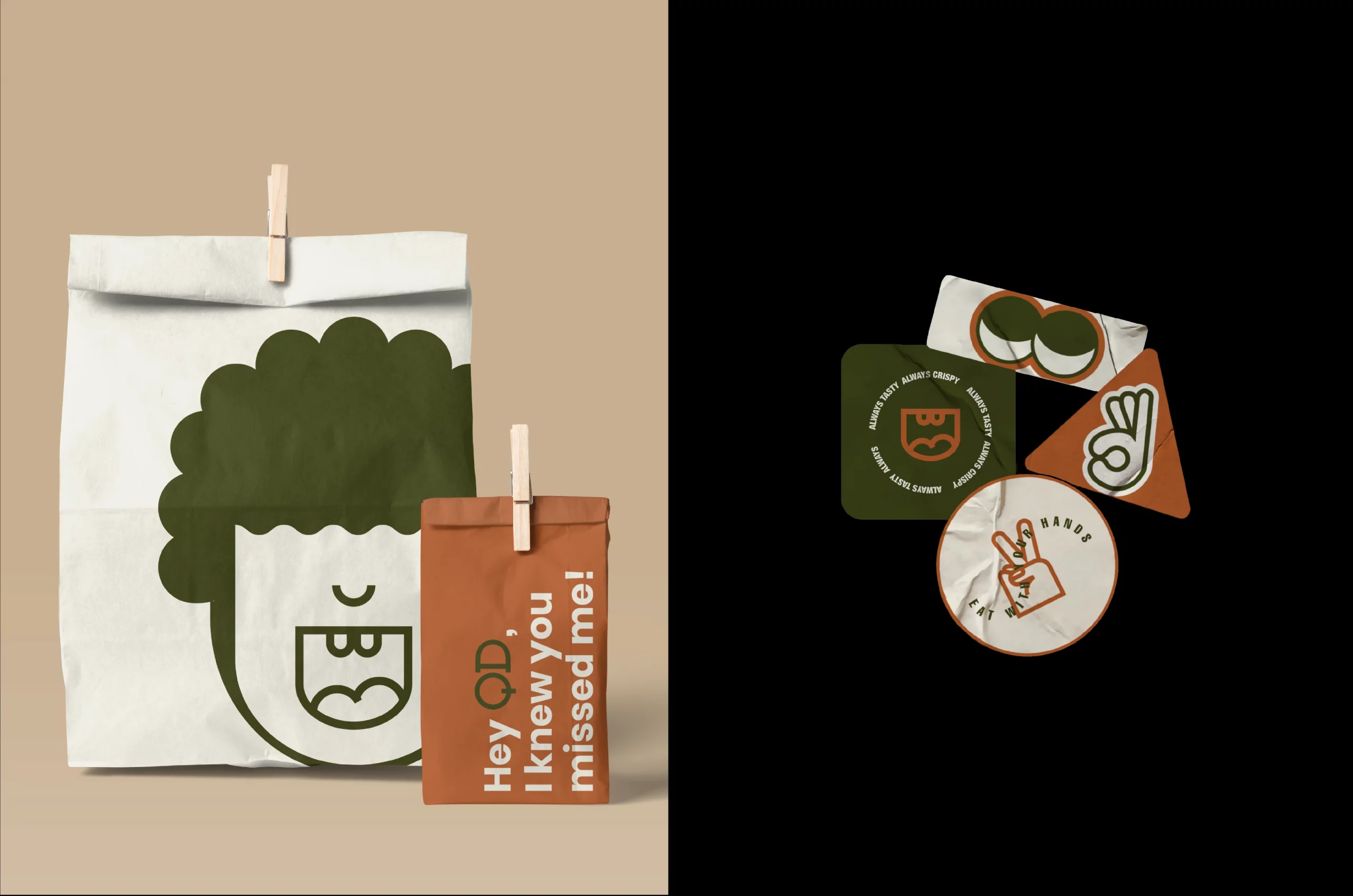
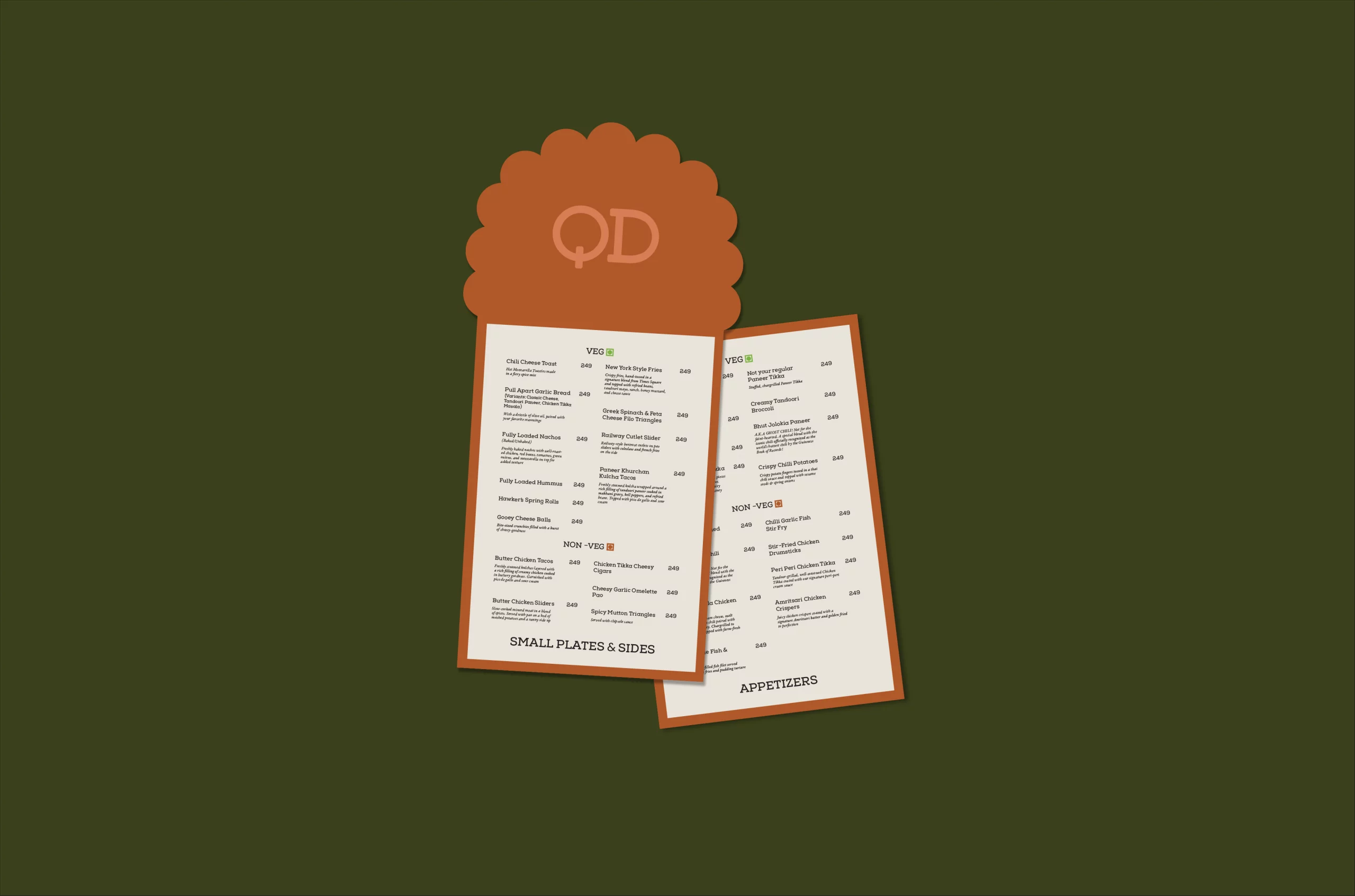
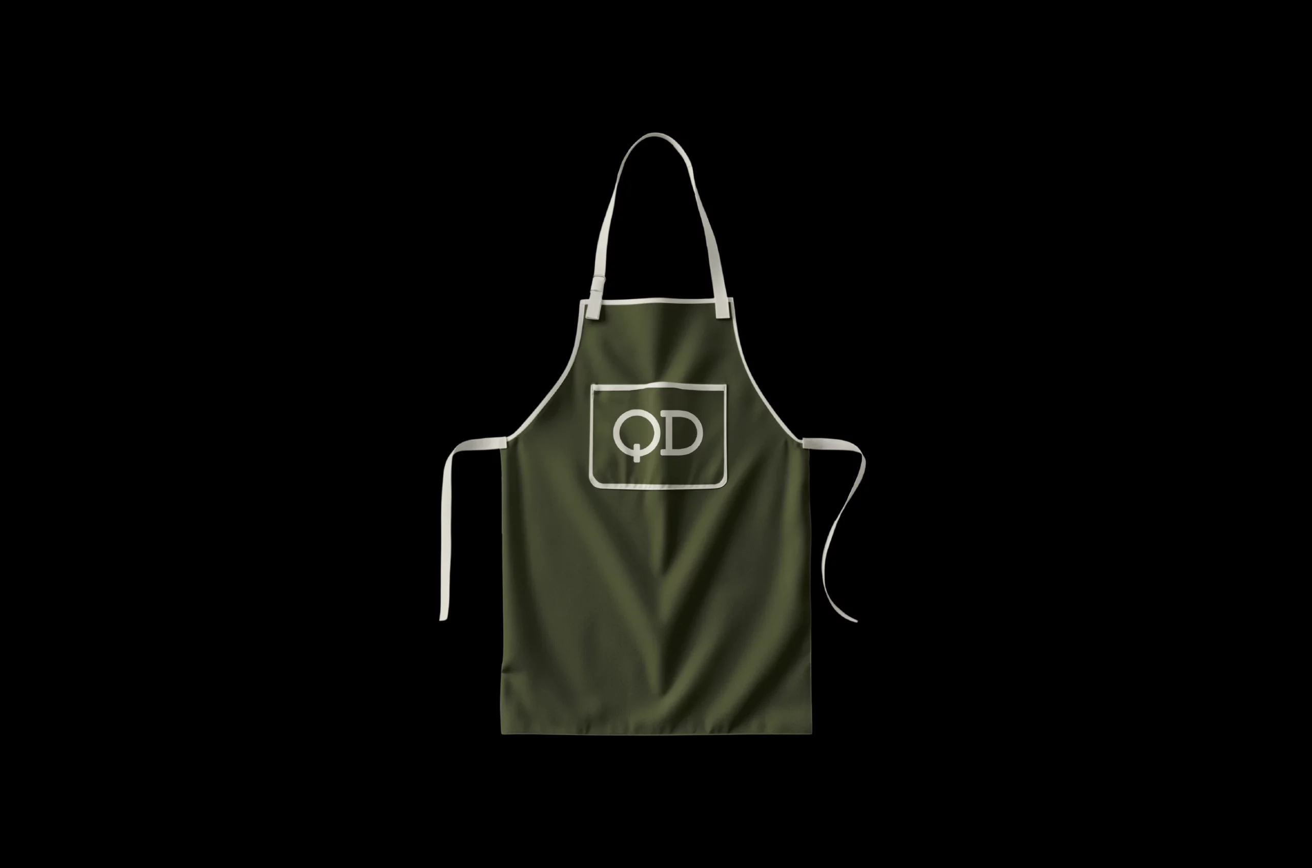
We crafted a visual ecosystem centered around a cleverly conceived mascot—a hungry figure ingeniously formed from the letters Q and D. This character anchors a broader identity system that employs warm browns and earthy olive greens, colours that simultaneously evoke comfort and freshness.

")
A Taste of Character
Typography choices reflect authenticity without pretension, mirroring QD's straightforward culinary philosophy. Packaging features cheeky quips and understated wit, creating memorable touchpoints that extend the dining experience beyond the restaurant walls. The result is a brand that feels familiar yet refreshed—sophisticated enough for the discerning urban diner.
Services
Company
Socials
Services
Company
Socials
© The Neat Trick 2026
<Made extra neat, so it's not that tricky>
Terms & Conditions