
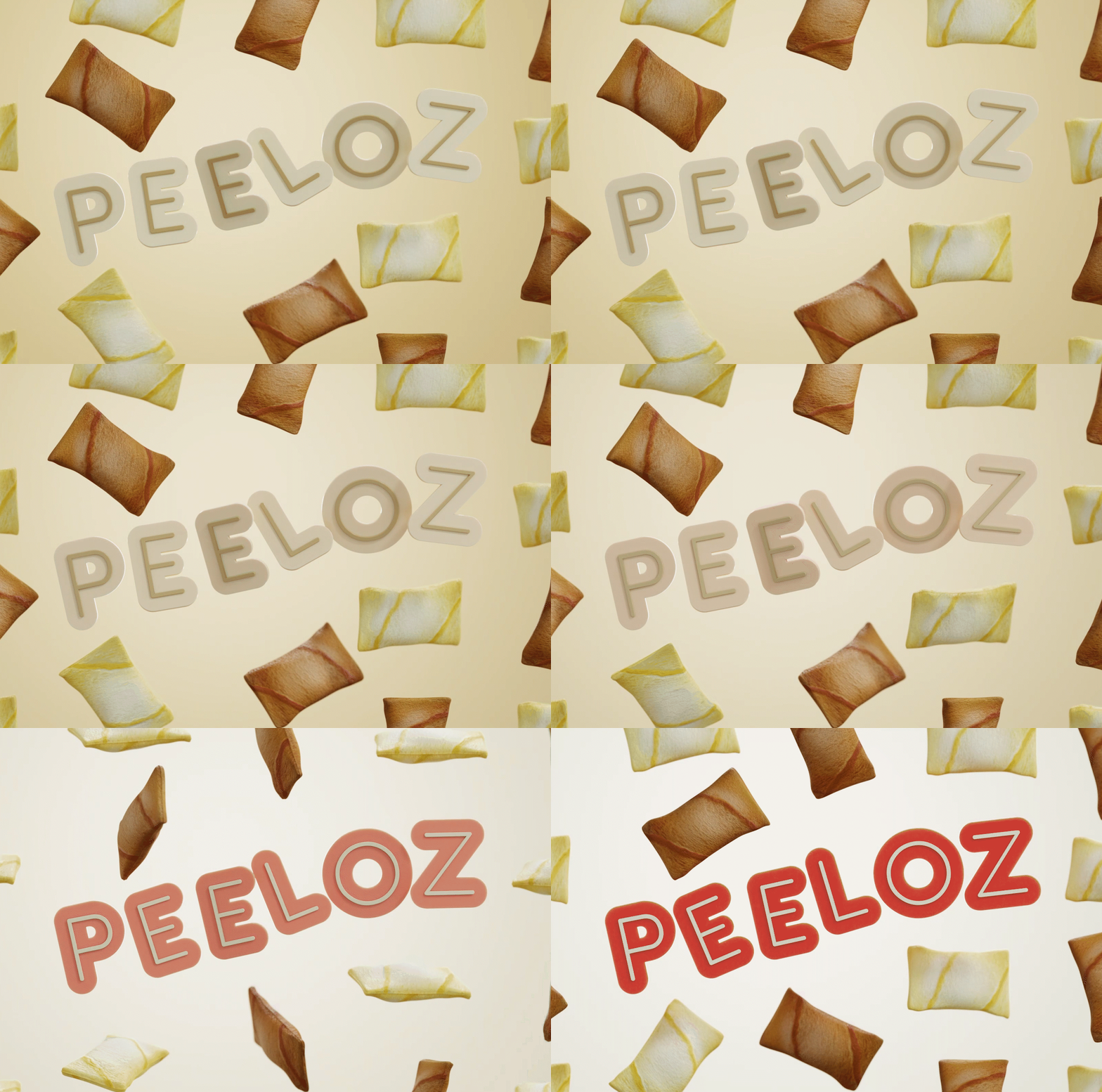
Peeloz
Services
Visual Identity | Packaging Design
FMCG
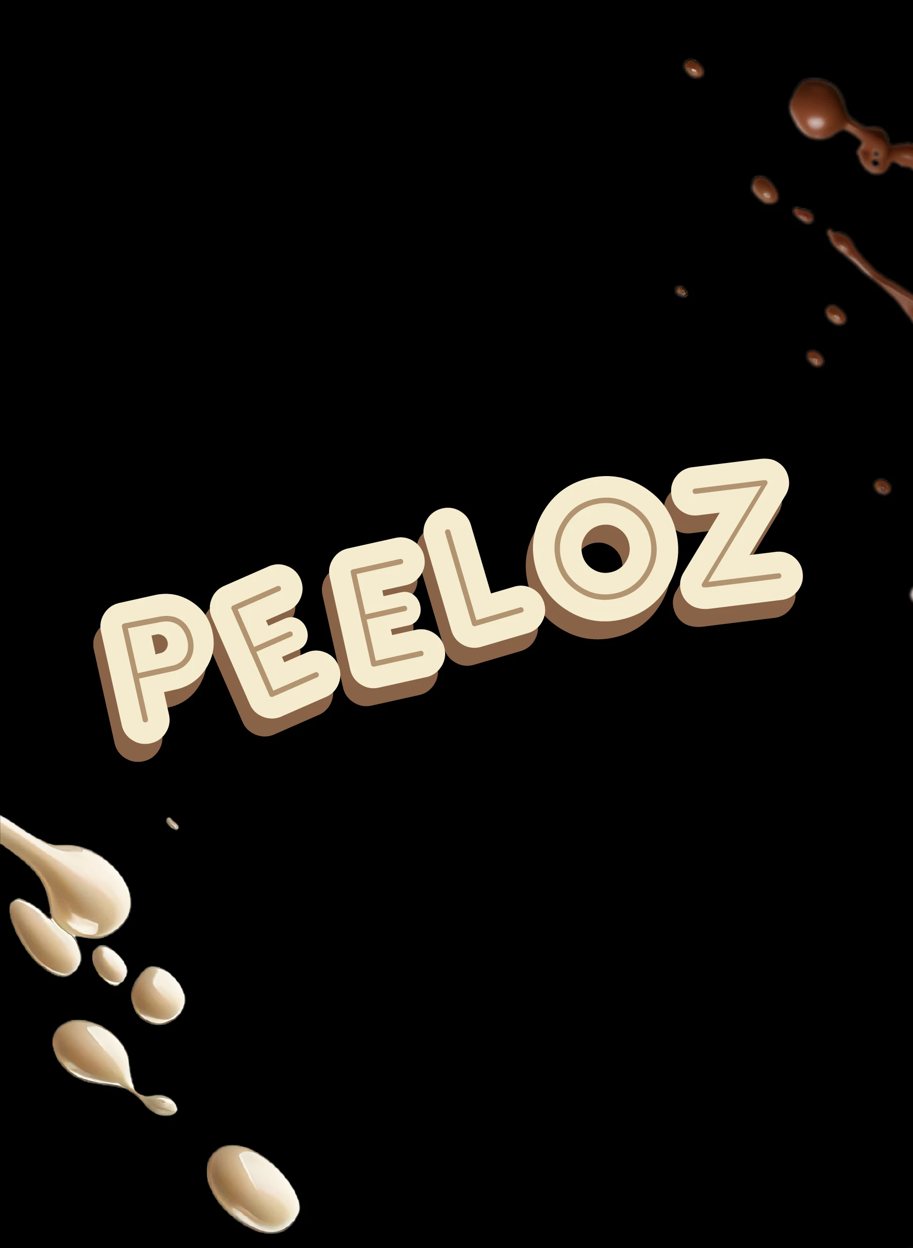
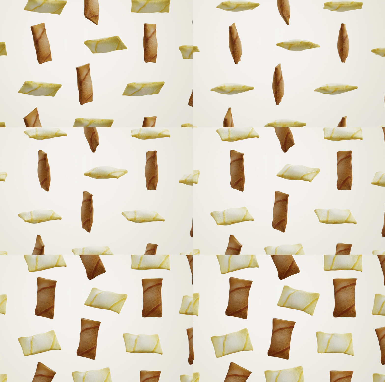
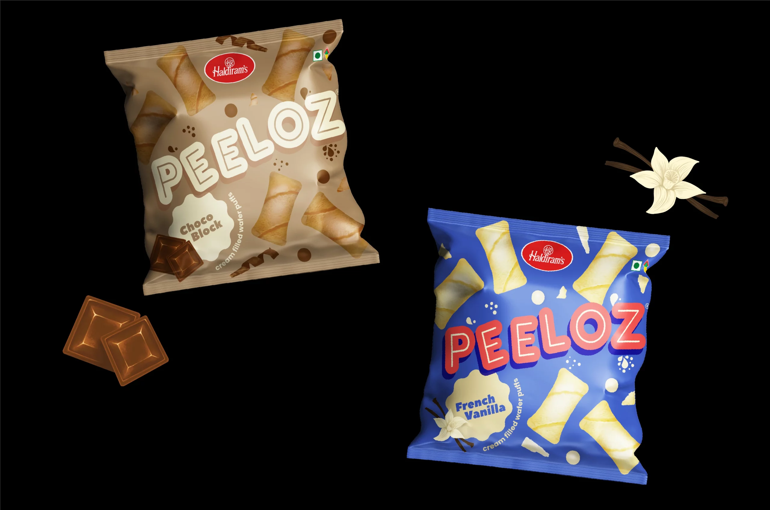
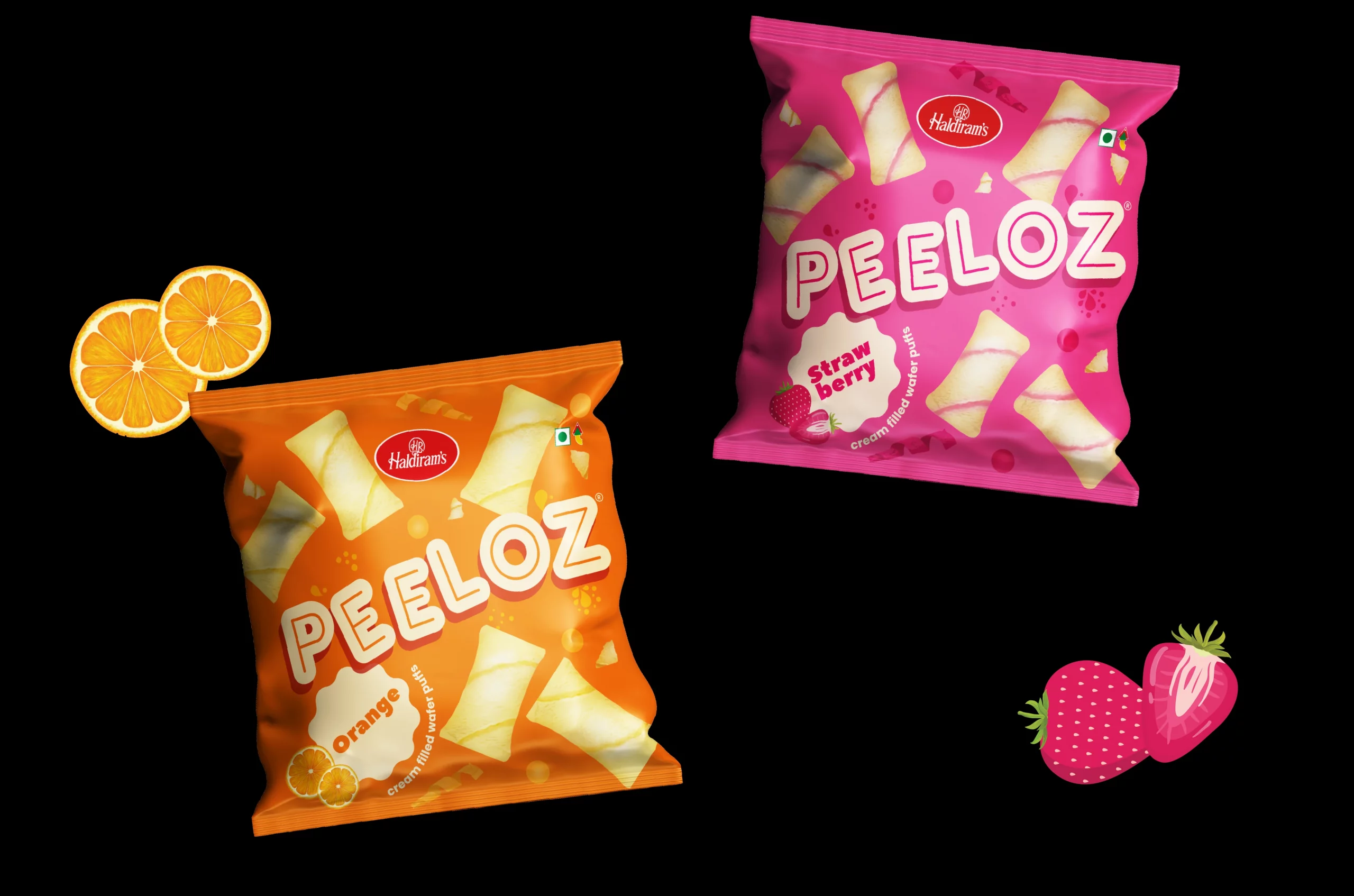
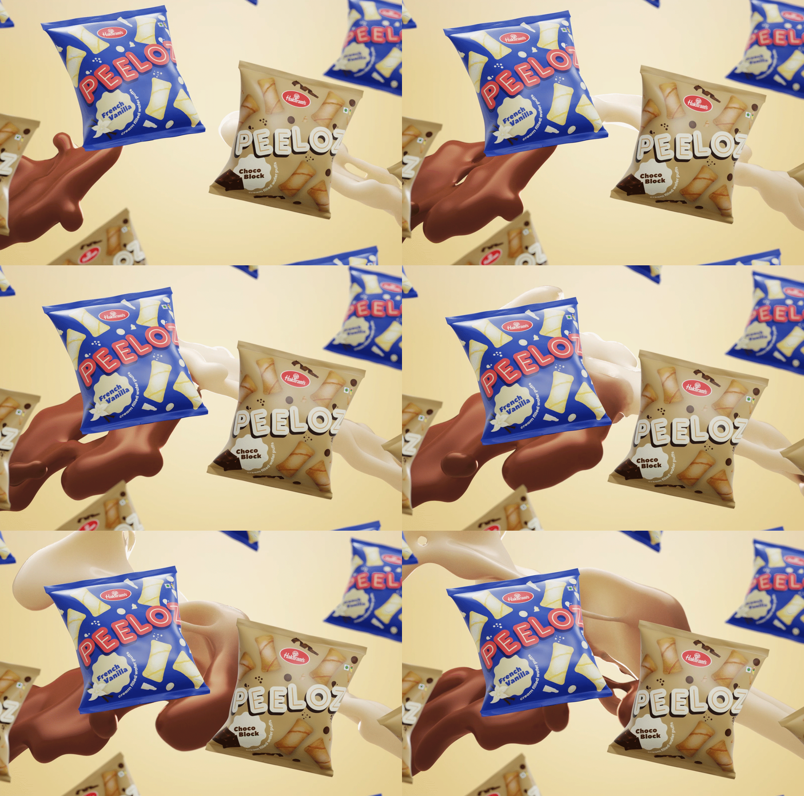
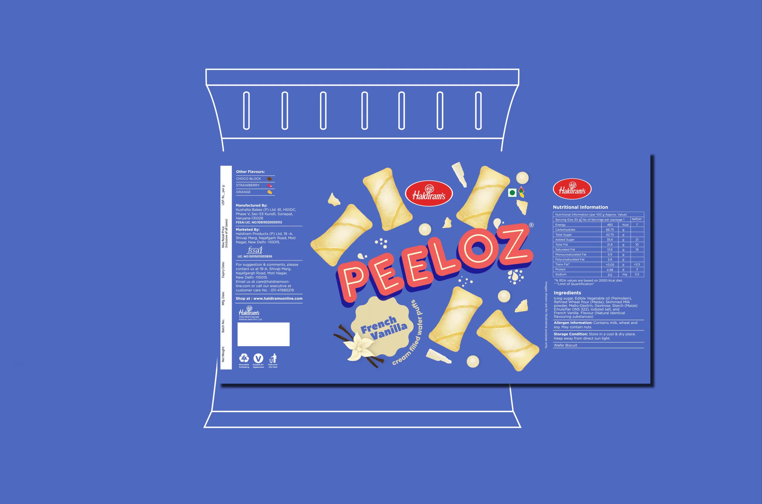
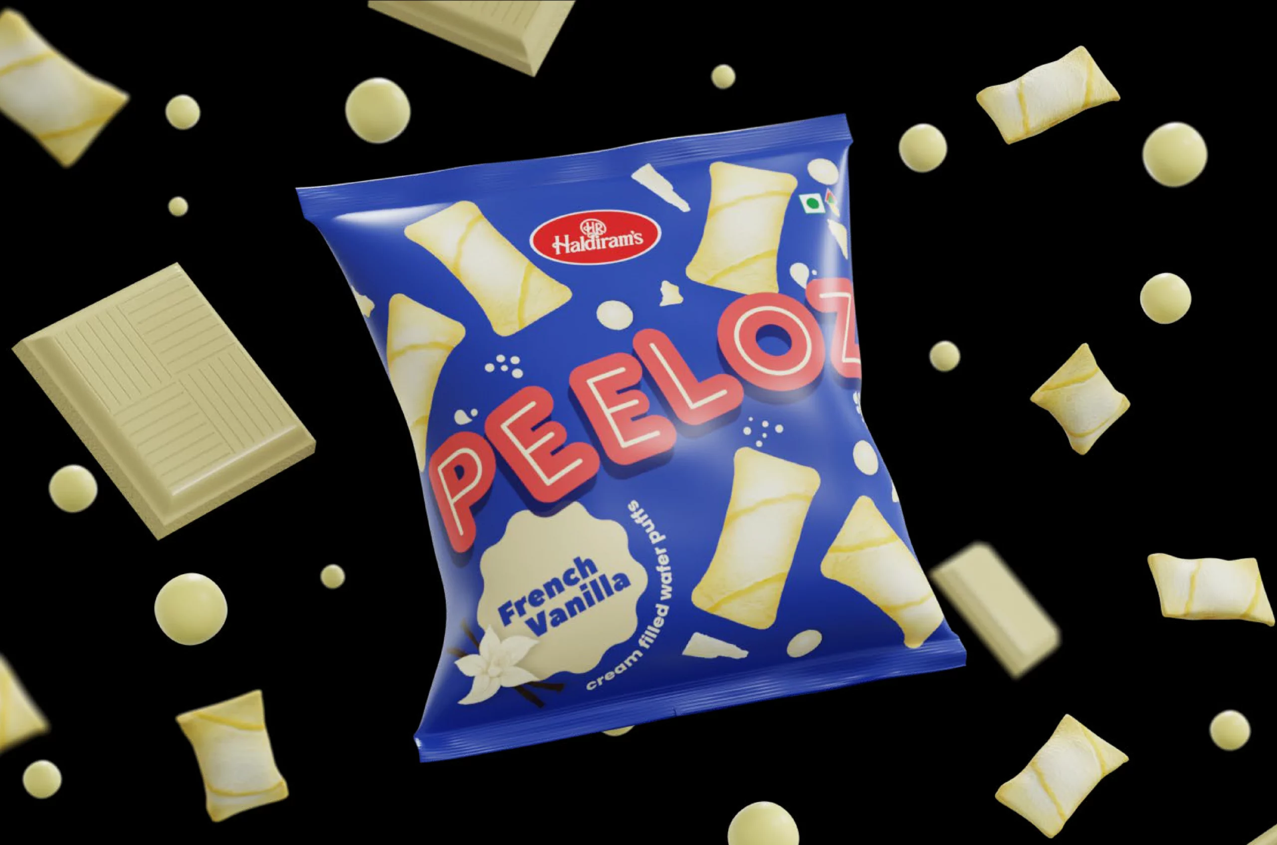
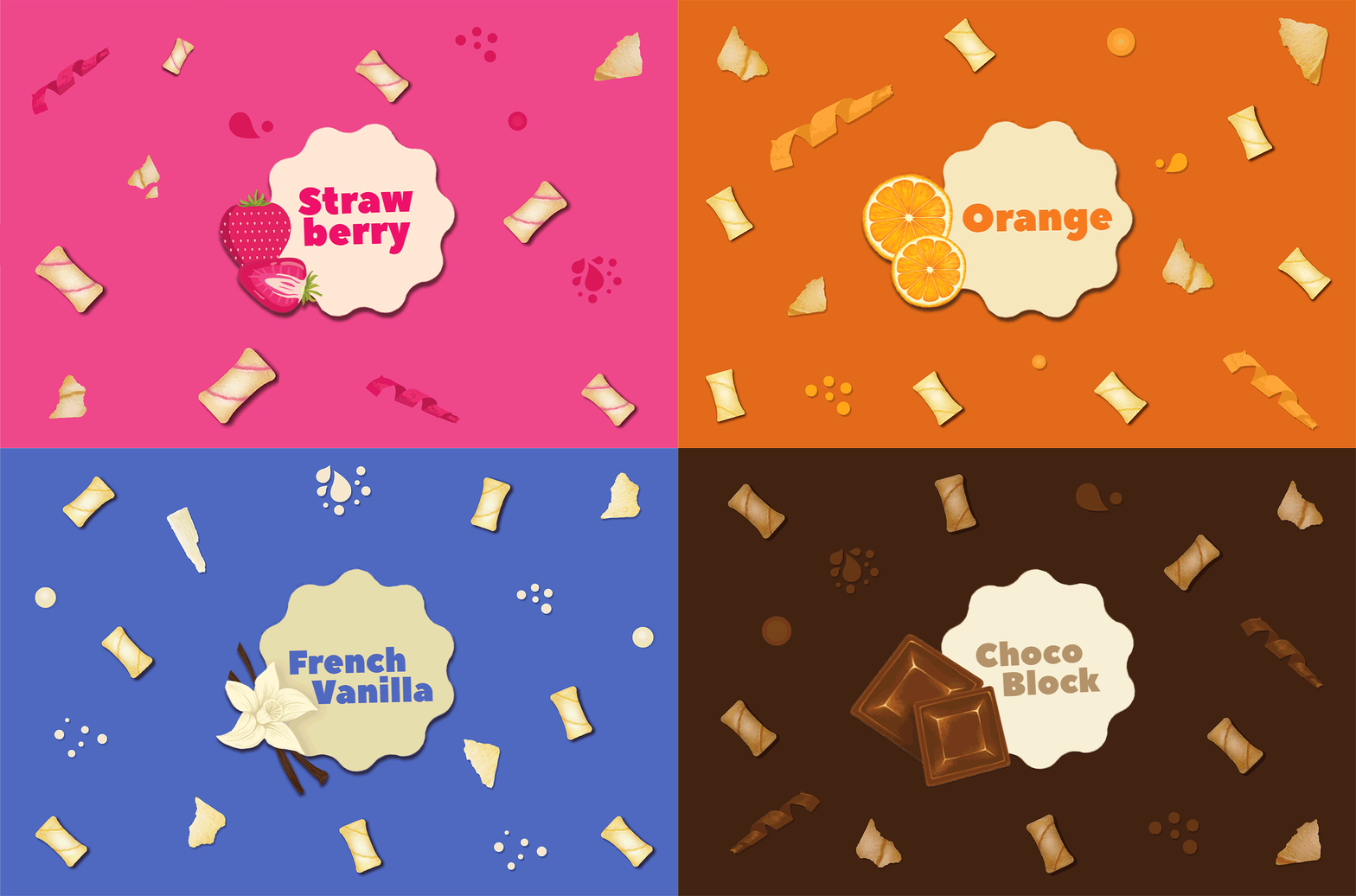
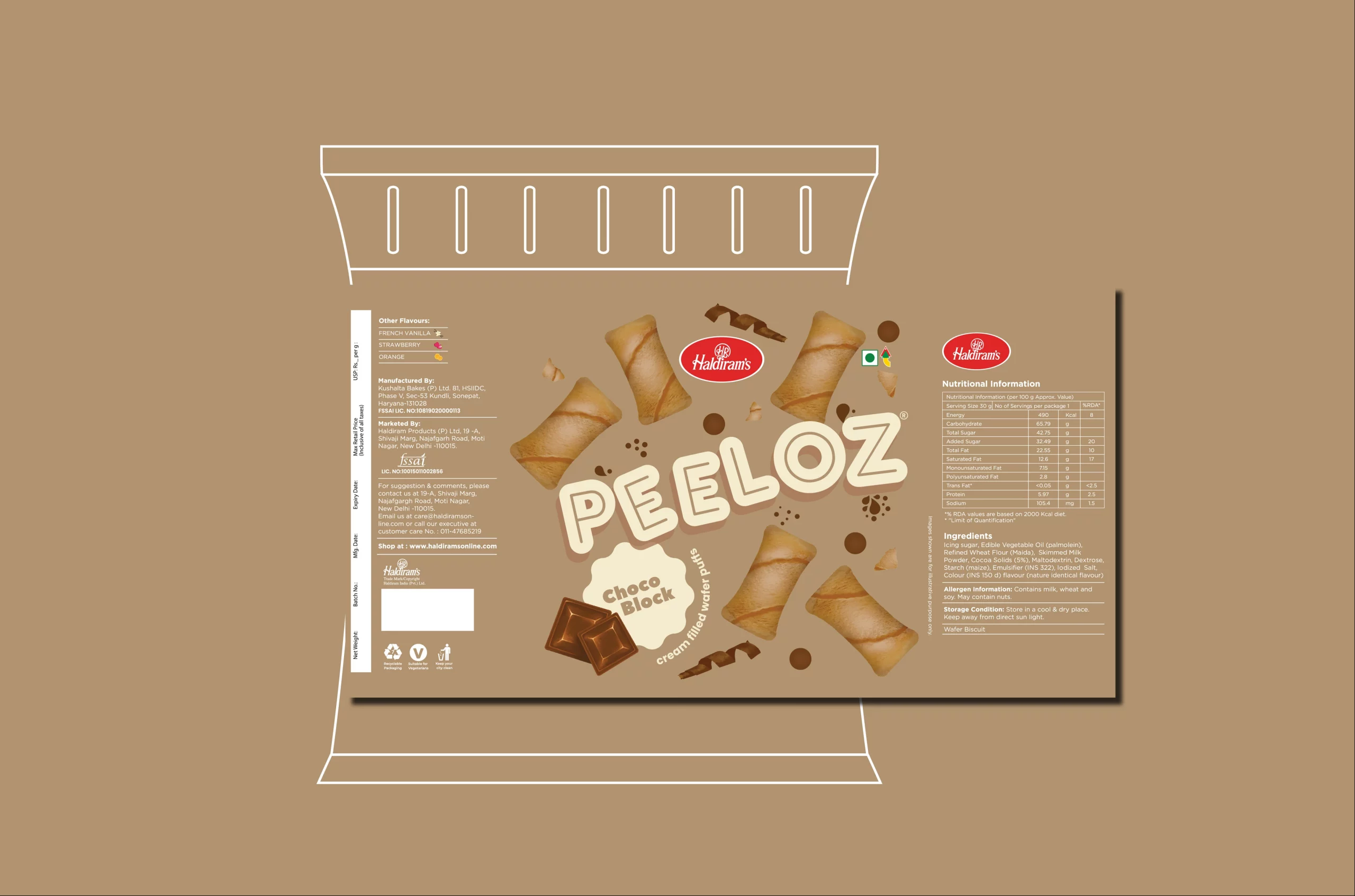
When Haldiram's decided to add some modern oomph to their snack portfolio with Peeloz, they needed packaging with enough personality to charm the most discerning metropolitans while still feeling like a familiar friend in tier 2 and 3 markets. Our challenge? Orchestrate a visual courtship between tradition and trend that would make eyes widen and hands reach—regardless of postal code or birth year.


The Warmth That Remains
The logo draws from a childhood memory that feels universally familiar, using the ladybug as a symbol of warmth, affection, and quiet wonder. Rather than dominating the identity, it appears subtly, allowing recognition to build gradually over time. The wordmark complements this approach with a form inspired by the intricacy of embroidery, its structure intentional and disciplined to sit seamlessly across garments, tags, and packaging. Together, they create a cohesive visual language that mirrors the embroidered detailing present throughout the brand and within the ladybug itself.
Consistency Across Forms
The brand extends as a cohesive system rather than a collection of visuals, carrying a consistent intent across stationery, tags, packaging, textiles, and photography without shifting its voice. While elements adapt in scale and material, their meaning remains unchanged, ensuring each touchpoint feels connected rather than designed in isolation. This approach allows Dulari to grow without reinvention, with the embroidery logic translating seamlessly across surfaces, the palette staying steady as materials evolve, and details appearing or receding with purpose. Nothing is added for effect; instead, familiarity is built through repetition, and recognition emerges through consistency over time.
Services
Company
Socials
Services
Company
Socials
© The Neat Trick 2026
<Made extra neat, so it's not that tricky>
Terms & Conditions
