
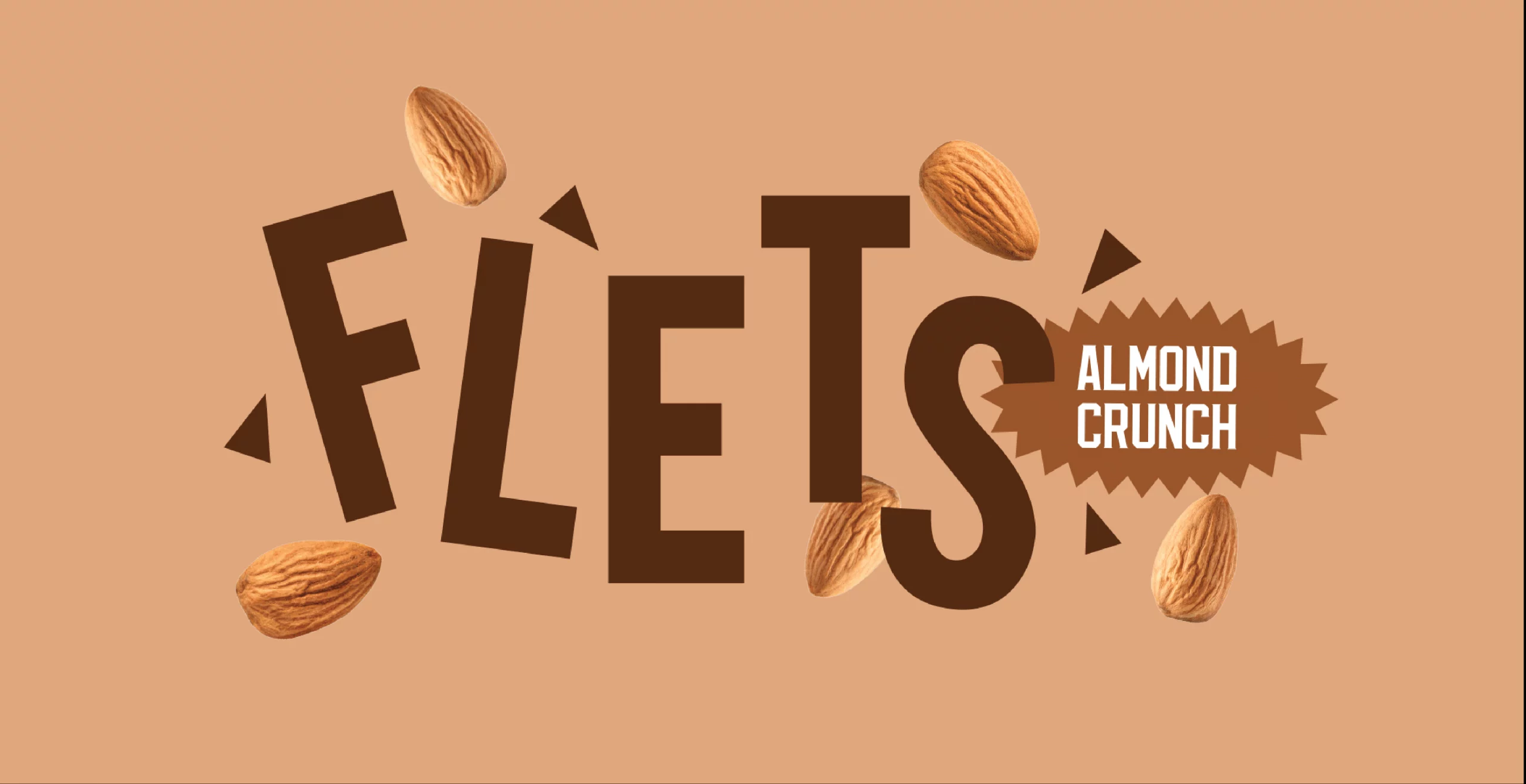
Flets
Services
Visual Identity | Packaging
FMCG
The Challenge
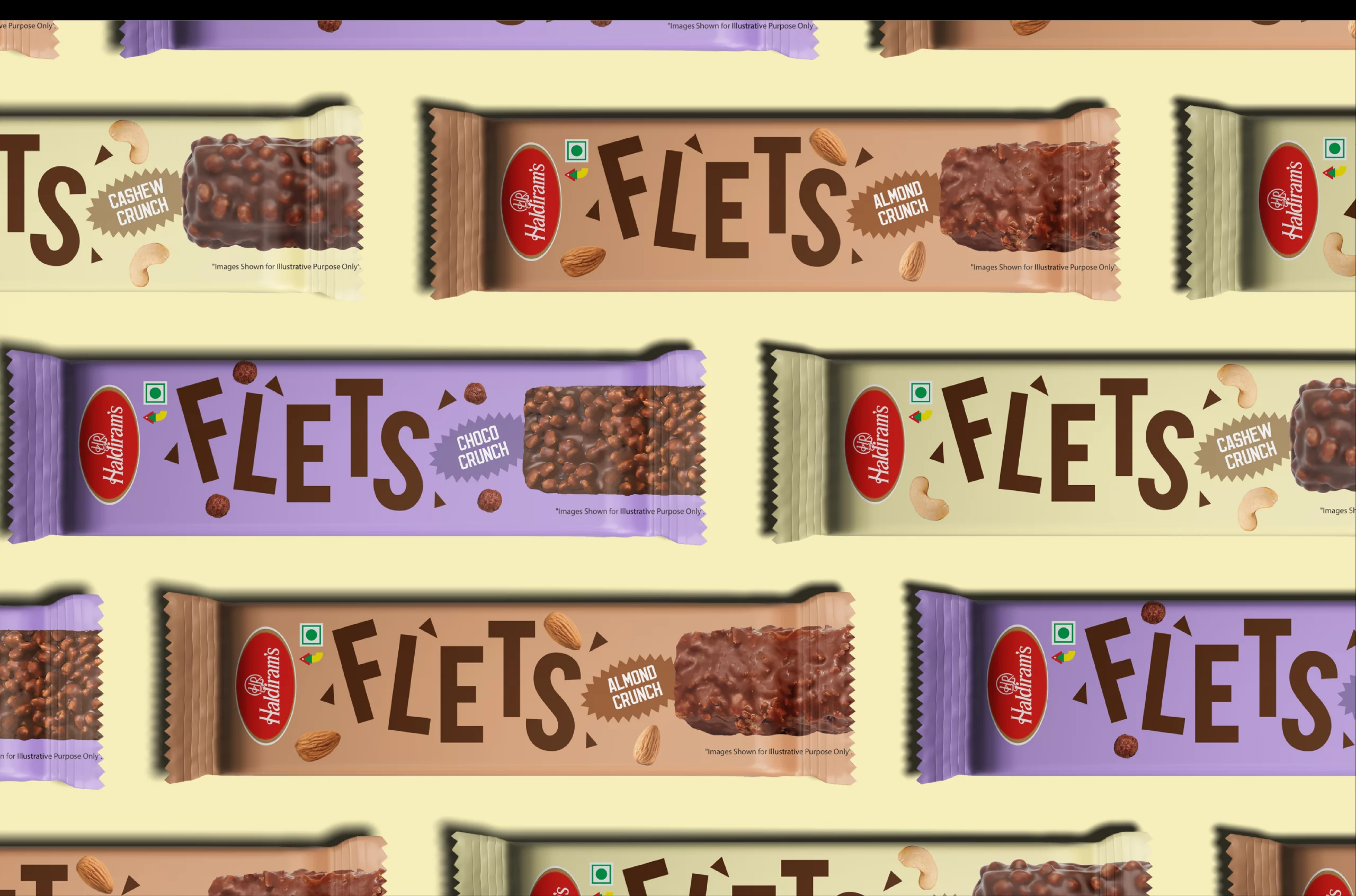
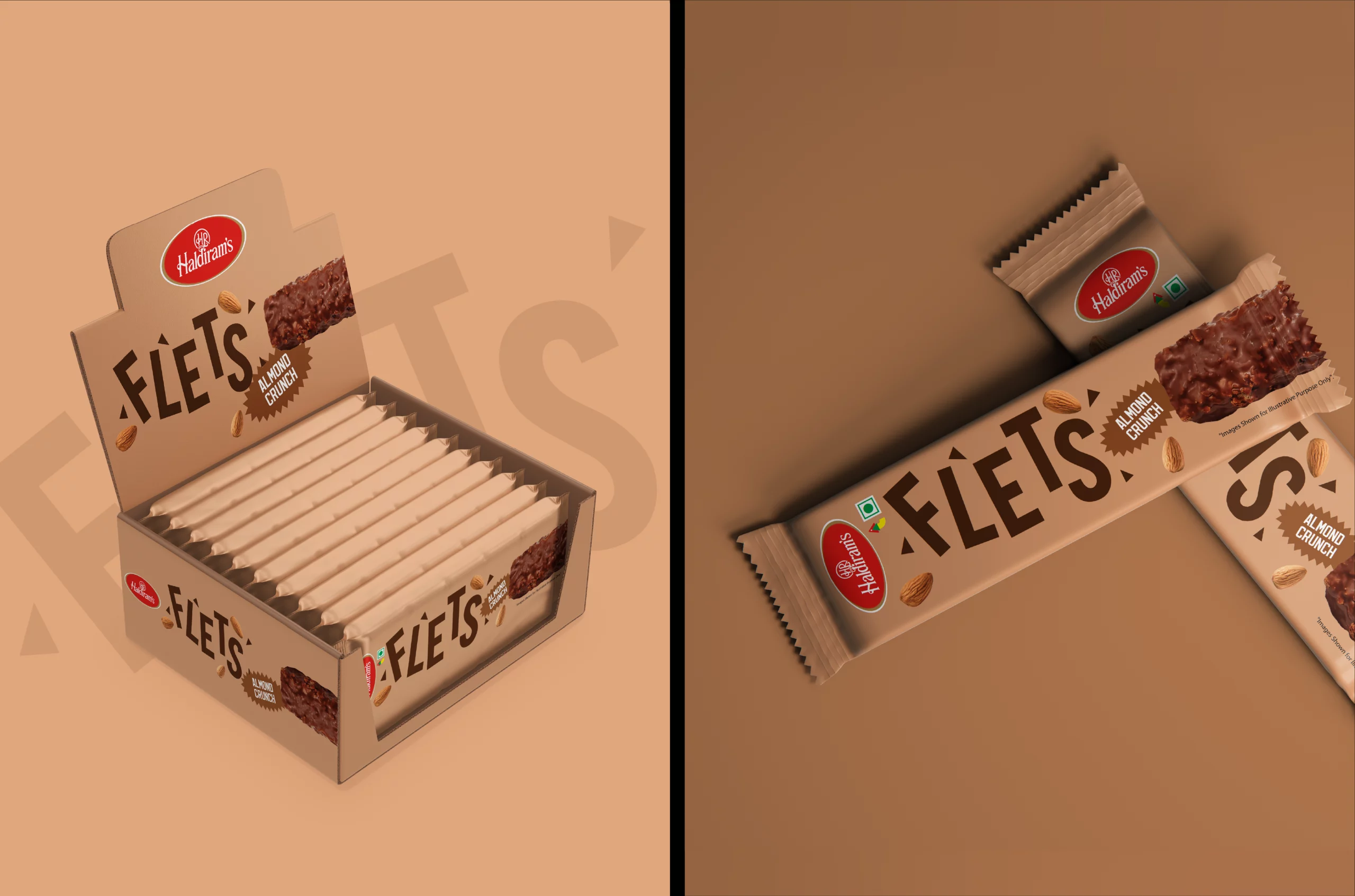
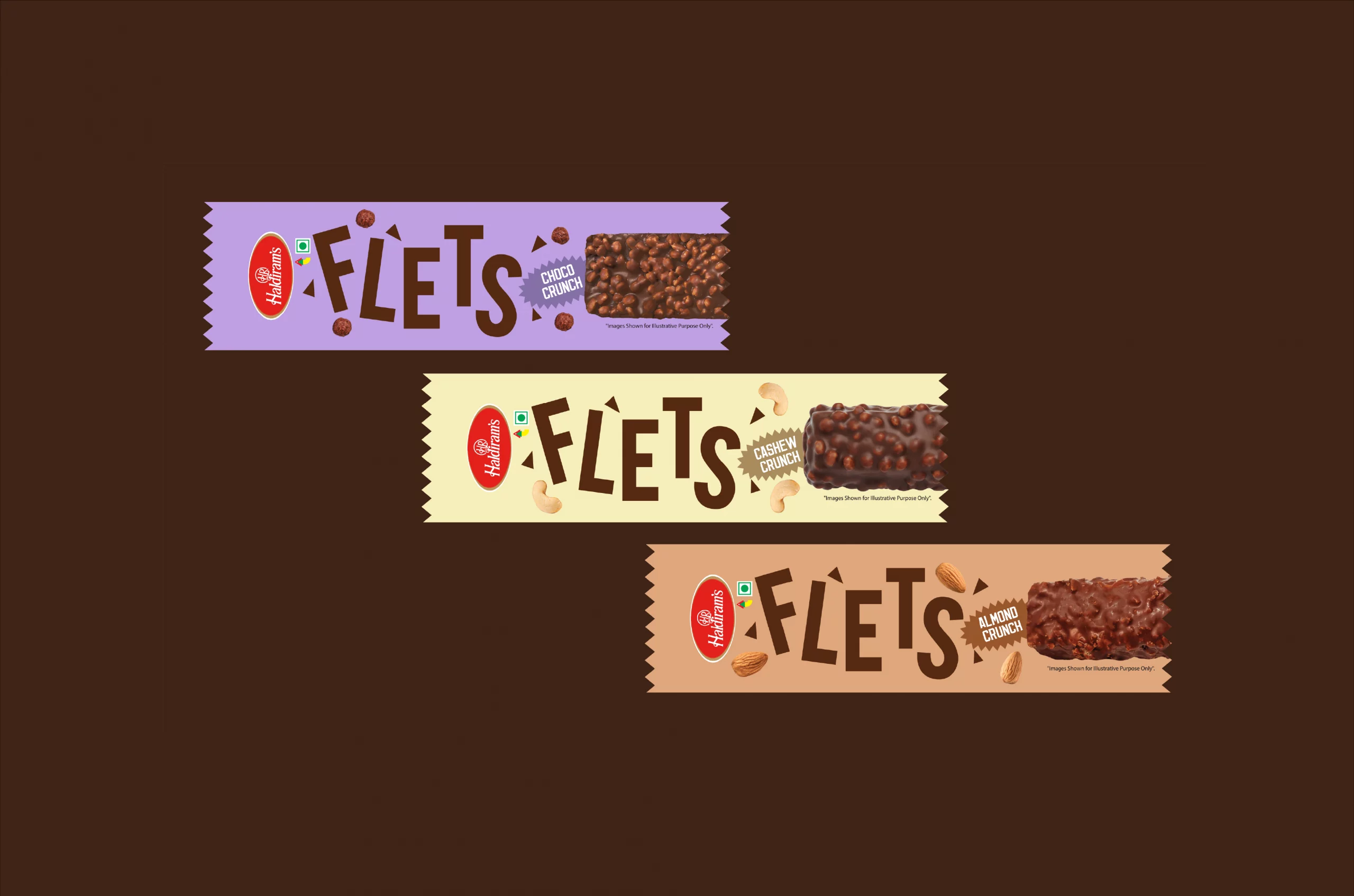
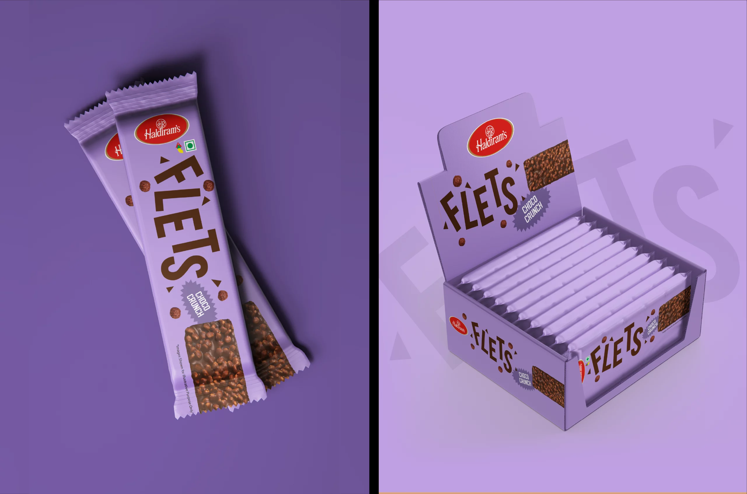
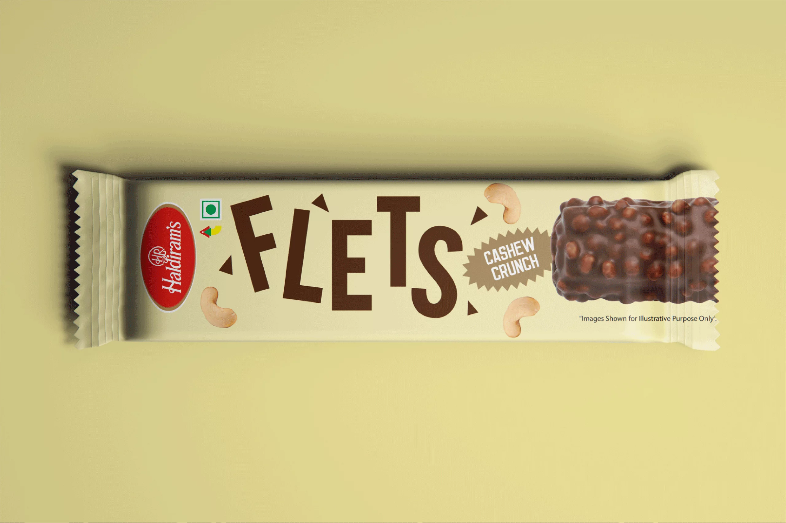
When heritage brand Haldiram's ventured into chocolate territory with Flets, they needed packaging that would honour tradition while carving out new visual territory. Our challenge was creating a system that would feel at home in both modern retail environments and traditional kirana stores, while ensuring the product had immediate shelf appeal in either setting.
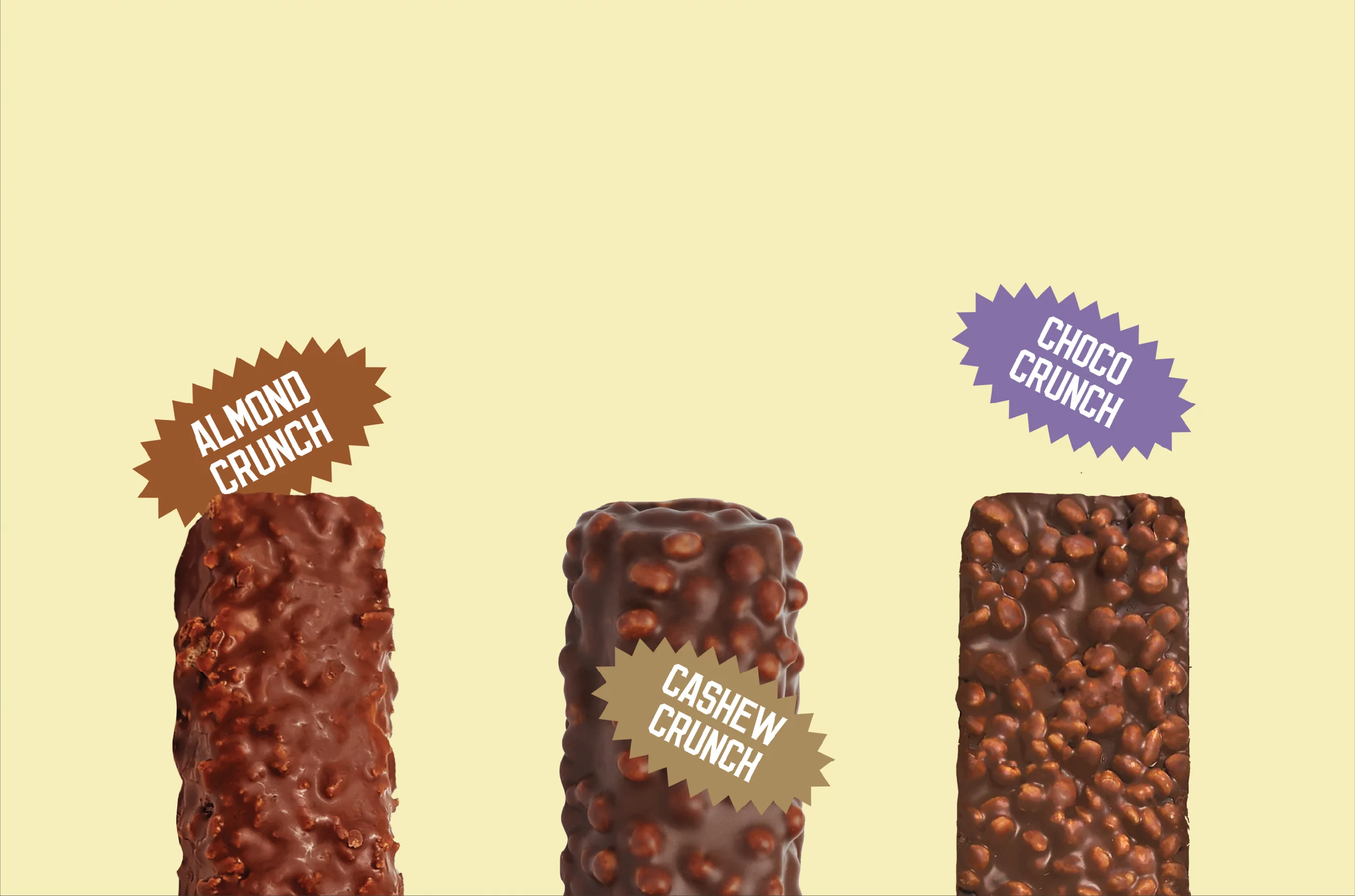
We developed a distinctive packaging system that marries nostalgic pastel palettes with contemporary condensed typography— creating a visual tension which demands attention.
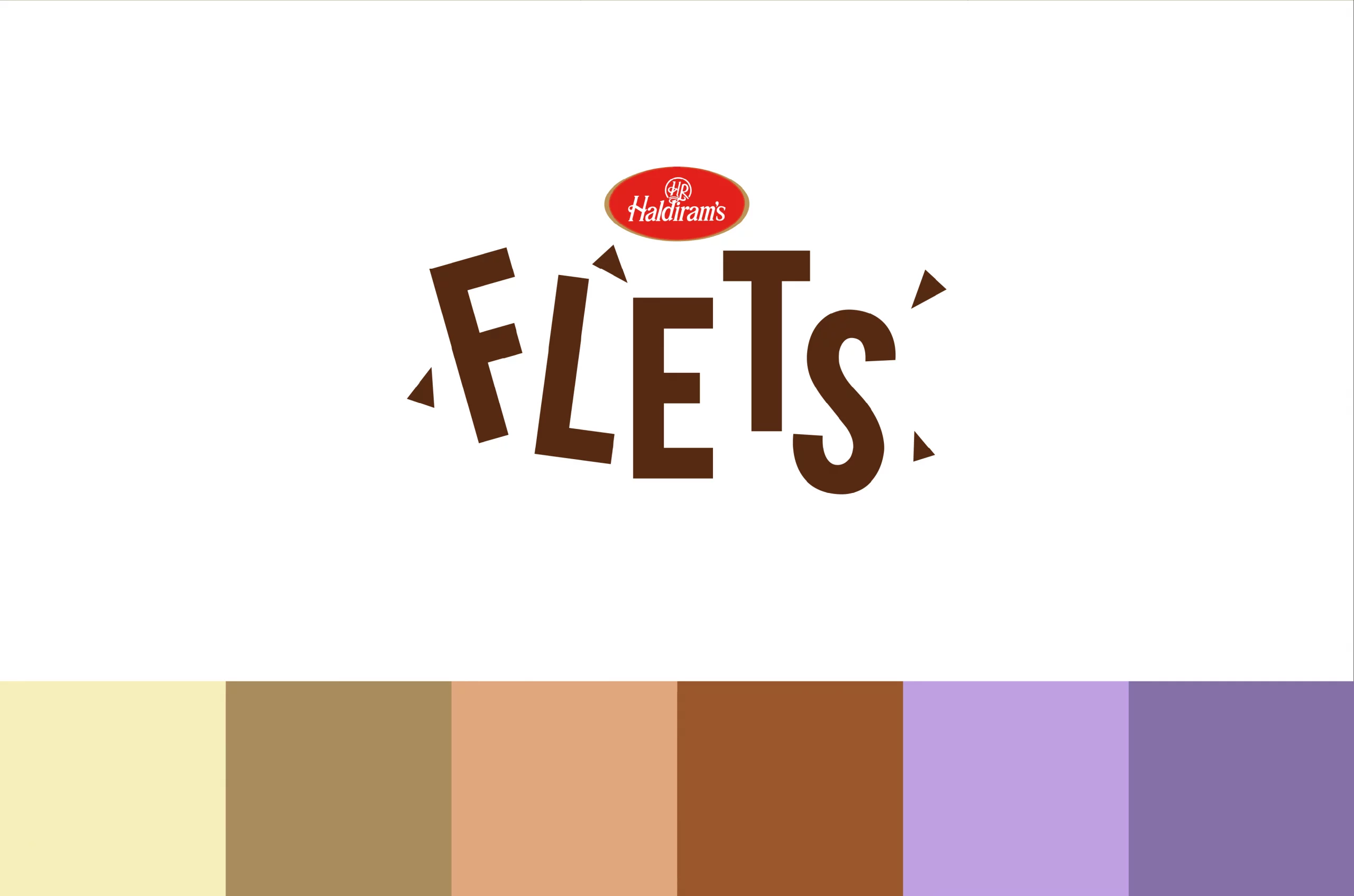

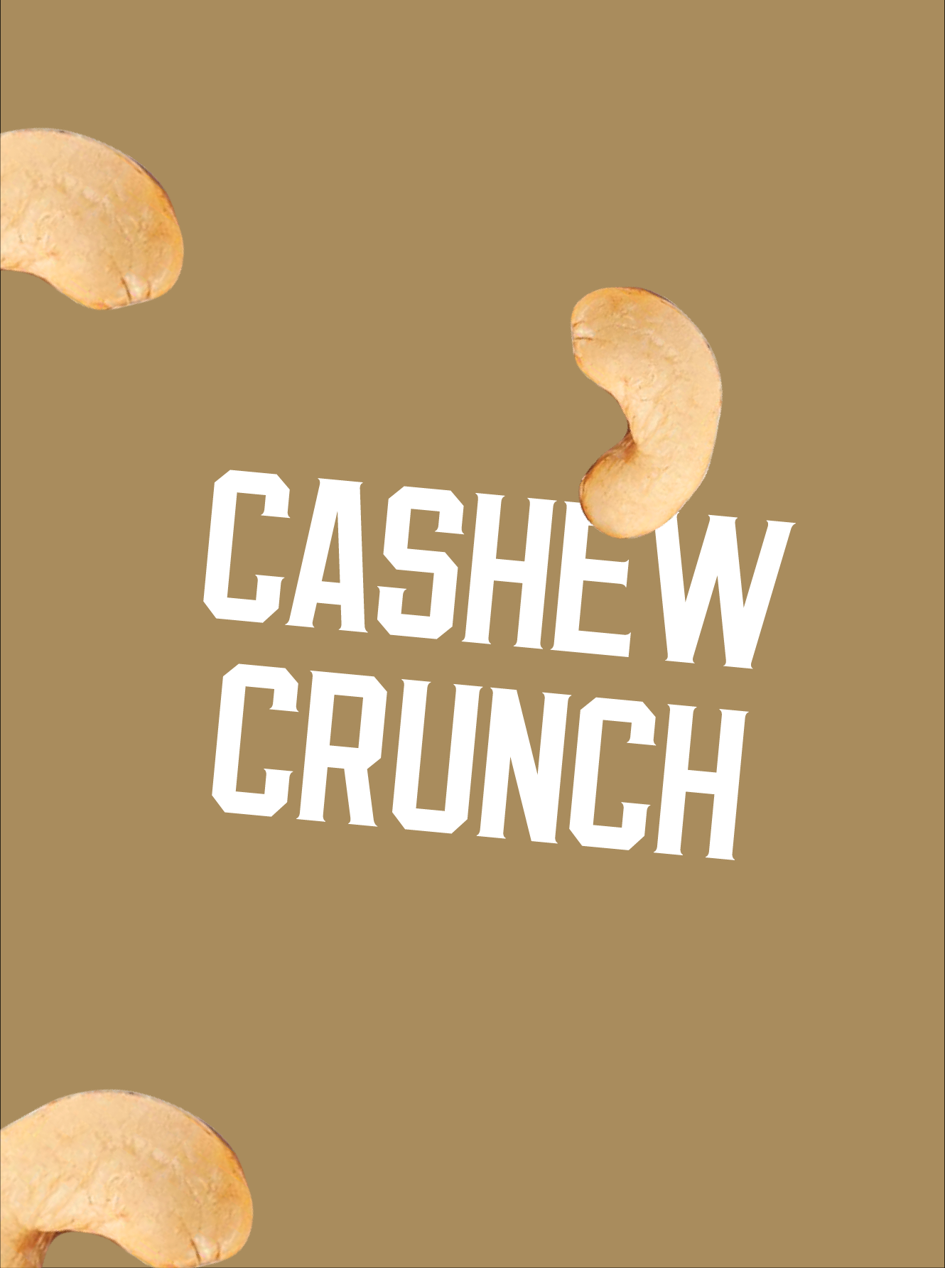

Sweet traditions, Boldly Reimagined.
The logo draws from a childhood memory that feels universally familiar, using the ladybug as a symbol of warmth, affection, and quiet wonder. Rather than dominating the identity, it appears subtly, allowing recognition to build gradually over time. The wordmark complements this approach with a form inspired by the intricacy of embroidery, its structure intentional and disciplined to sit seamlessly across garments, tags, and packaging. Together, they create a cohesive visual language that mirrors the embroidered detailing present throughout the brand and within the ladybug itself.
Services
Company
Socials
Services
Company
Socials
© The Neat Trick 2026
<Made extra neat, so it's not that tricky>
Terms & Conditions
