

Dromen & Co
Services
Visual Identity | Packaging
FMCG
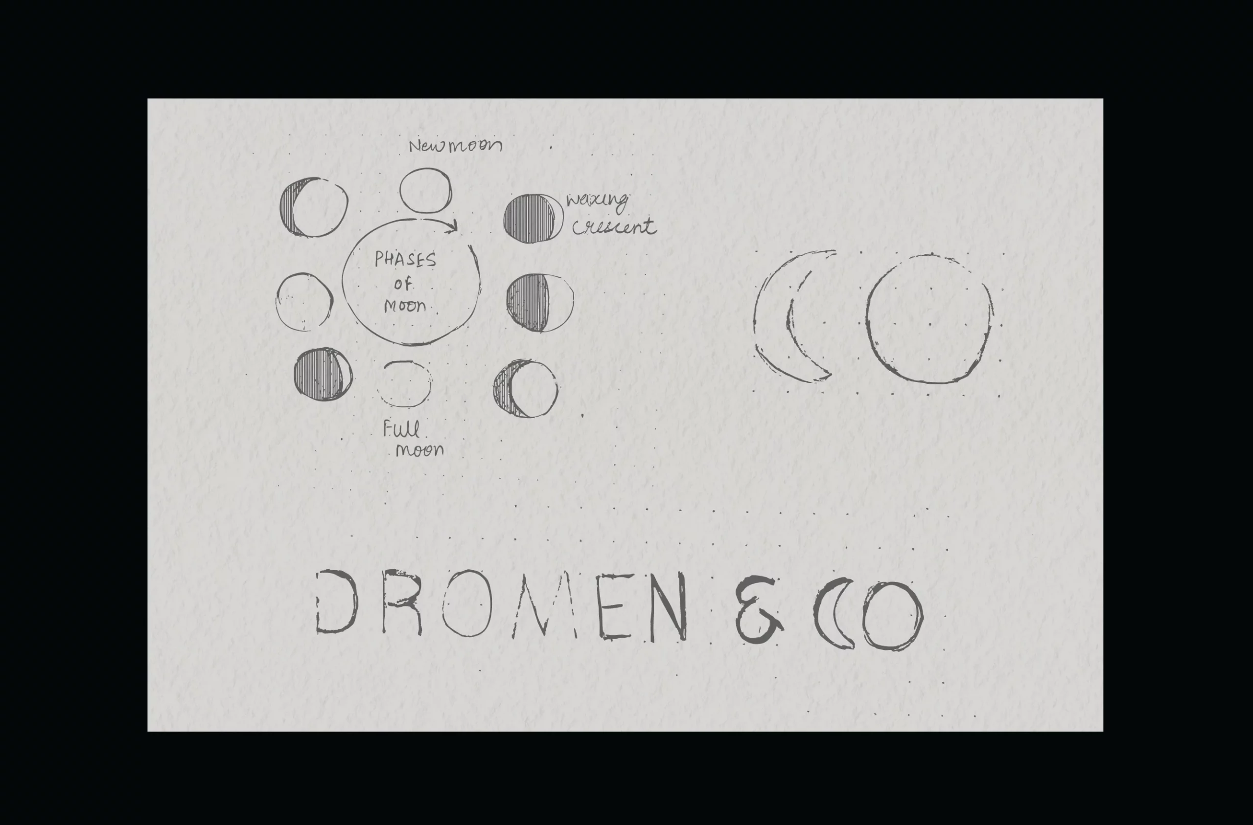
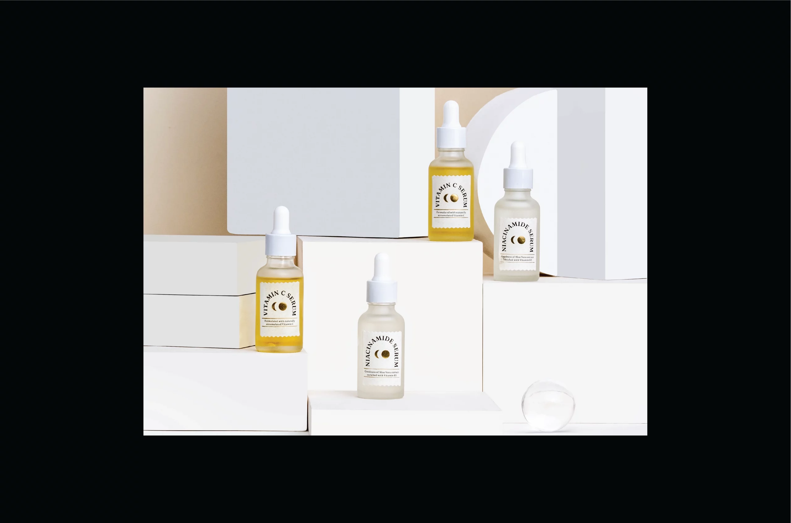
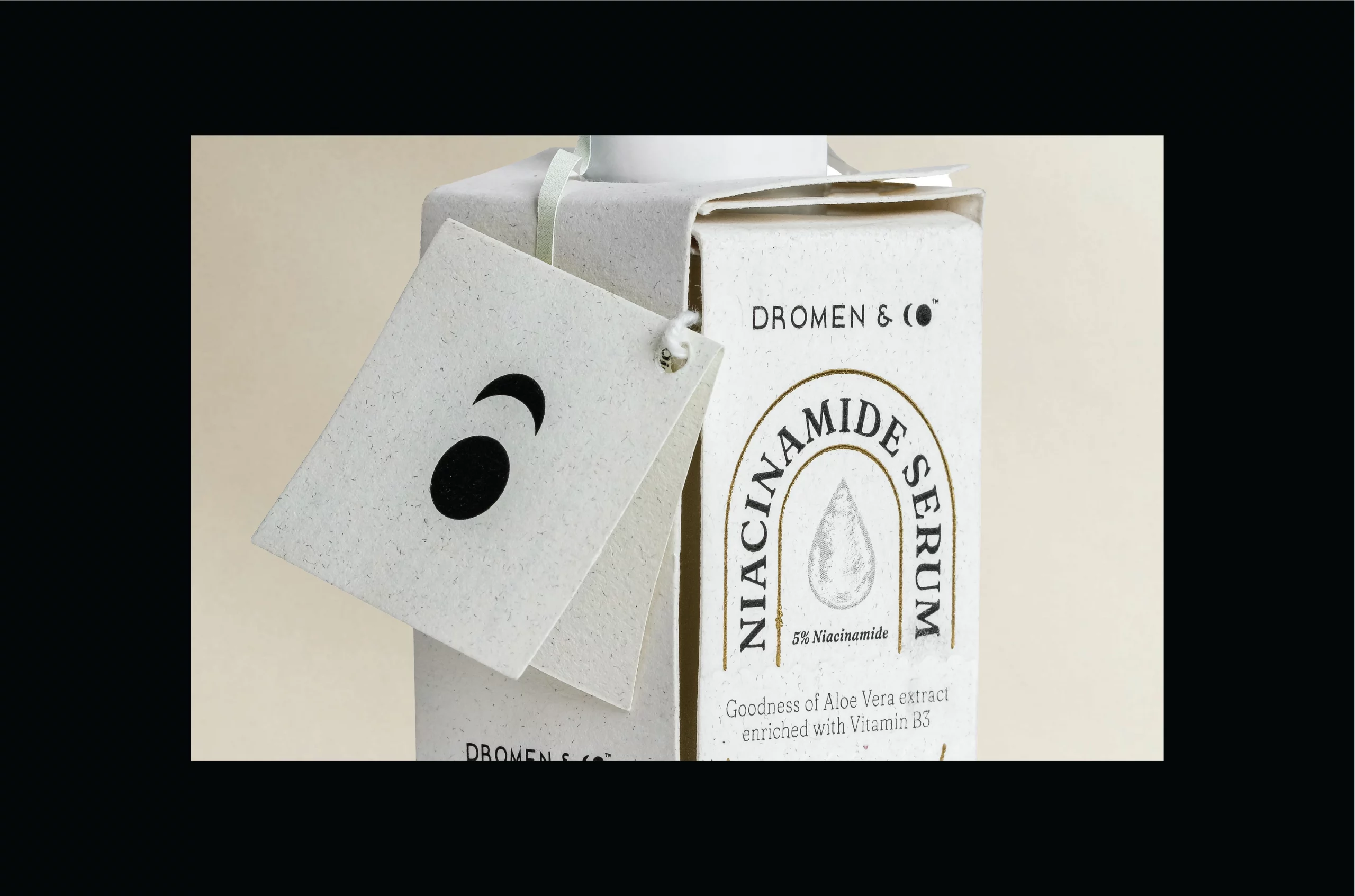
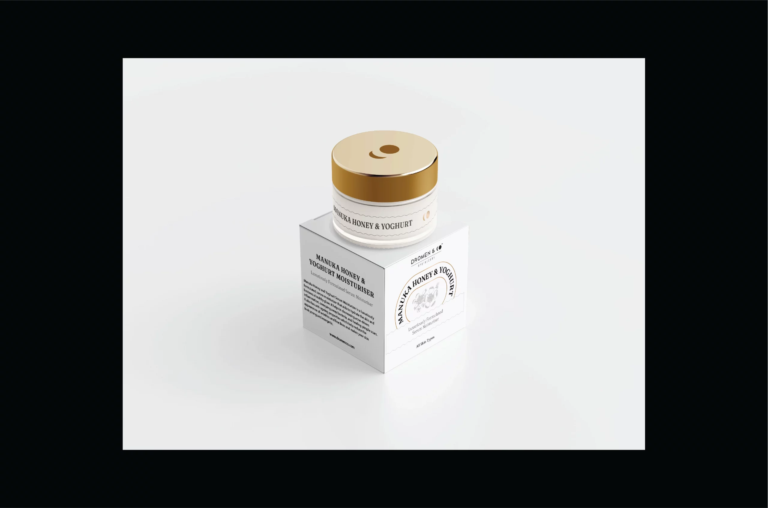
Organic skincare with celestial ambitions. We transformed moon phases into commercial artillery for Dromen & Co's market approach. The Dutch name—meaning "dreams"—becomes tactical positioning rather than mere translation. Through calculated design, self-care rituals elevate to astronomical manipulation, each product broadcasting purity signals with scientific precision.



The Weaponised
Whisper
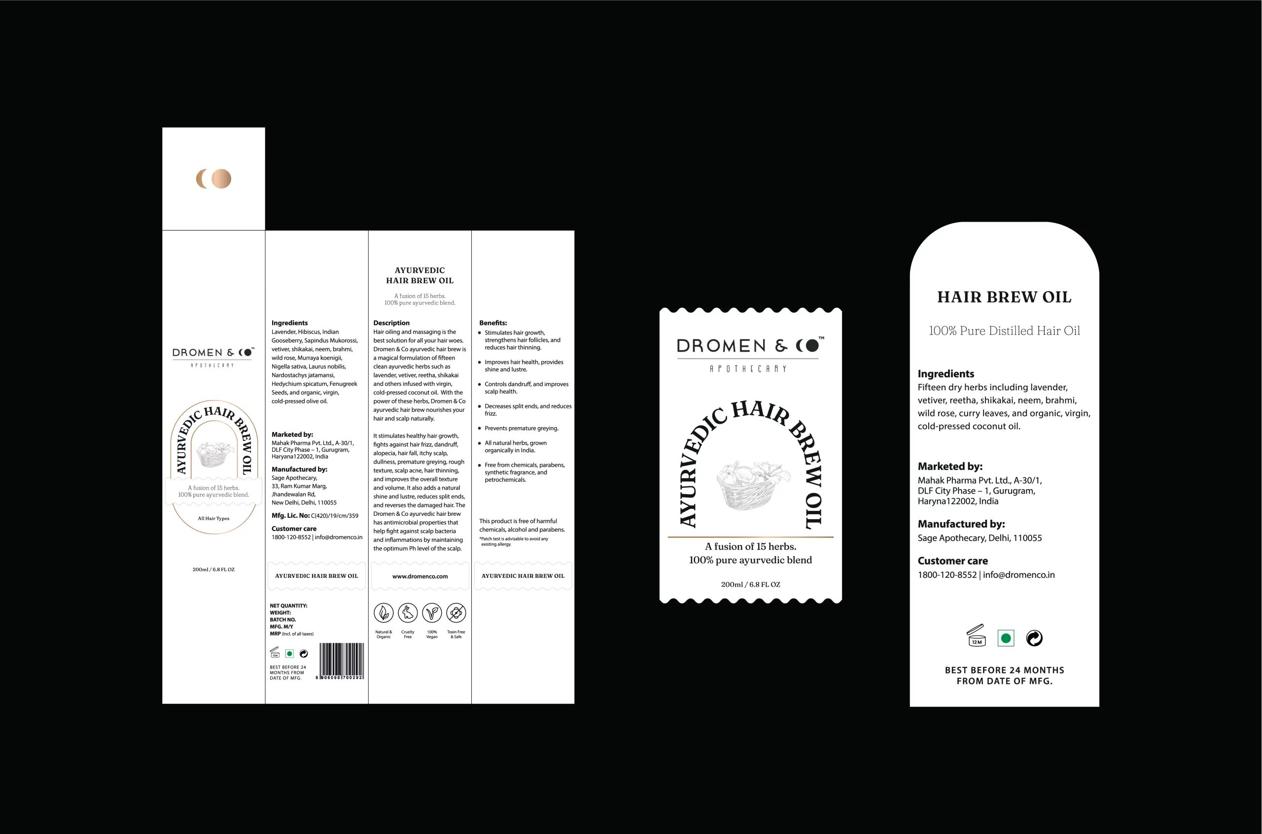
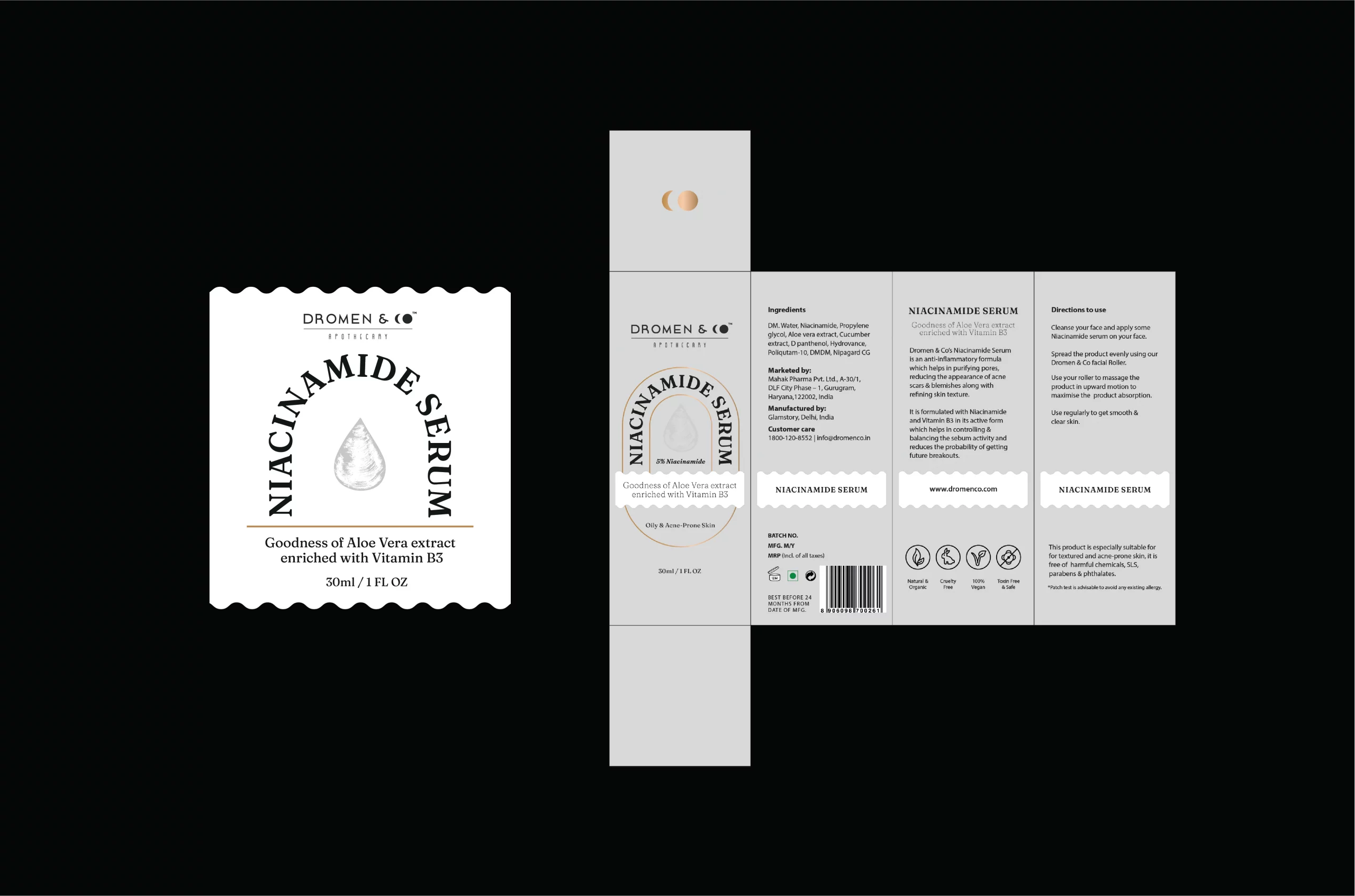
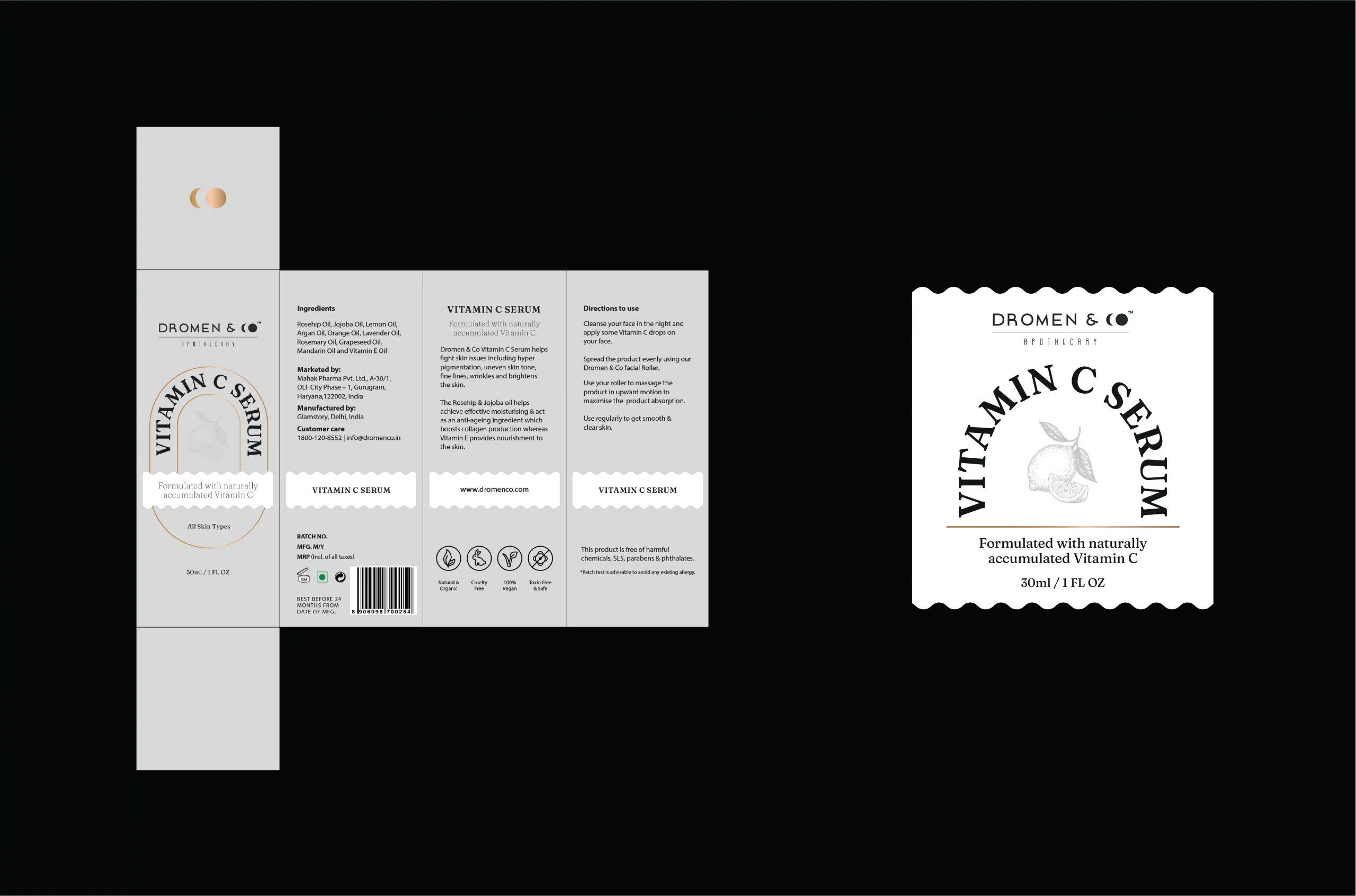
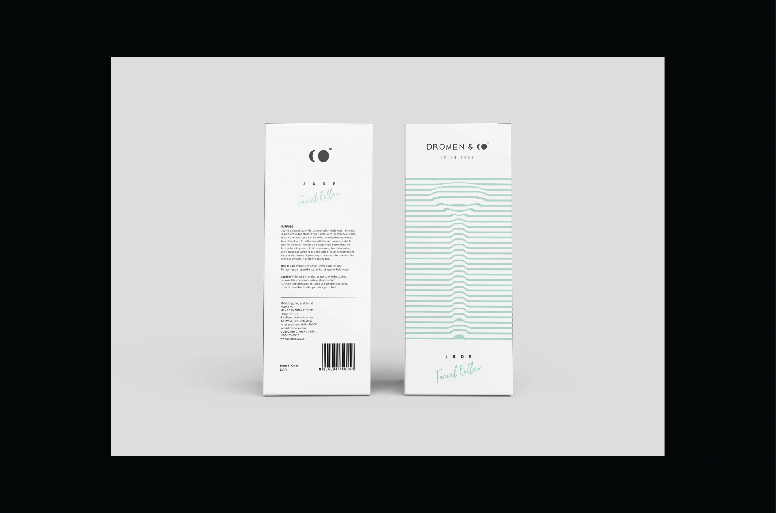
Psychological architecture disguised as color choice. Purple and teal green bypass critical thinking, triggering subconscious dream associations before rational thought can intervene. Minimalism serves as concentrated intent rather than stylistic restraint. Watch how white space manufactures perceived purity through what's deliberately absent rather than what's shown.


The Circular Deception
Moon icons performing systematic reinforcement with every glance. “A full circle of care” functions as subliminal instruction rather than mere tagline—creating bottled illusions of completeness. Each touchpoint is calibrated for tactical consistency, transforming brand uniformity into marketplace advantage. Here lies the quiet conspiracy between product and perception: Dutch dreams packaged and sold as scientific solutions.



Services
Company
Socials
Services
Company
Socials
© The Neat Trick 2026
<Made extra neat, so it's not that tricky>
Terms & Conditions
