
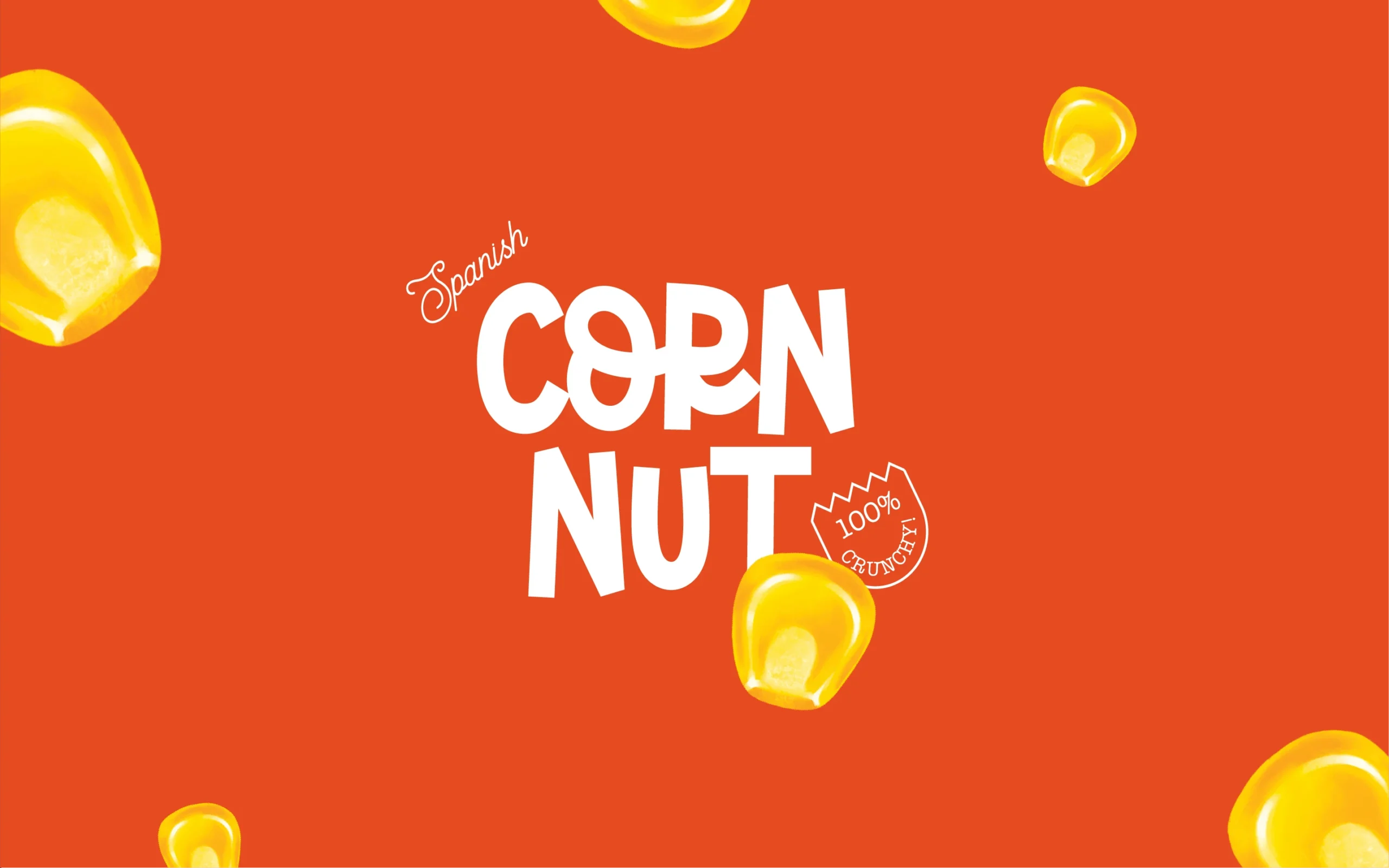
CORN NUT
Services
Visual Identity | Packaging Design
FMCG
A Legacy Staging a Coup
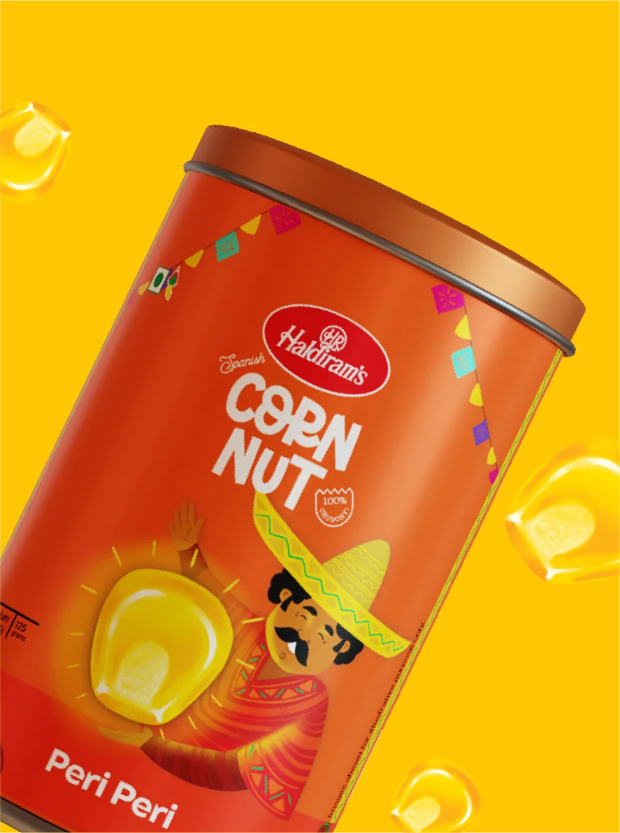
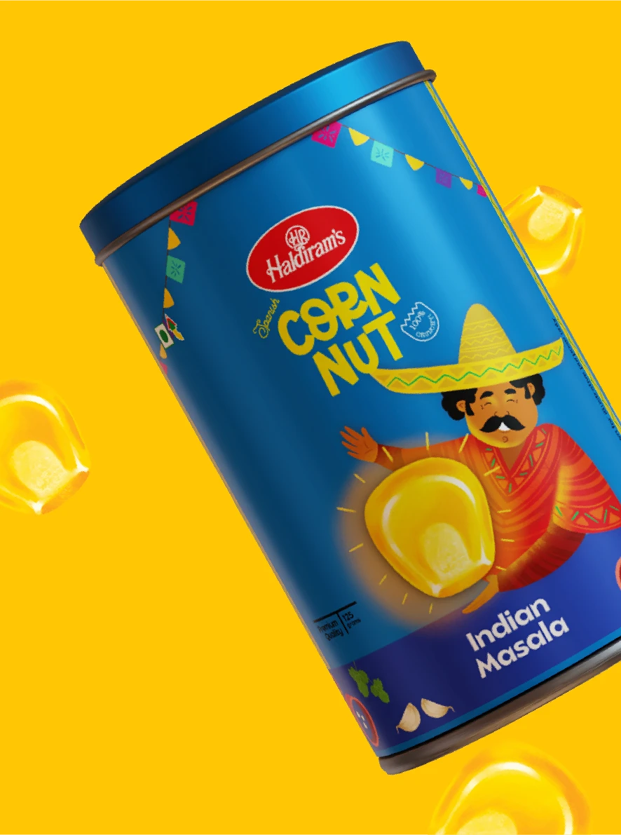
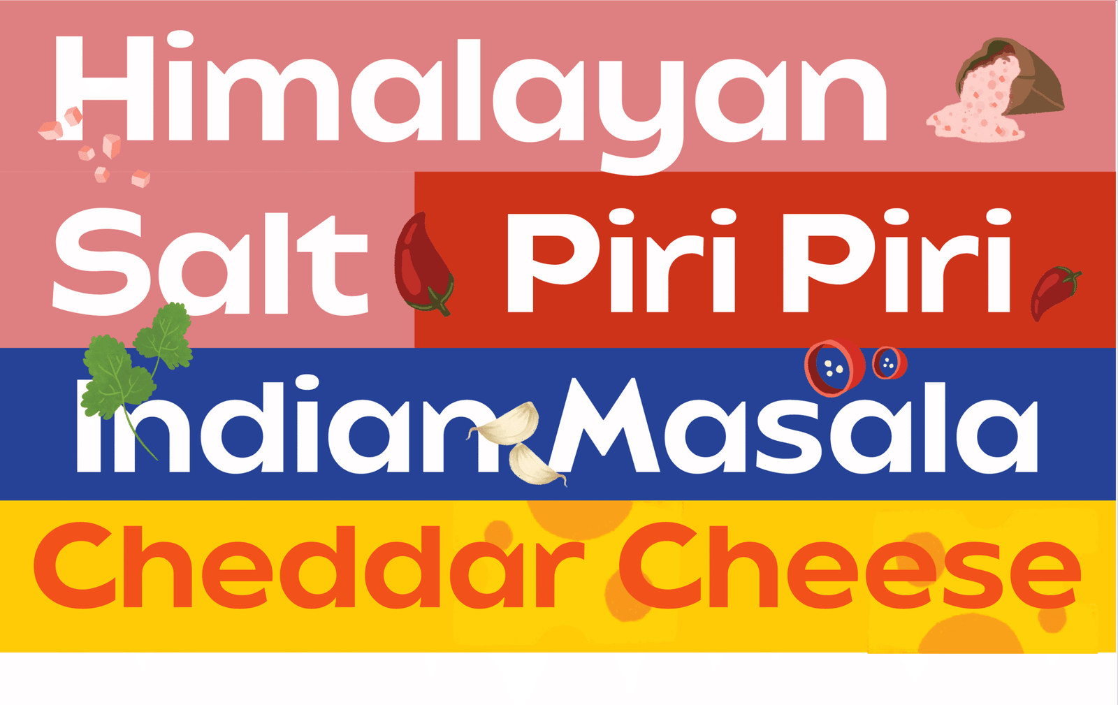
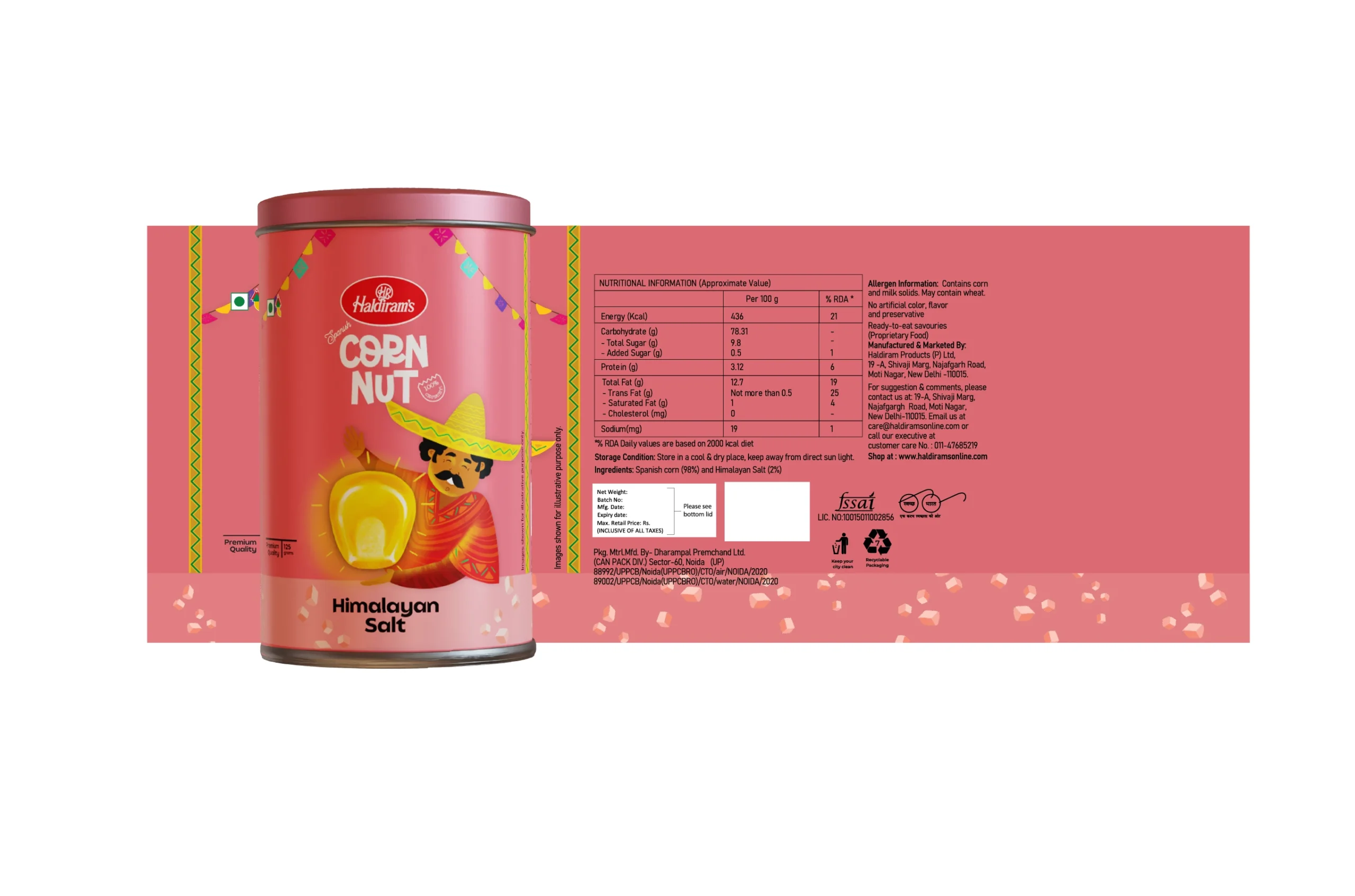
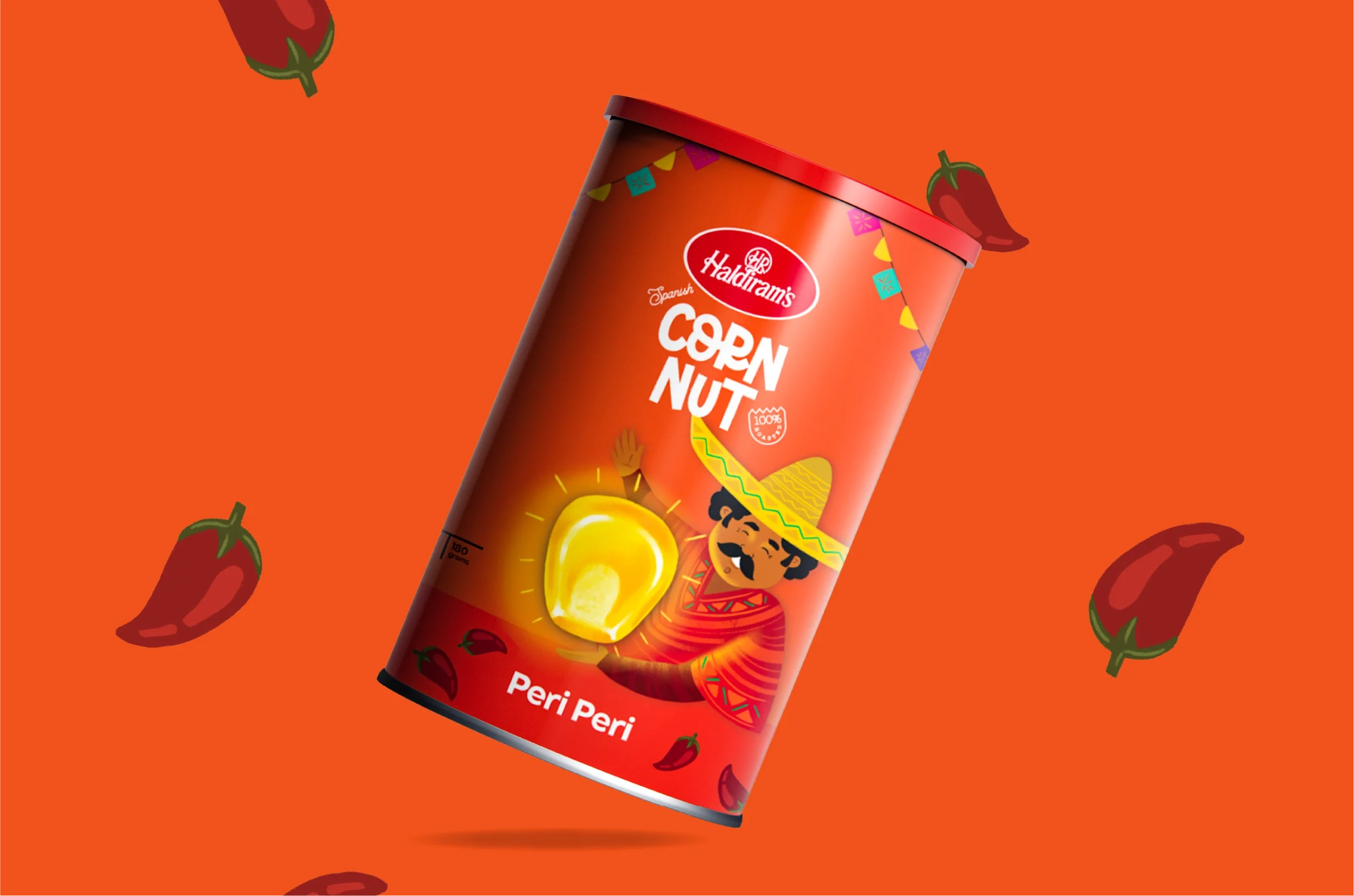
Not just another snack. A calculated disruption in the Haldiram dynasty. After eight decades of namkeen domination, Spanish Corn doesn't politely request shelf space—it demands visual allegiance. We engineered packaging that respects tradition while committing elegant insurrection against expectation. The iconic logo doesn't change; everything around it does.
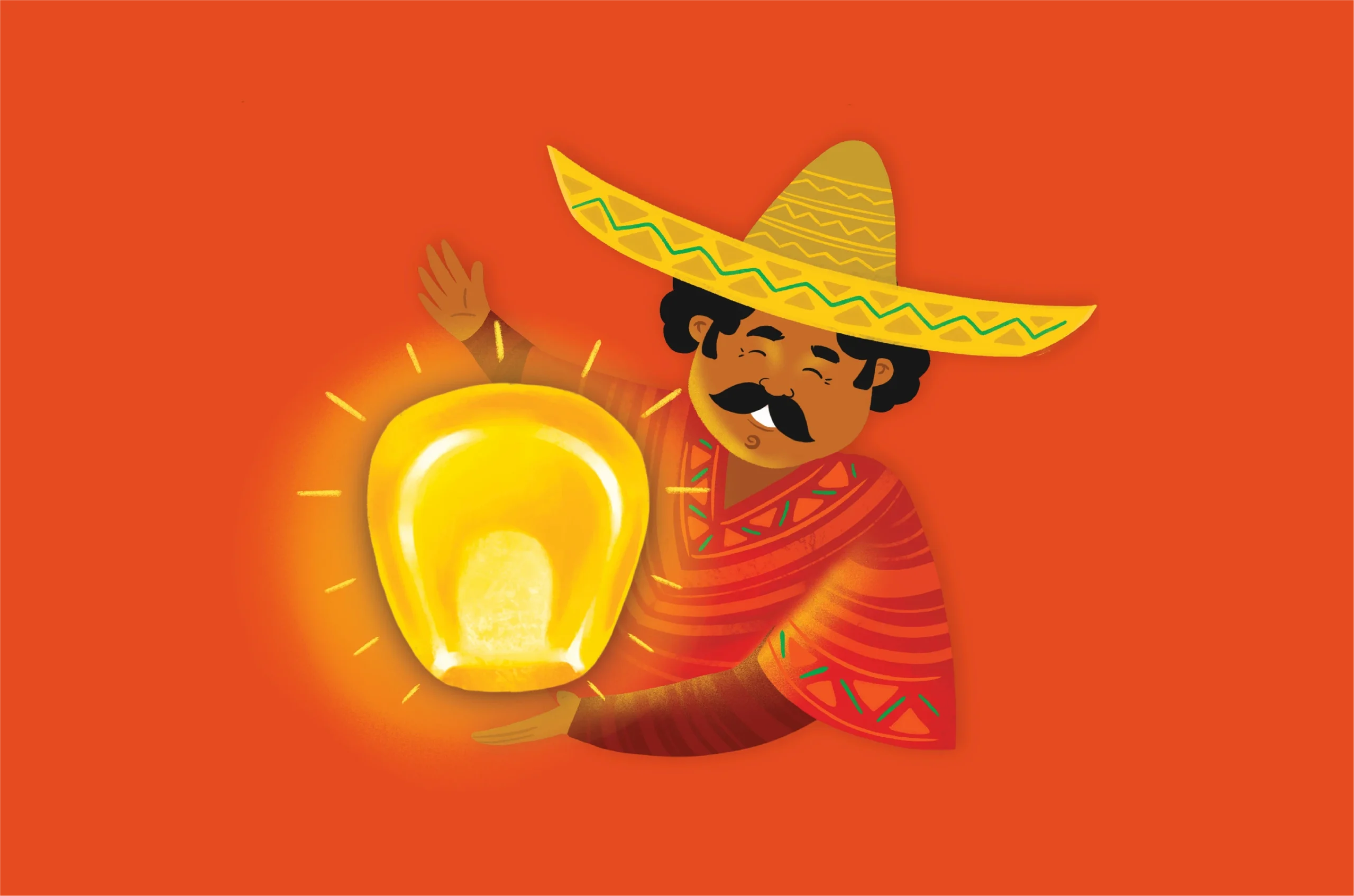
The Strategic Simplicity
The design isn't minimal—it's deliberately restrained. Vibrant colors for namkeens, subtle tones for sweets—not creative choices but tactical decisions in the war for visual attention. Each package calibrated to maximize impact without betraying the master brand. This isn't design; it's psychological warfare against competing snacks that rely on chaos to capture eyes.
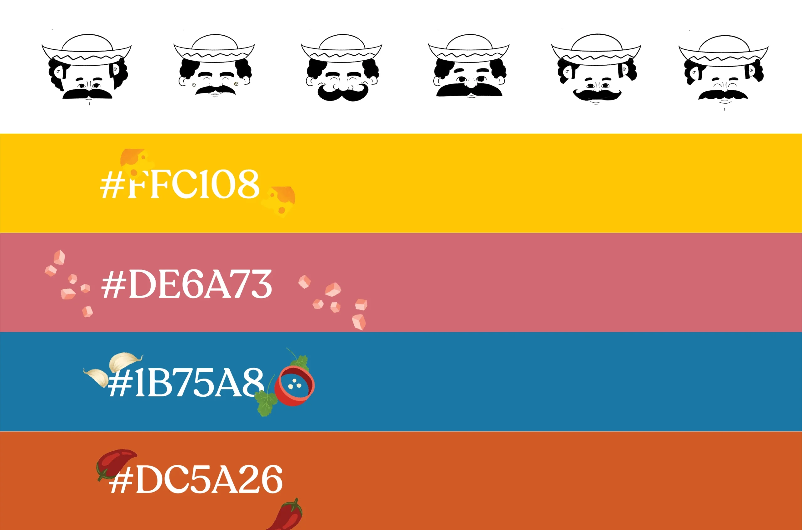
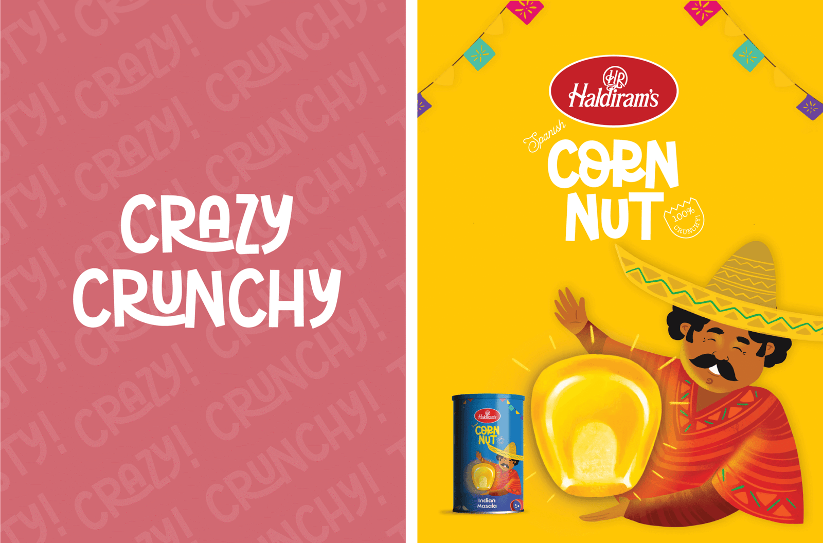
The Calculated Nostalgia
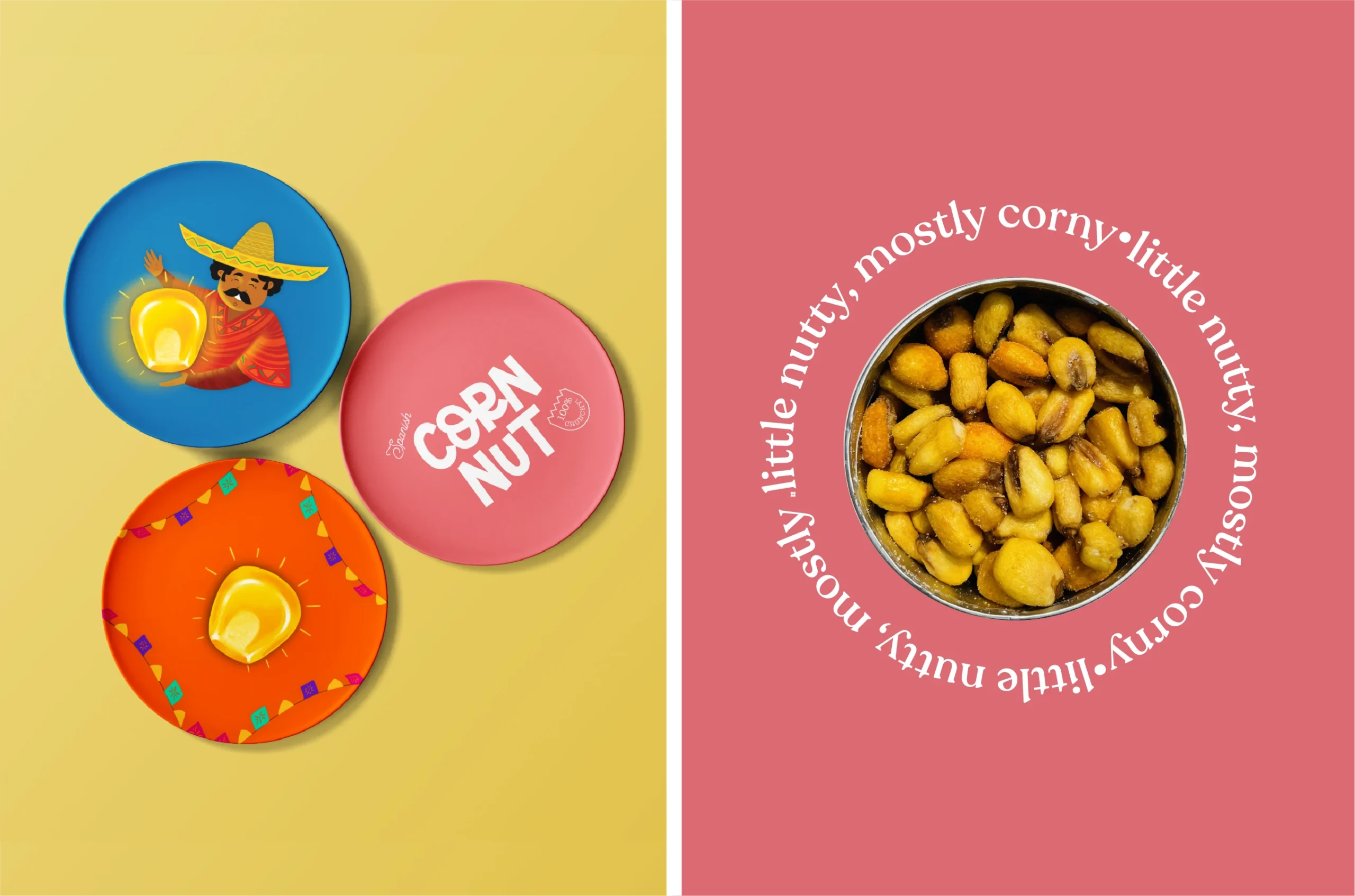
Every element serves dual masters—brand heritage and modern appetite. The packaging doesn't just contain corn; it contains eight decades of trust repackaged for contemporary cravings. Visual cues trigger memories you didn't know you had, while compositions nudge you toward purchases you haven't yet considered. Each bag a perfect contradiction—comfortingly familiar yet intriguingly different.
Services
Company
Socials
Services
Company
Socials
© The Neat Trick 2026
<Made extra neat, so it's not that tricky>
Terms & Conditions
