
Kapsons
Services
Rebranding | Packaging Design
In-store Design
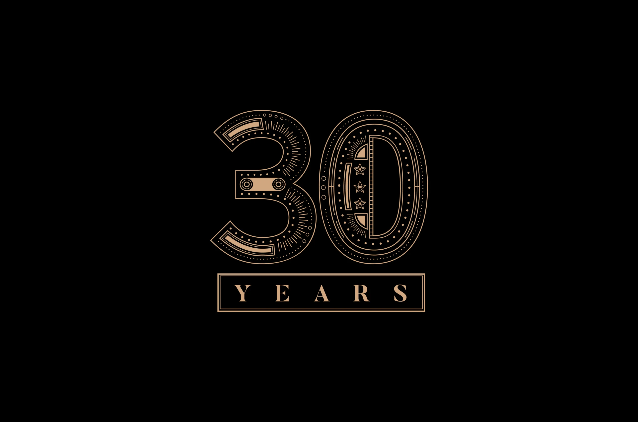
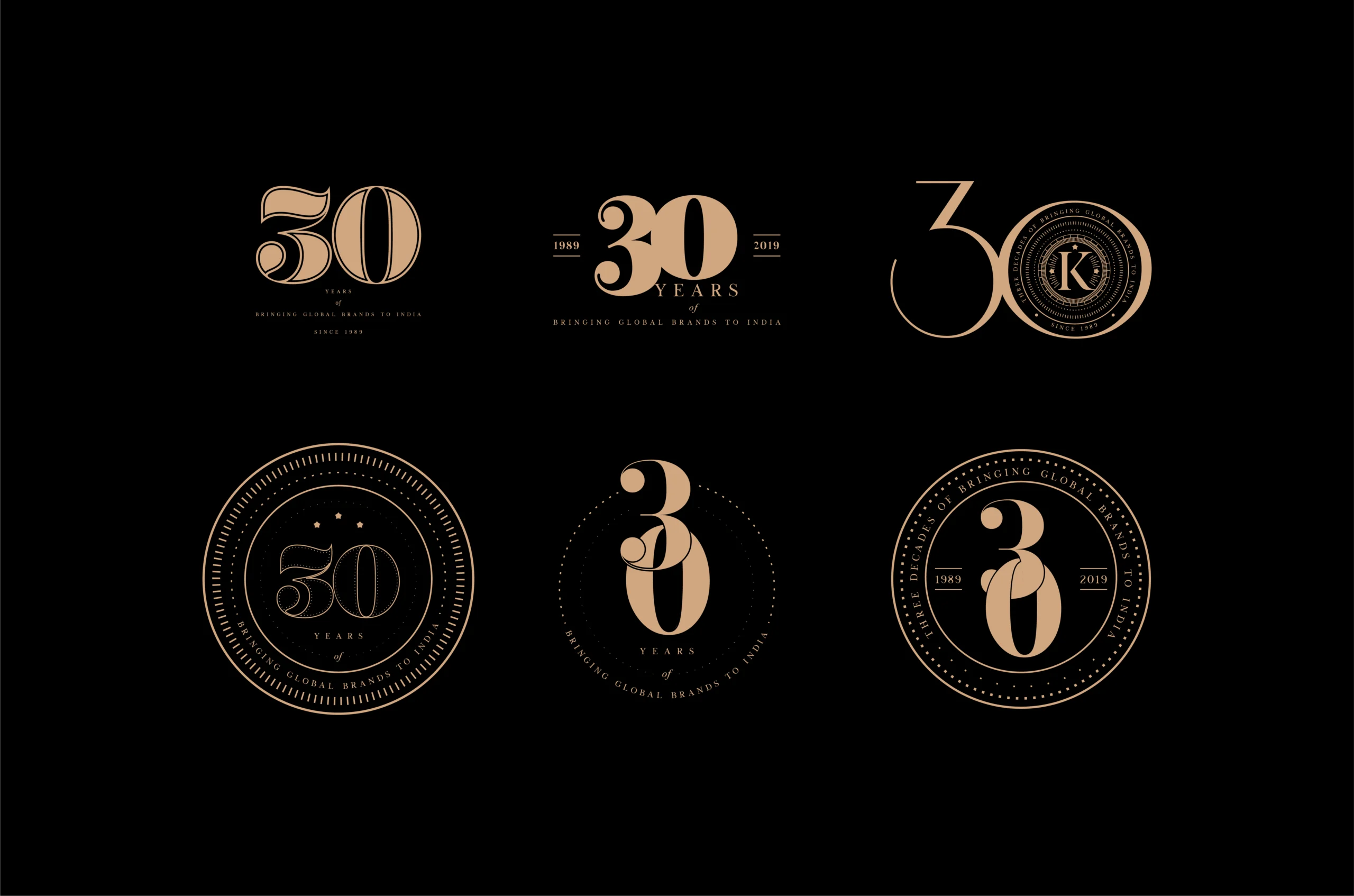
For over three decades, Kapsons has been a trusted name in North India’s fashion landscape—bringing global and homegrown labels together under one roof. Marking 30 years of retail excellence, the brand sought a renewed identity that would honour its legacy while connecting with a new generation of shoppers.
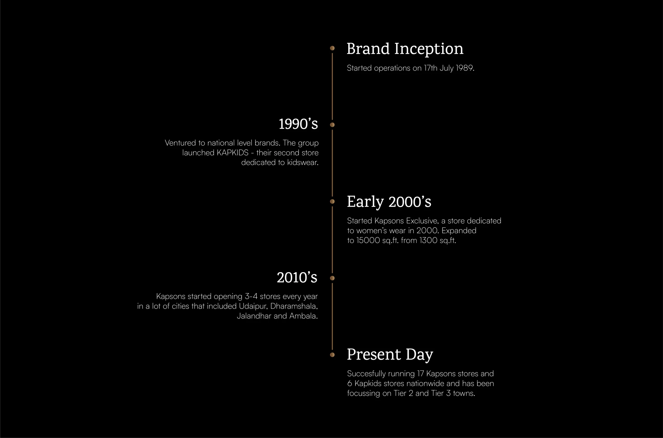
The idea behind designing Kapsons Logo
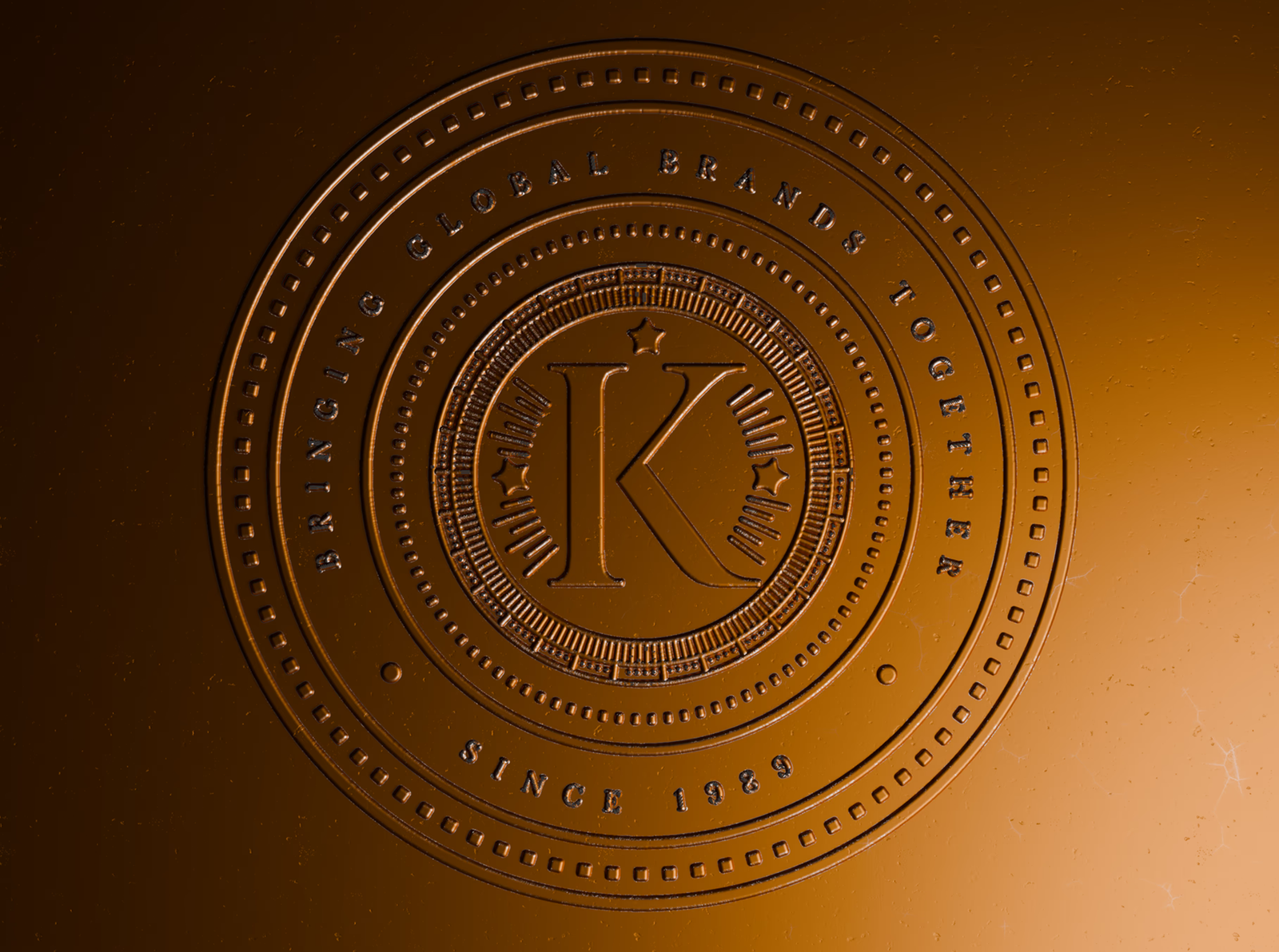
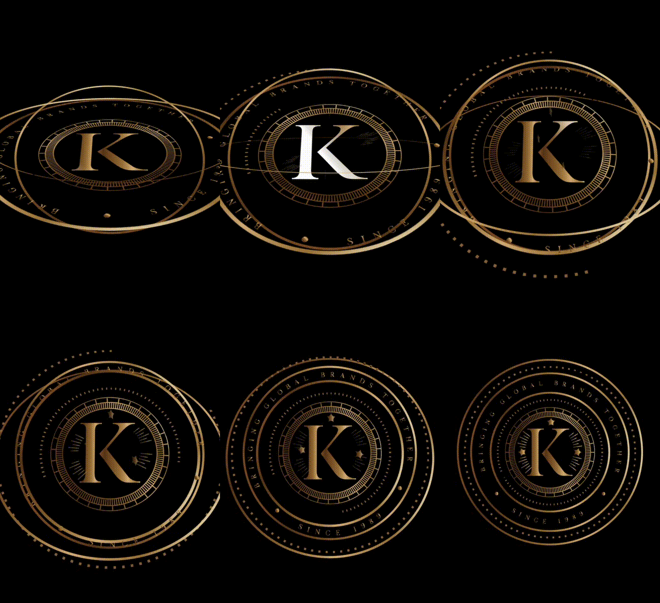
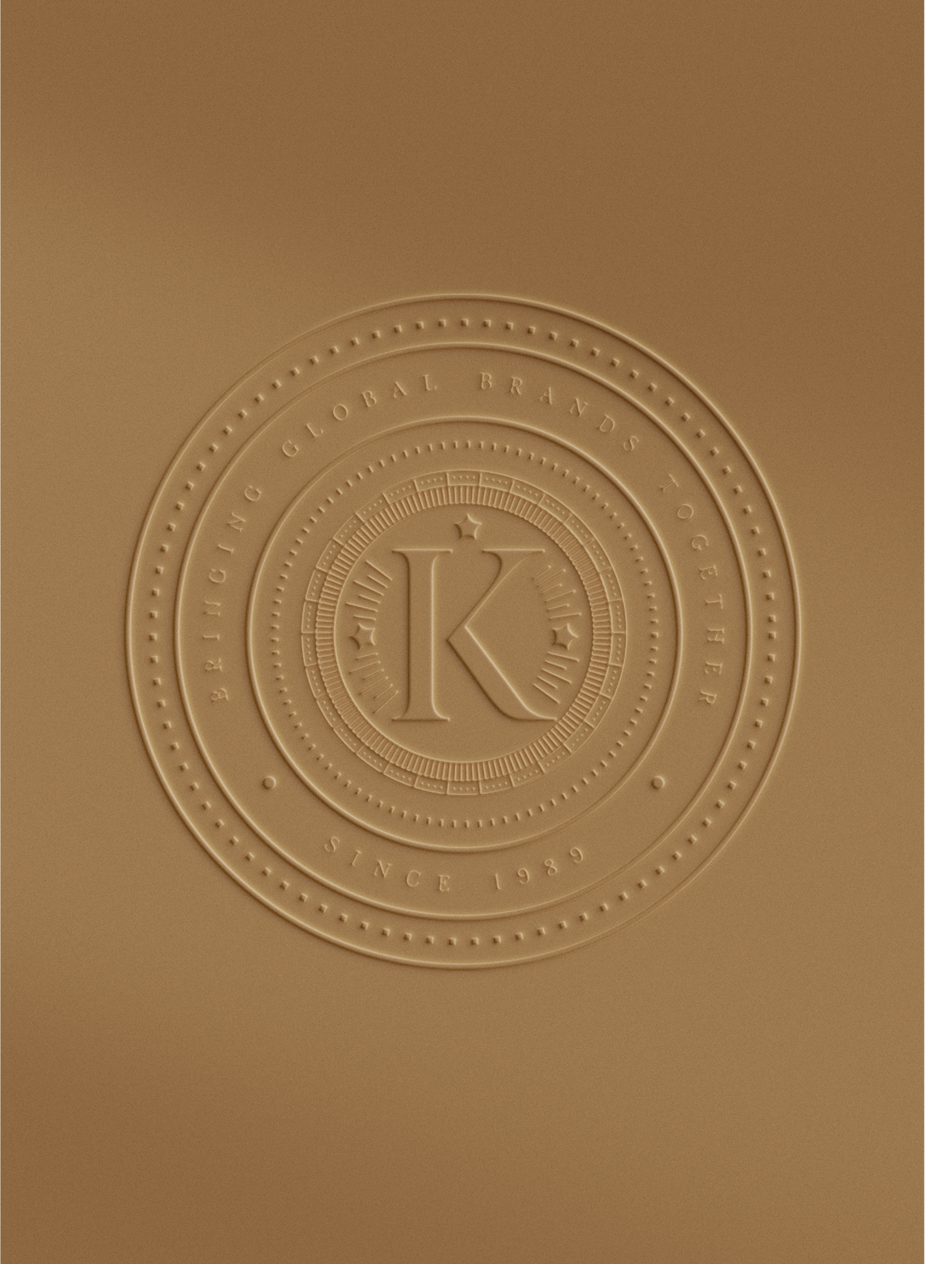
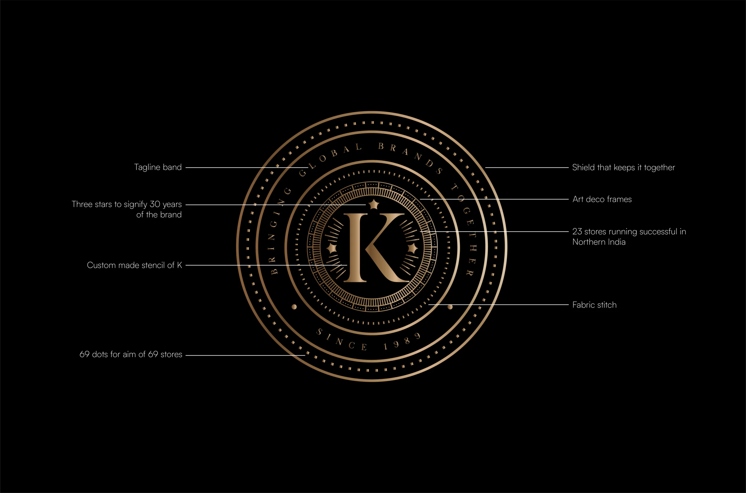
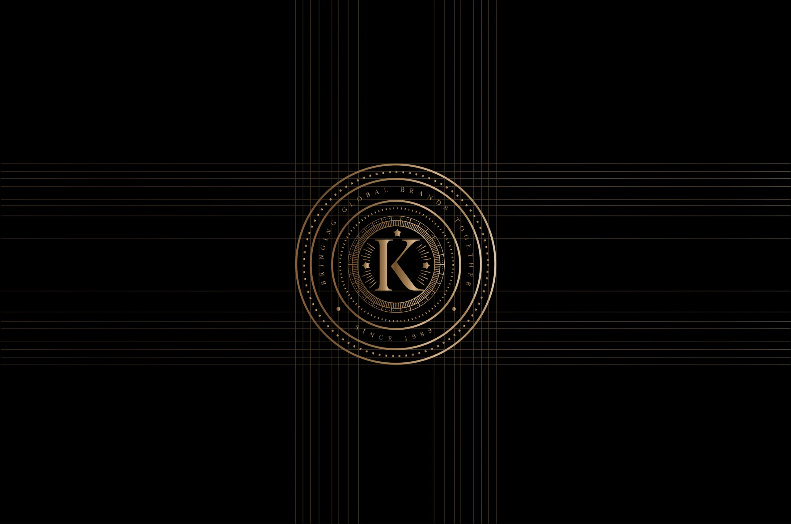
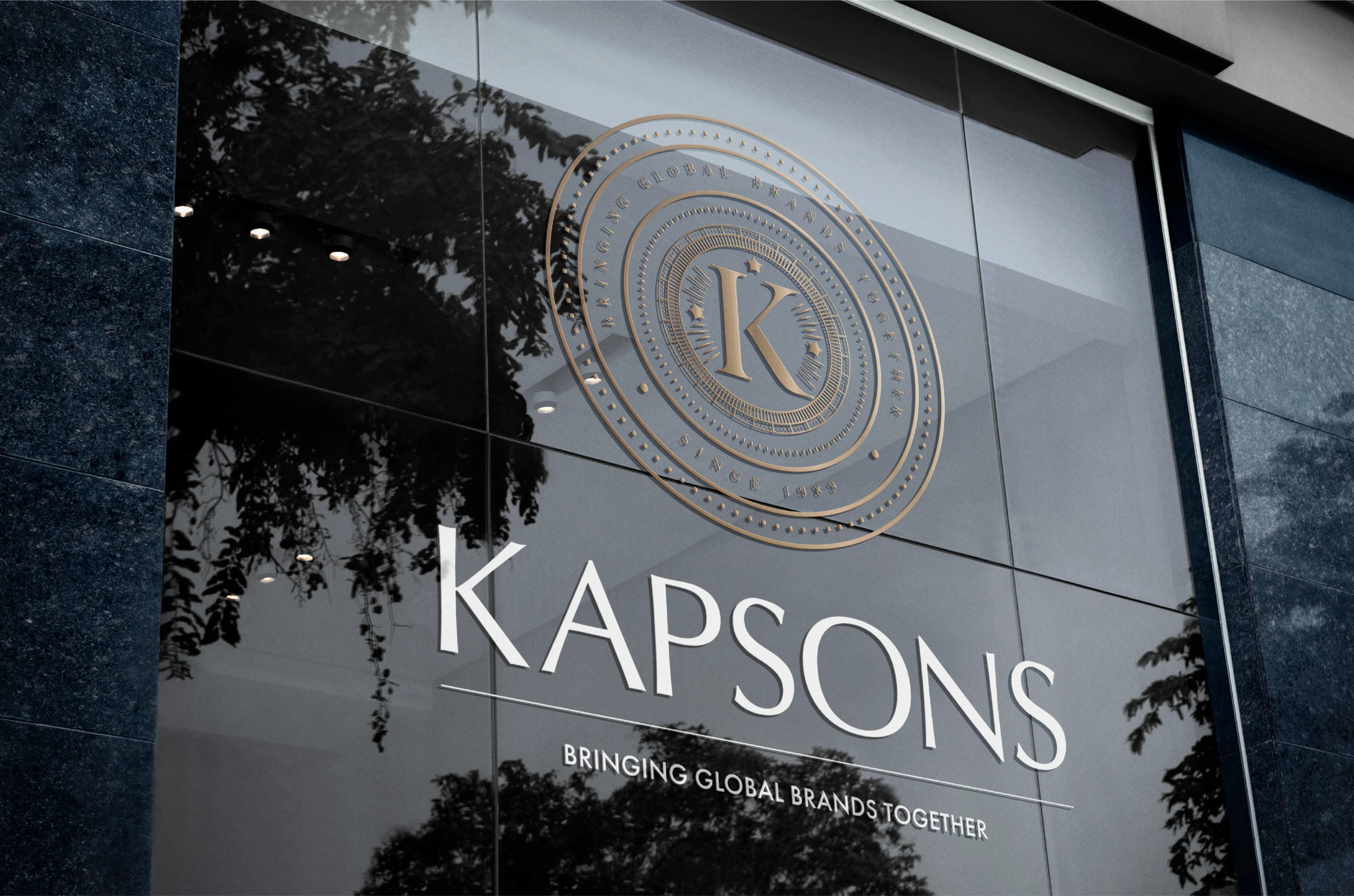
The primary logo is a character-laden crest as a whole; a modern take on the vintage shield. The new Kapsons crest reinterprets the timeless shield—symbolising heritage, quality, and pride—through a modern lens. The detailing within the logo also stands as testament to the brands years of experience in the industry.
The design balances old-world charm with contemporary minimalism, reflecting Kapsons’ evolution from a local retailer to a style curator. Beyond the logo, our focus lay in refining the brand’s tone, communication, and experience—building a visual language that feels both familiar and forward-looking.
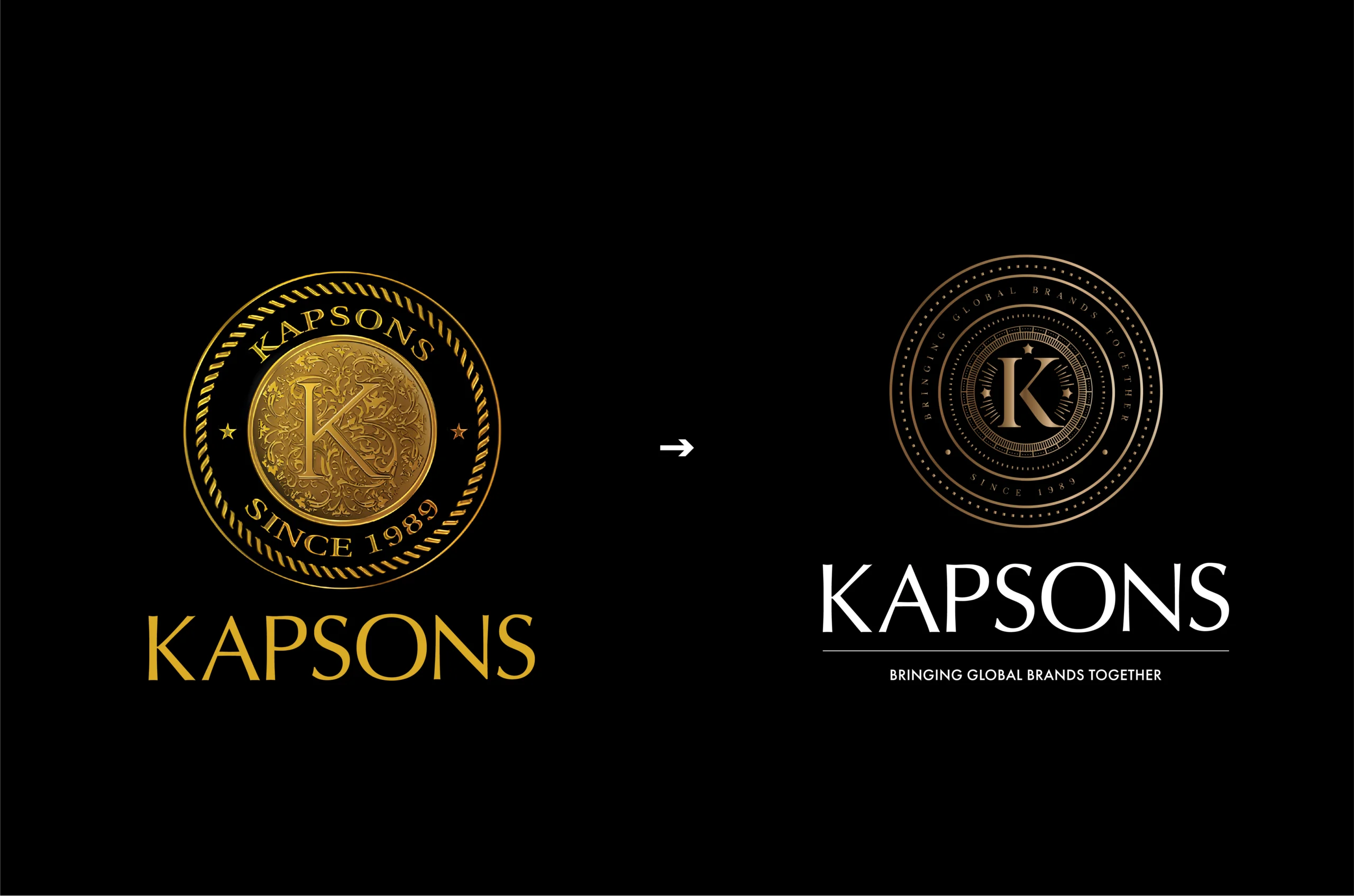
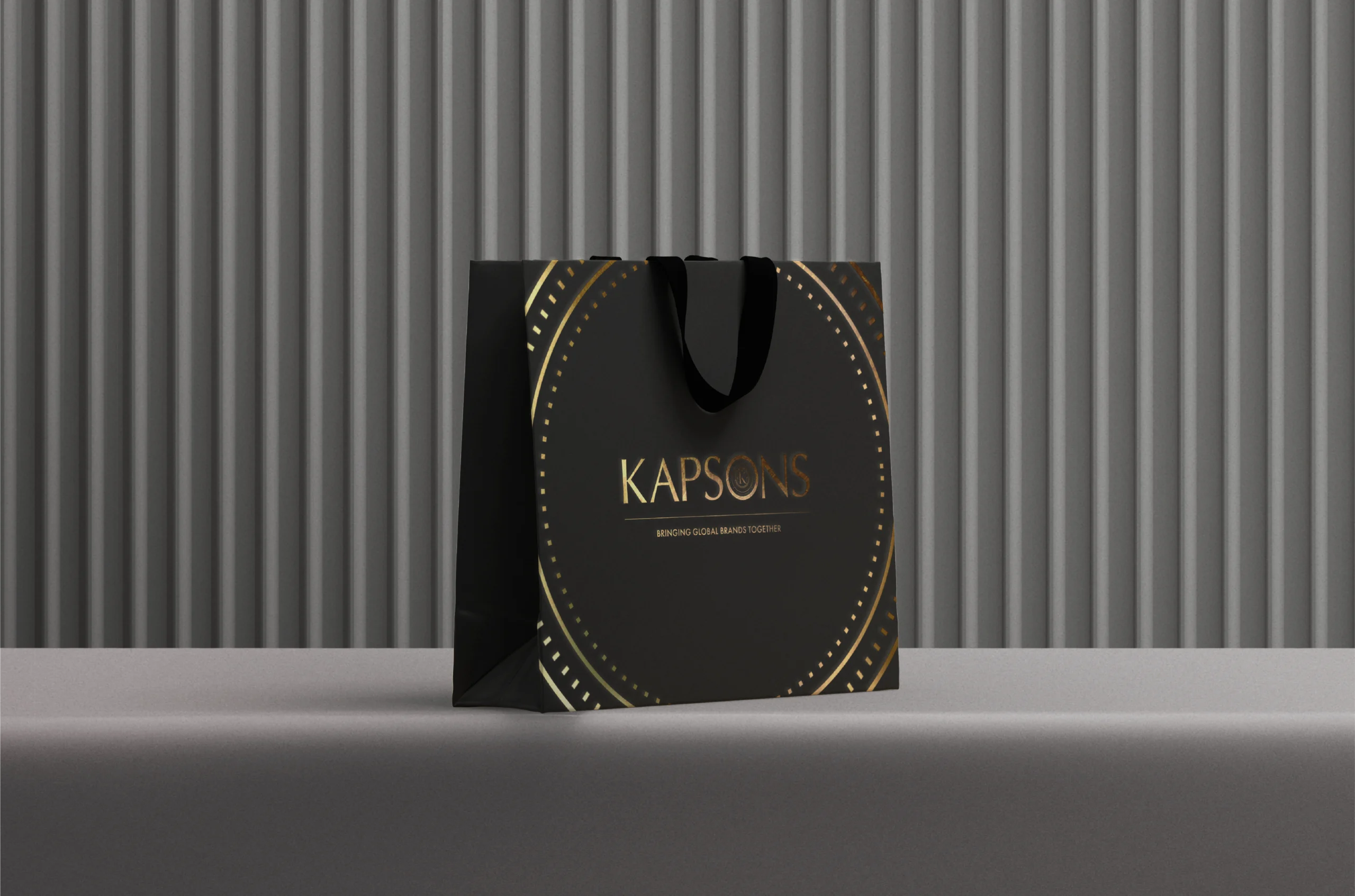
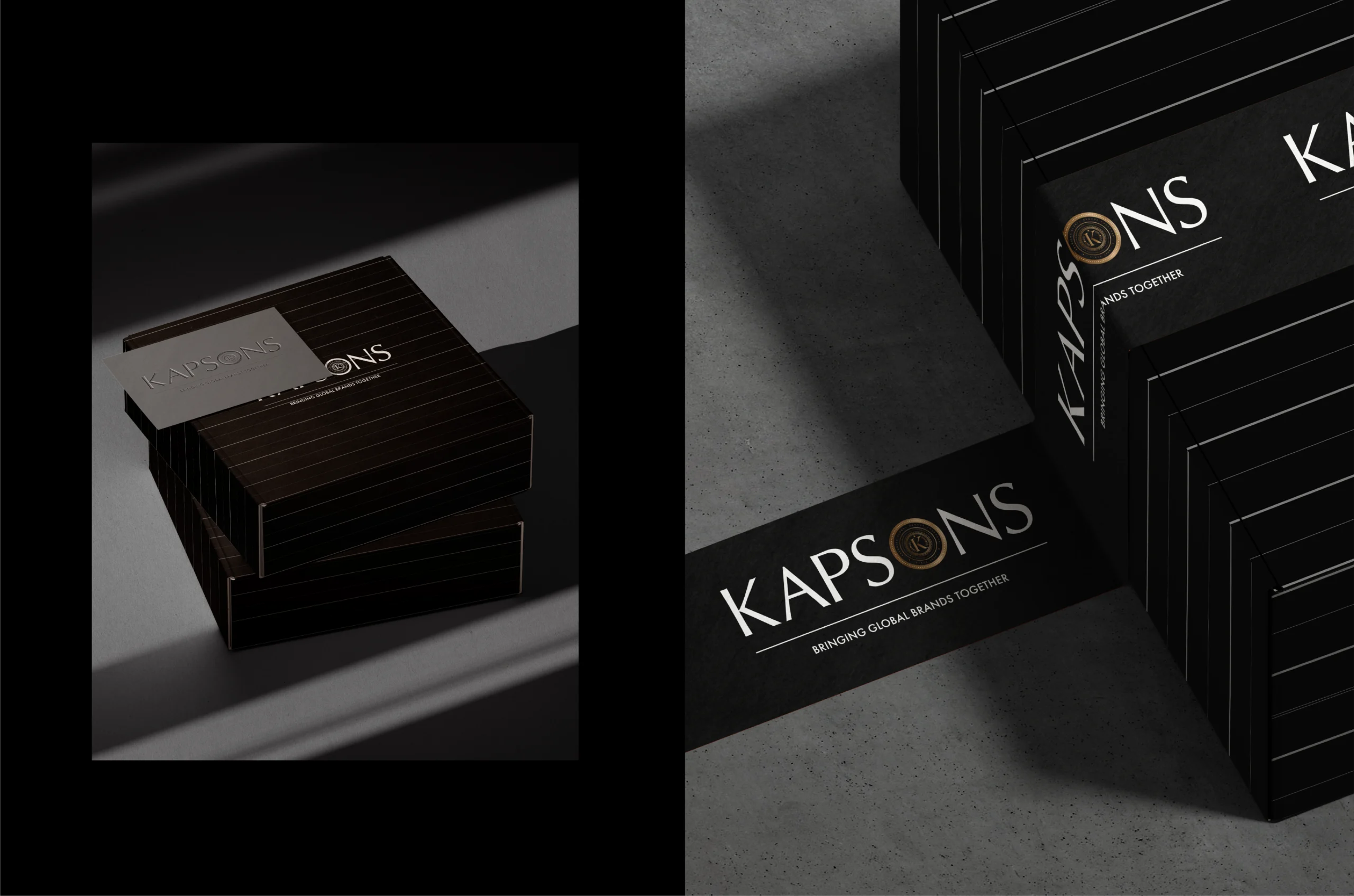
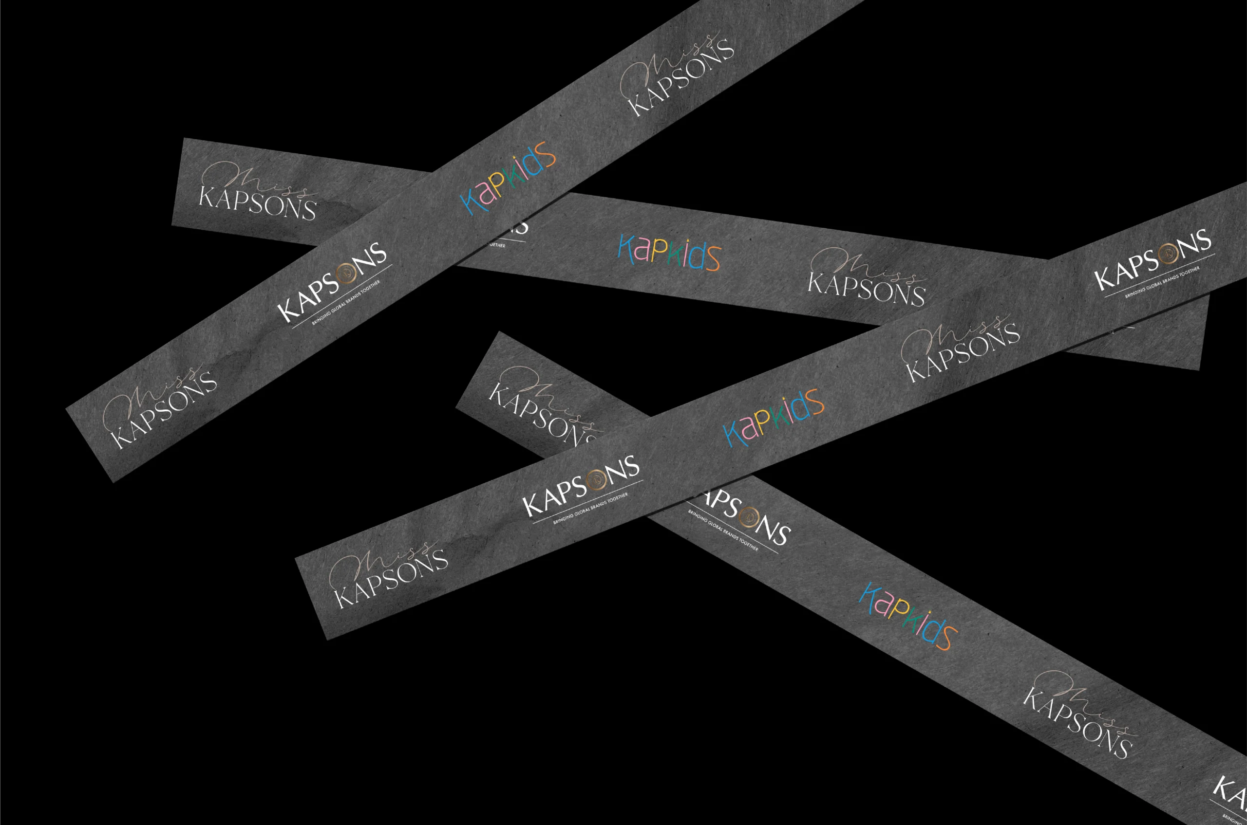
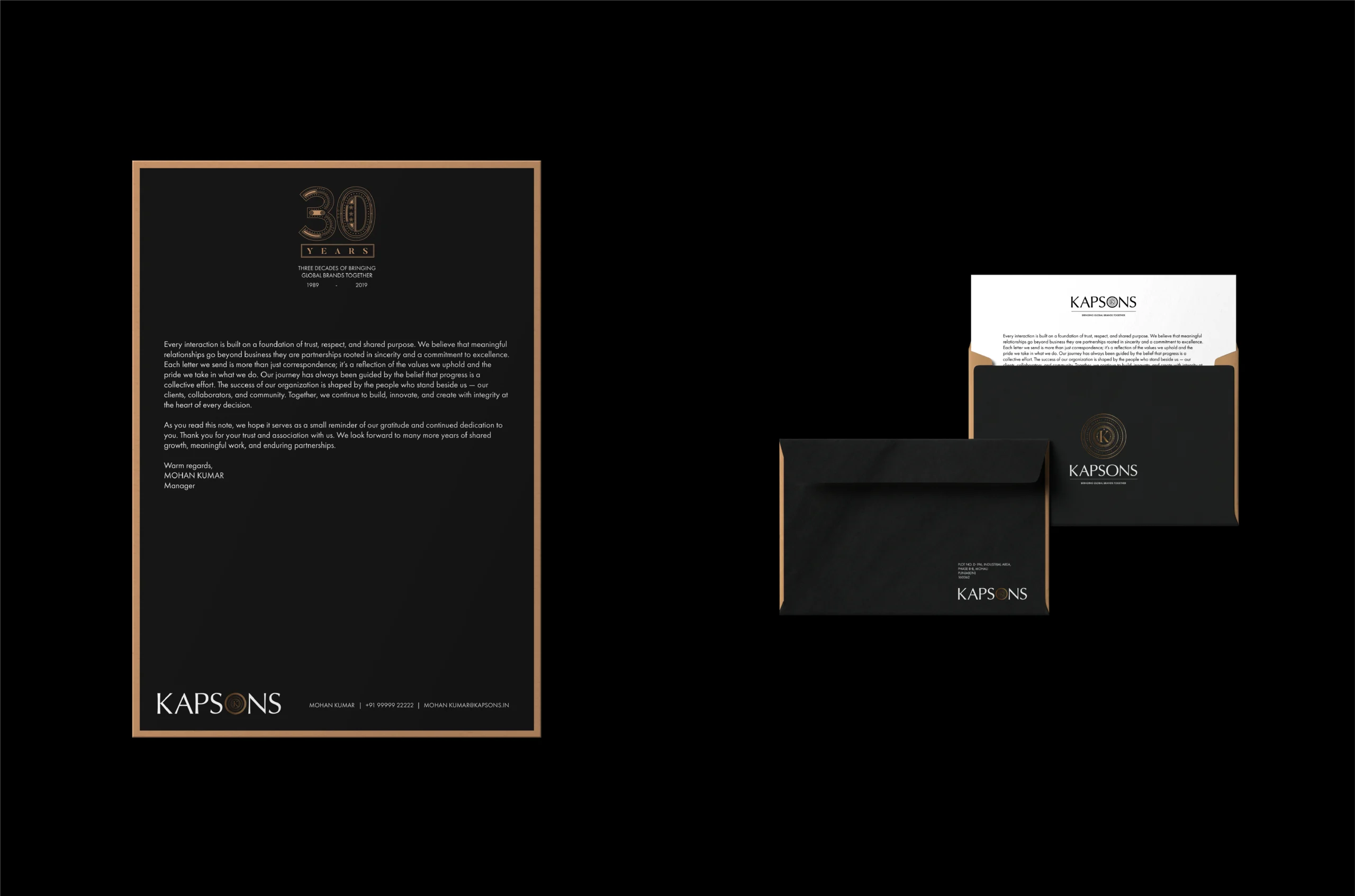
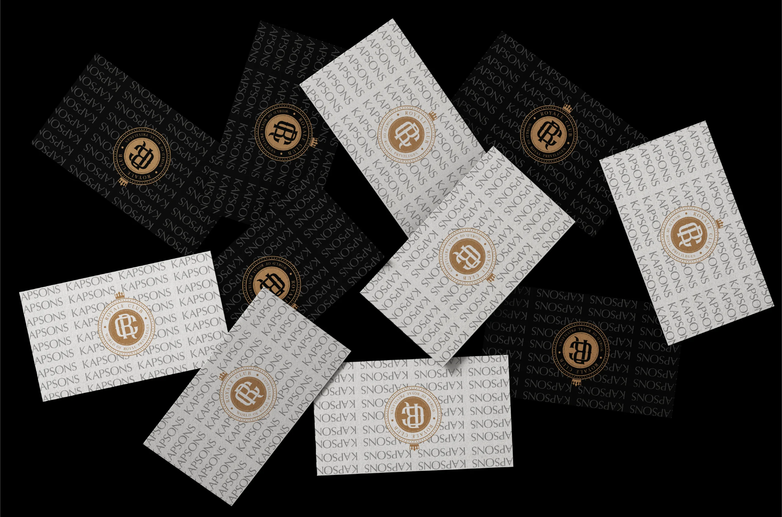
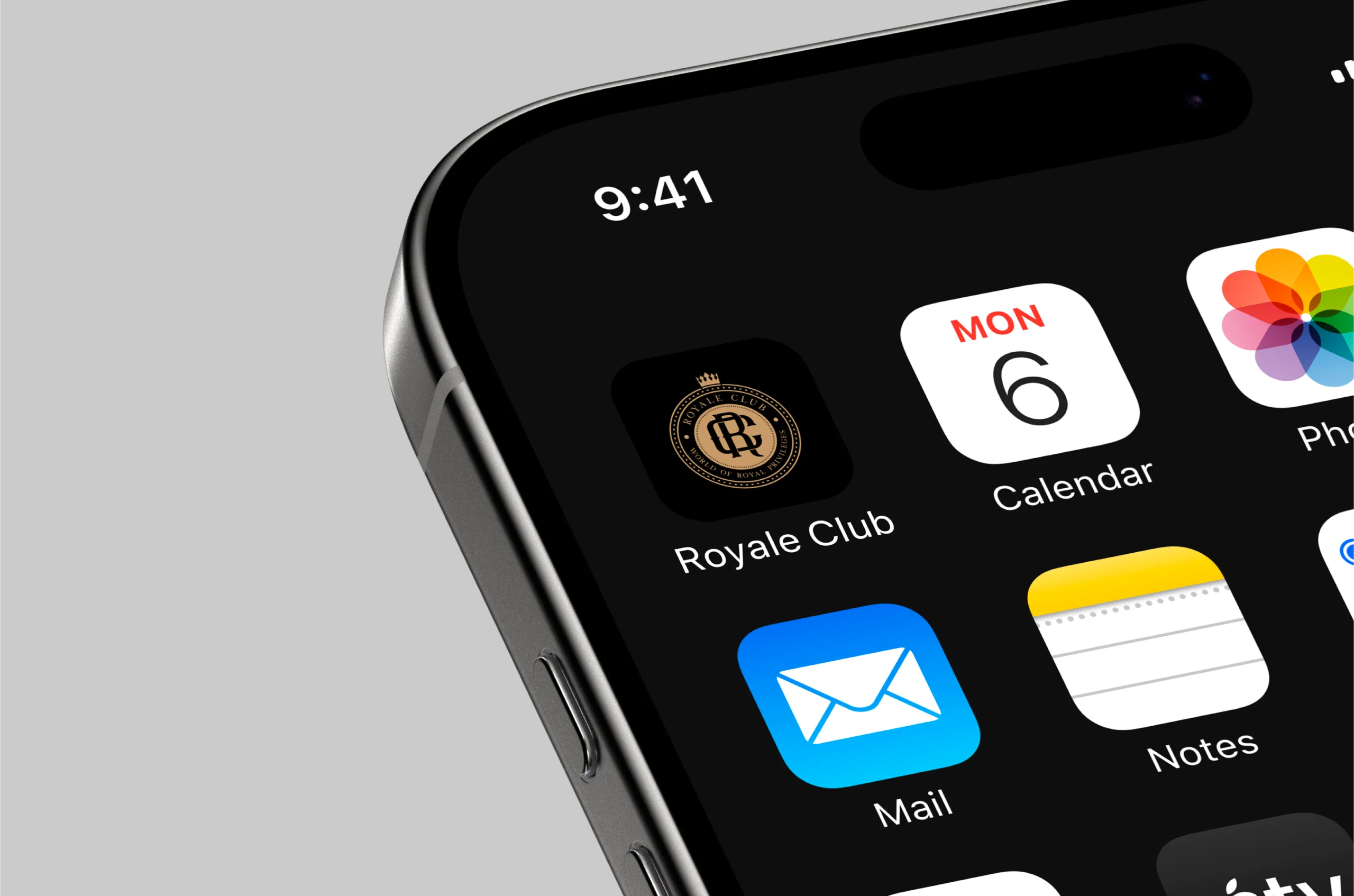
The identity was extended across packaging, in-store design, digital platforms, and membership programs, creating a cohesive ecosystem. Each touchpoint carries the spirit of the crest—structured, confident, and distinctly Kapsons.
From collectible packaging to a seamless app experience, the revamp turned every brand interaction into a reflection of modern retail sophistication.
Services
Company
Socials
Services
Company
Socials
© The Neat Trick 2026
<Made extra neat, so it's not that tricky>
Terms & Conditions
