
Ba Ba Reeba
Services
Visual Identity | Packaging
F&B
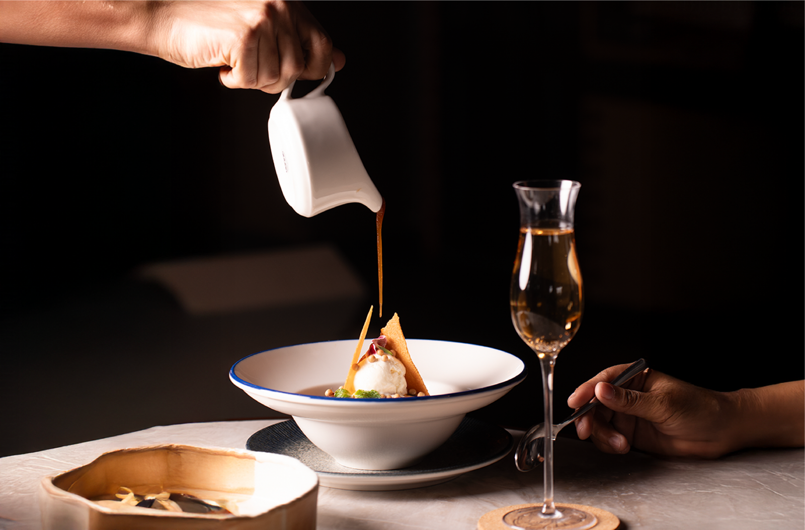
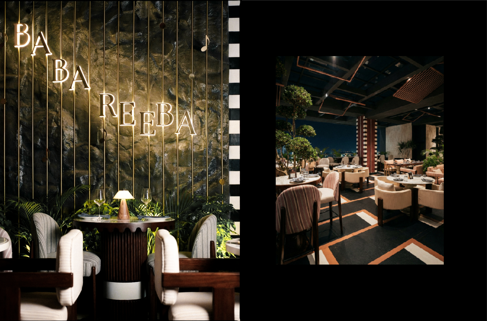
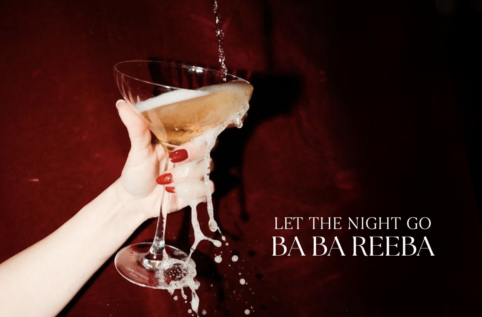
Ba Ba Reeba, Pune is imagined not just as a bar, but as an experience that mirrors the feeling of music. The name itself evokes joy and spontaneity, setting the tone for a space rooted in togetherness and rhythm. At its core, the concept draws from the idea that, like musical notes, individual elements gain meaning when they come together in harmony. This philosophy shapes the entire identity of the space, making it feel immersive, expressive, and alive.
Intent &
Concept
The design process began with a central idea: what if the brand functioned like a song? This led to a highly conceptual approach where every decision was intentional and rooted in meaning rather than decoration. Instead of merely styling the space, it was carefully orchestrated, with each element contributing to a larger composition, allowing the environment to flow seamlessly like a melody while maintaining strong cohesion, rhythm, and clarity of intent.
Branding & Composition
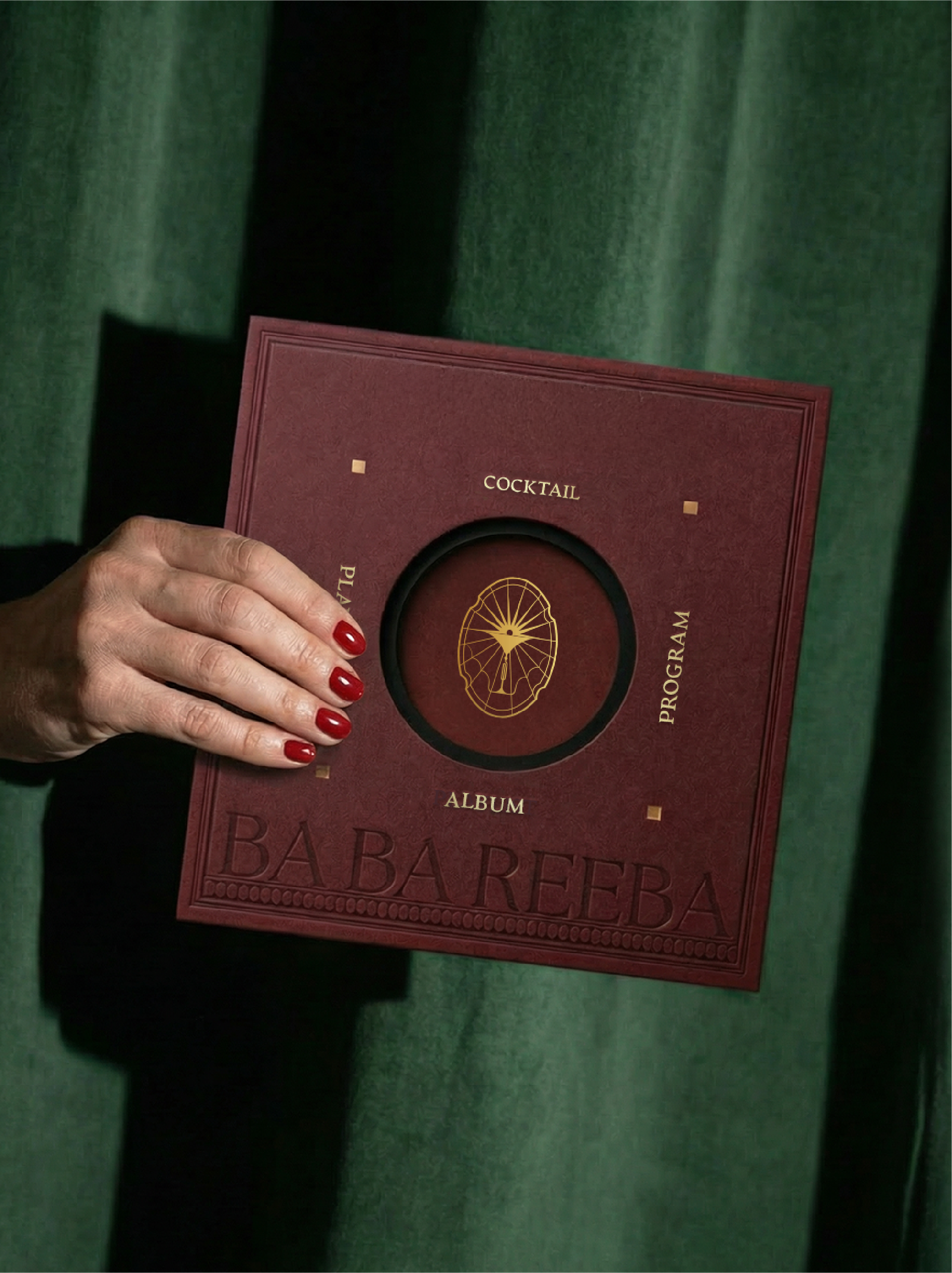
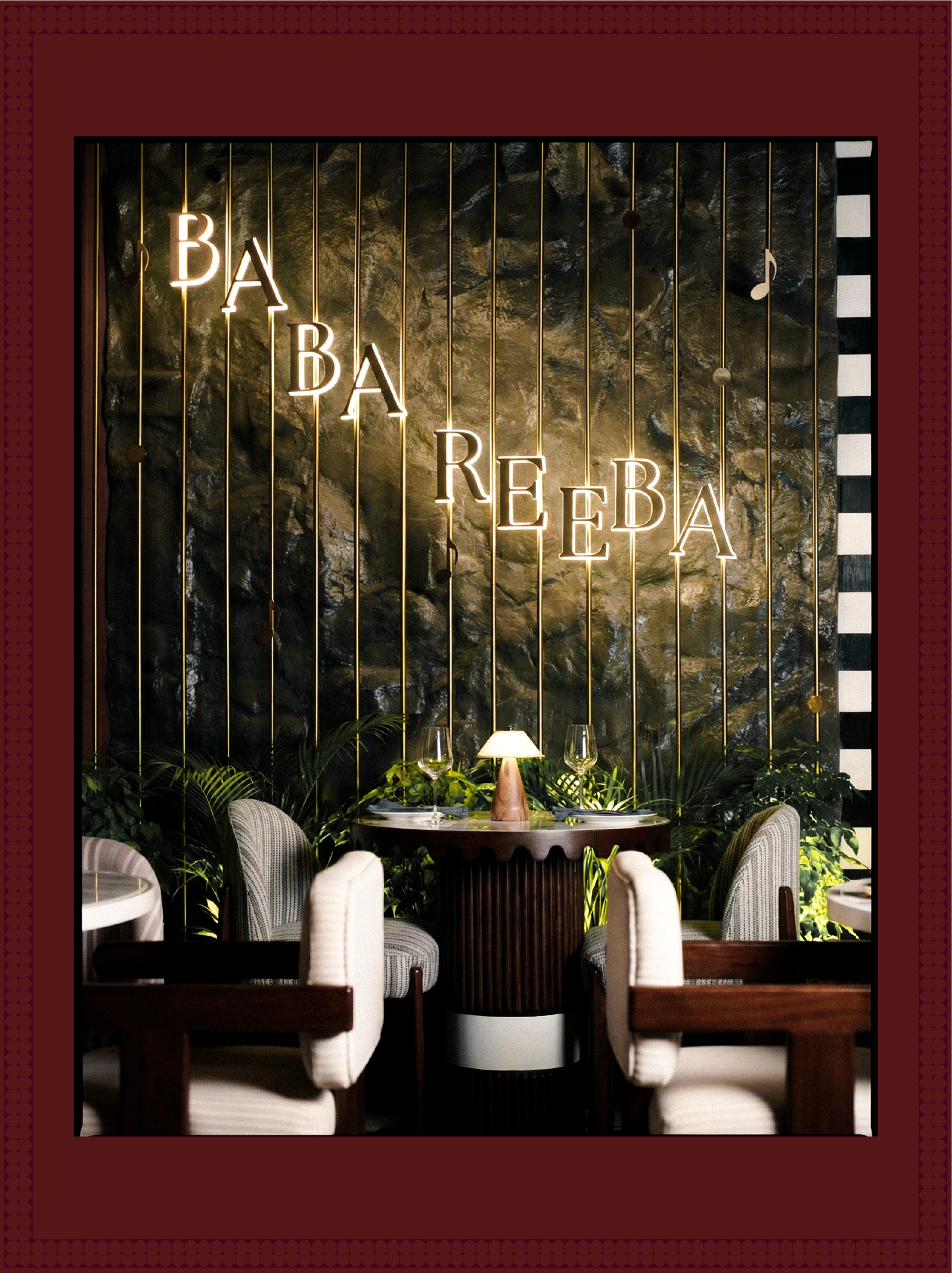
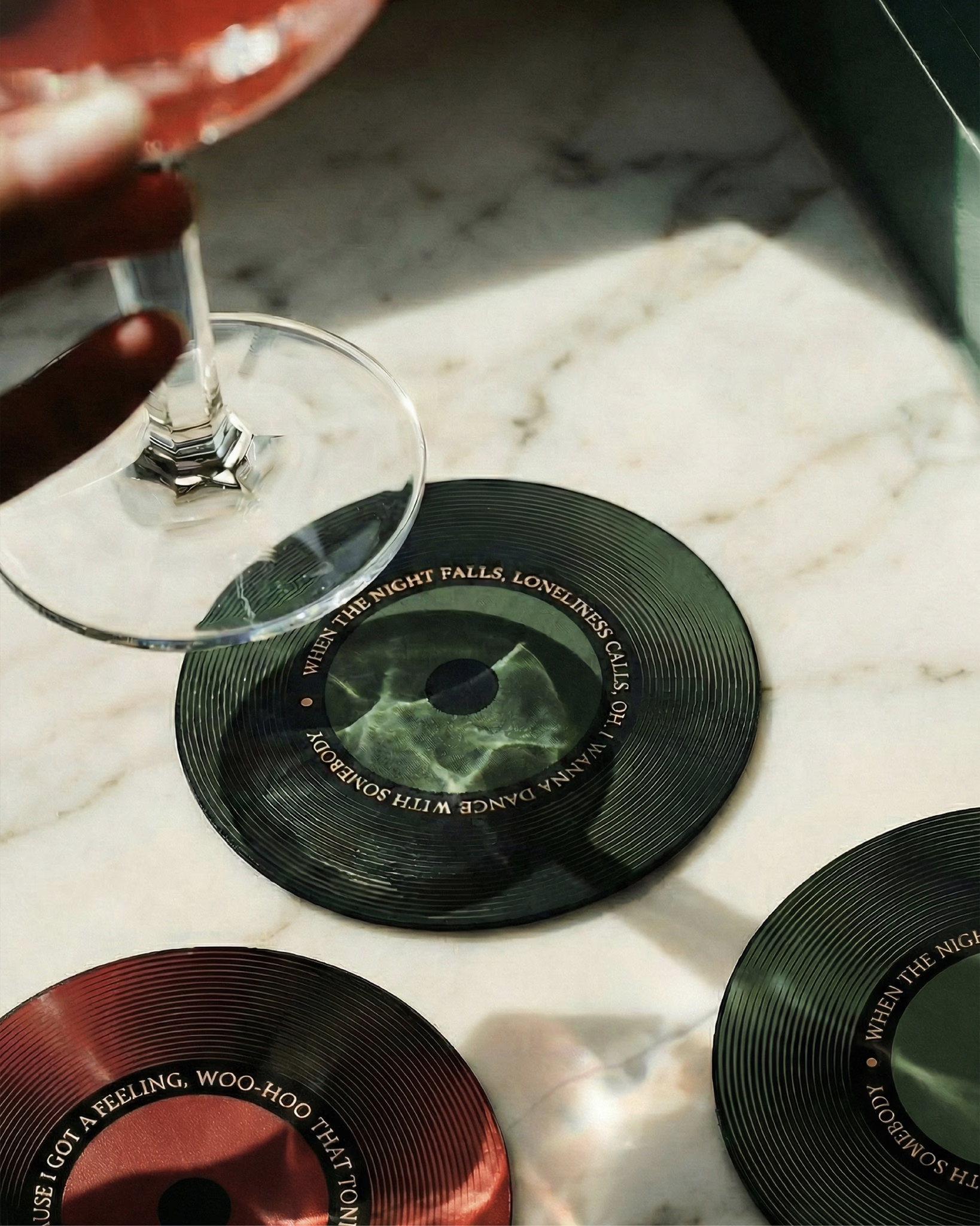
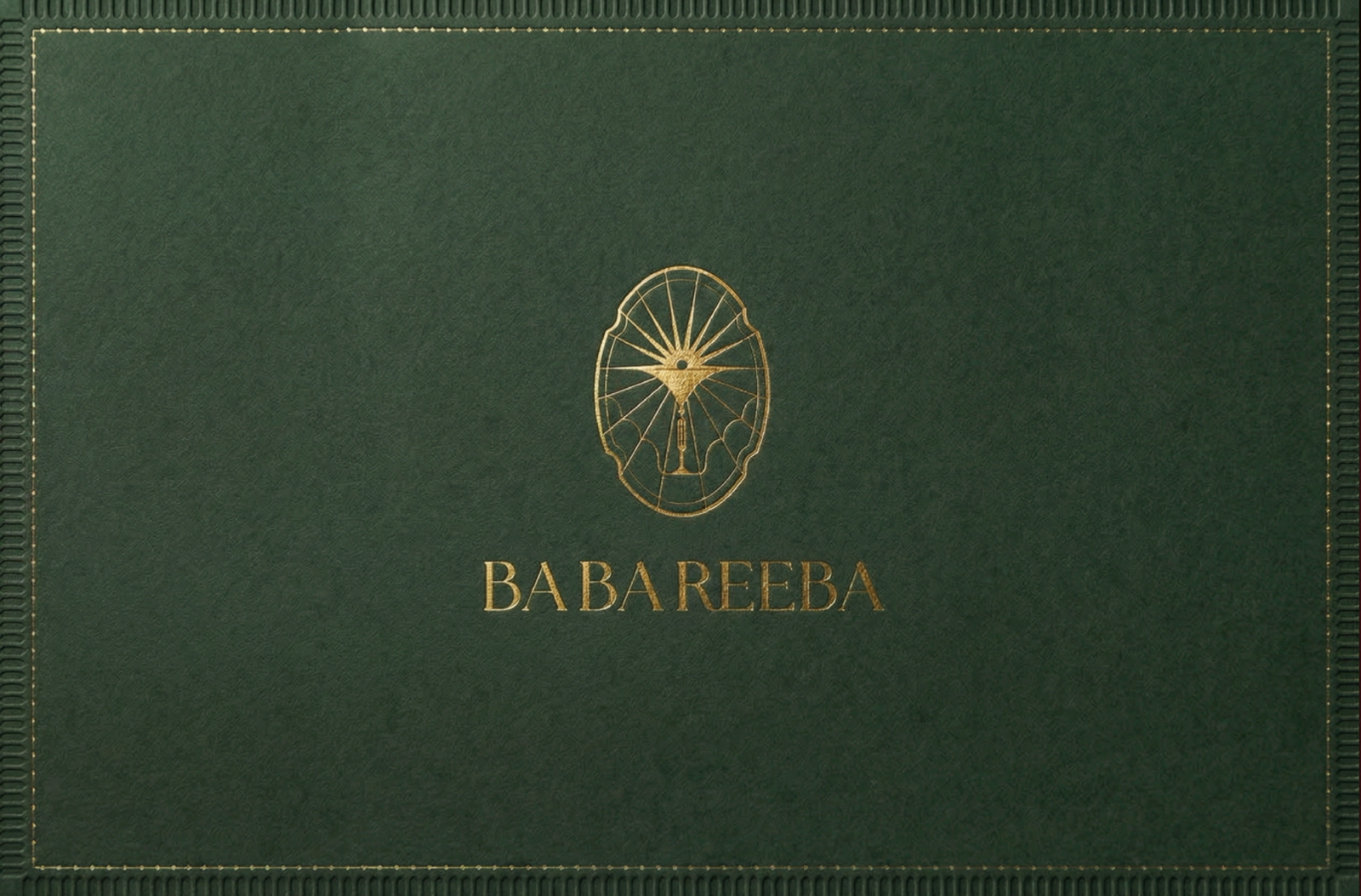
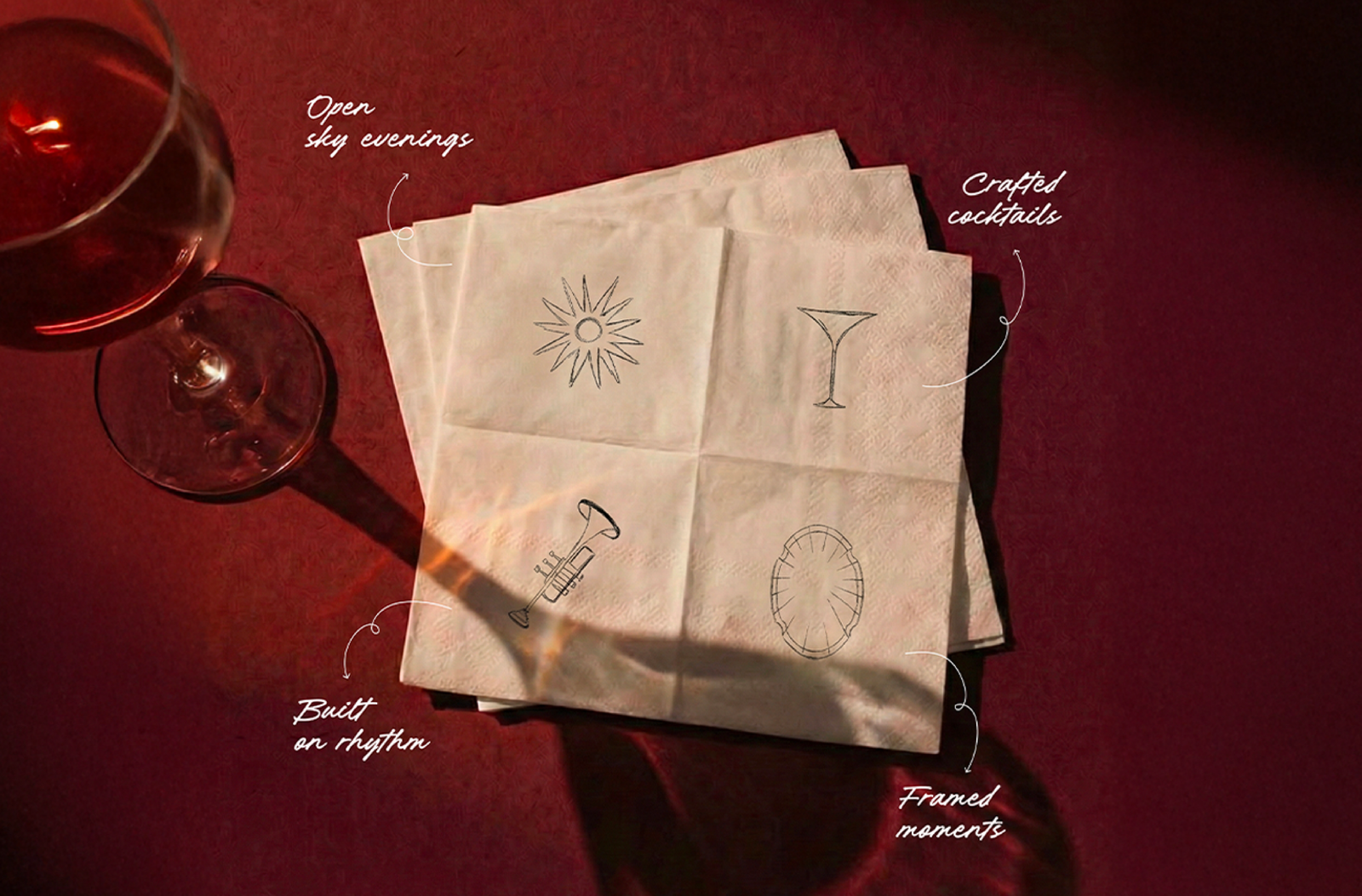
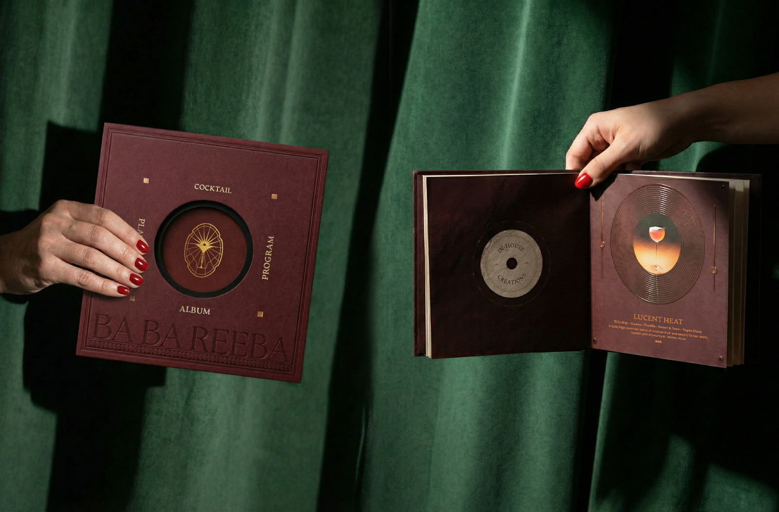
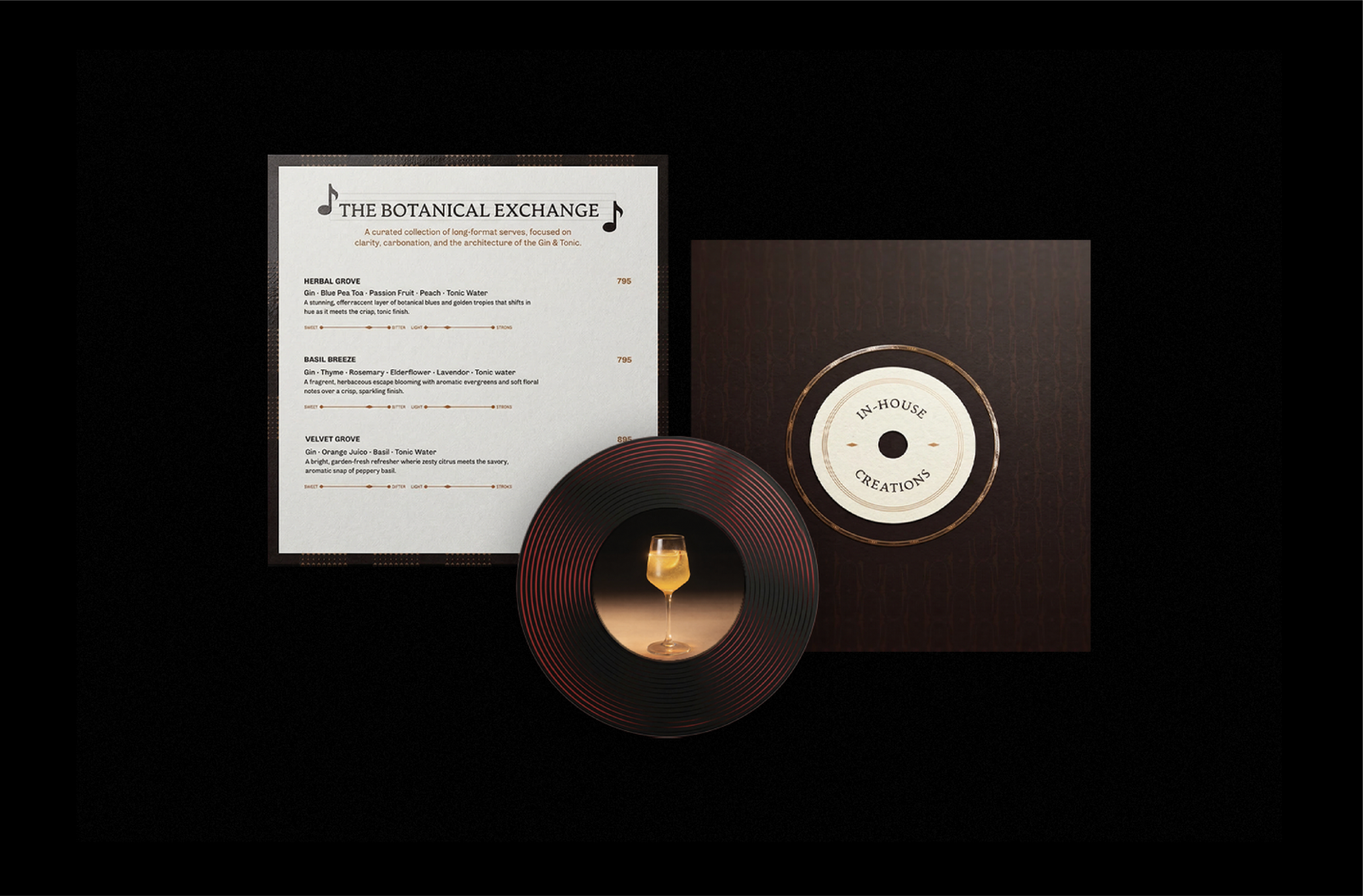
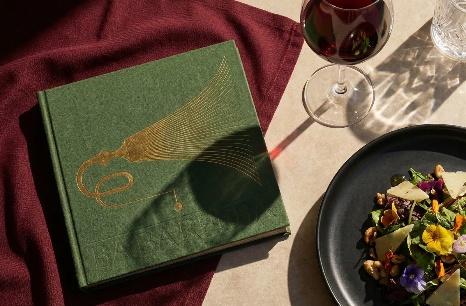
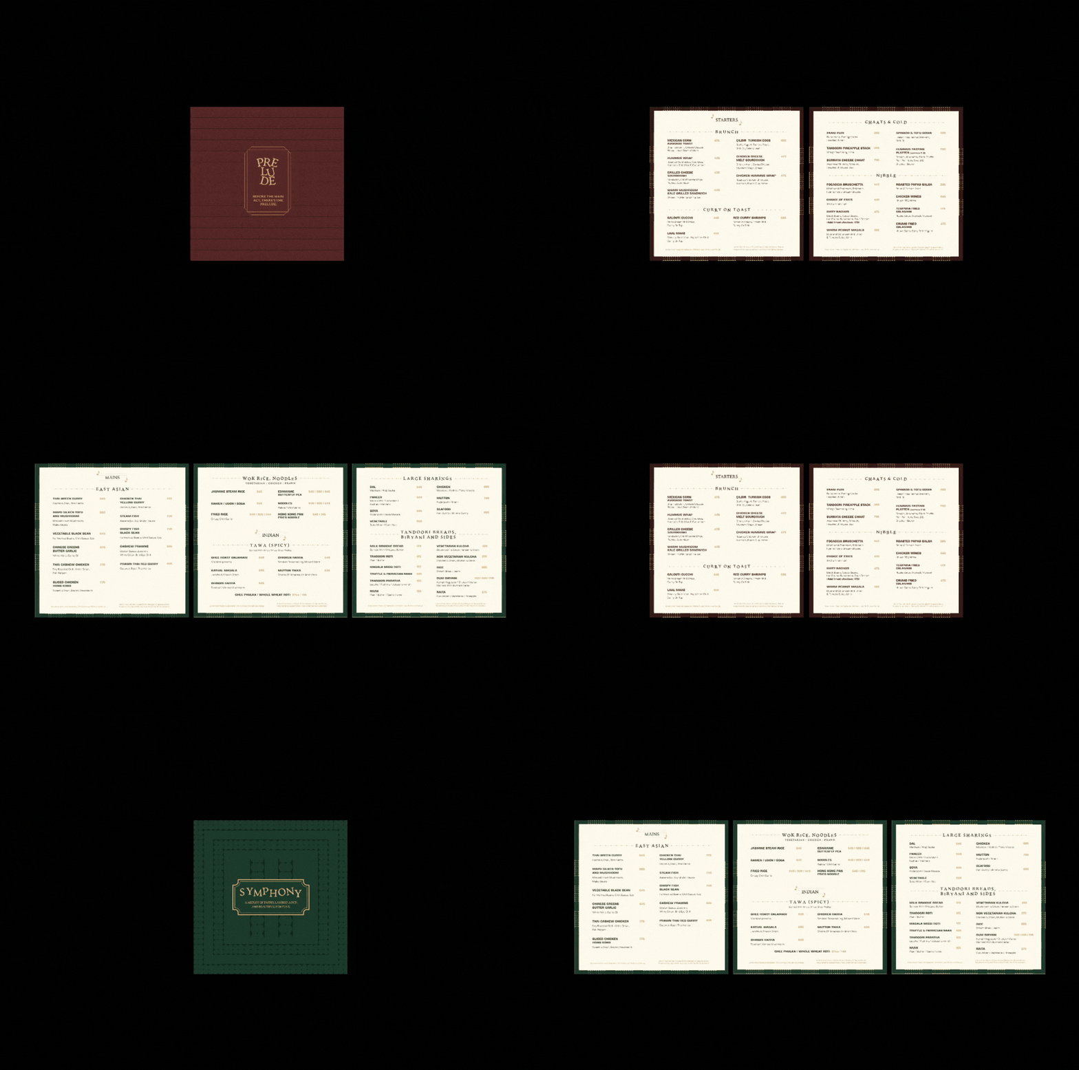
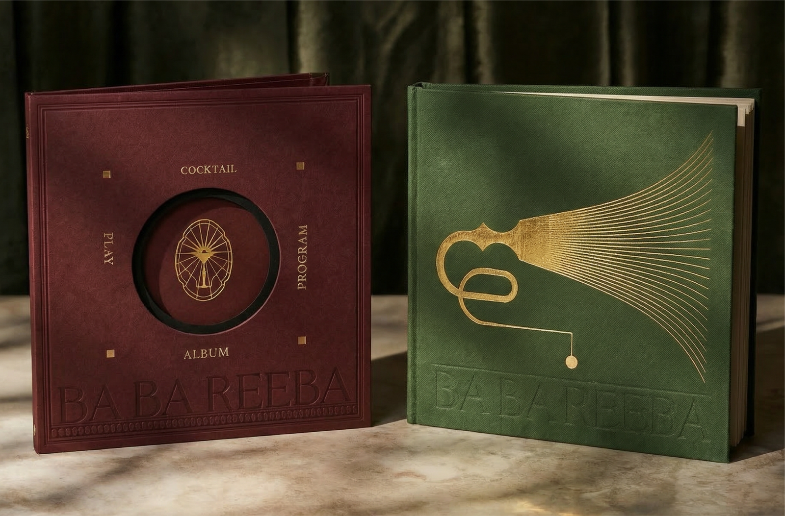
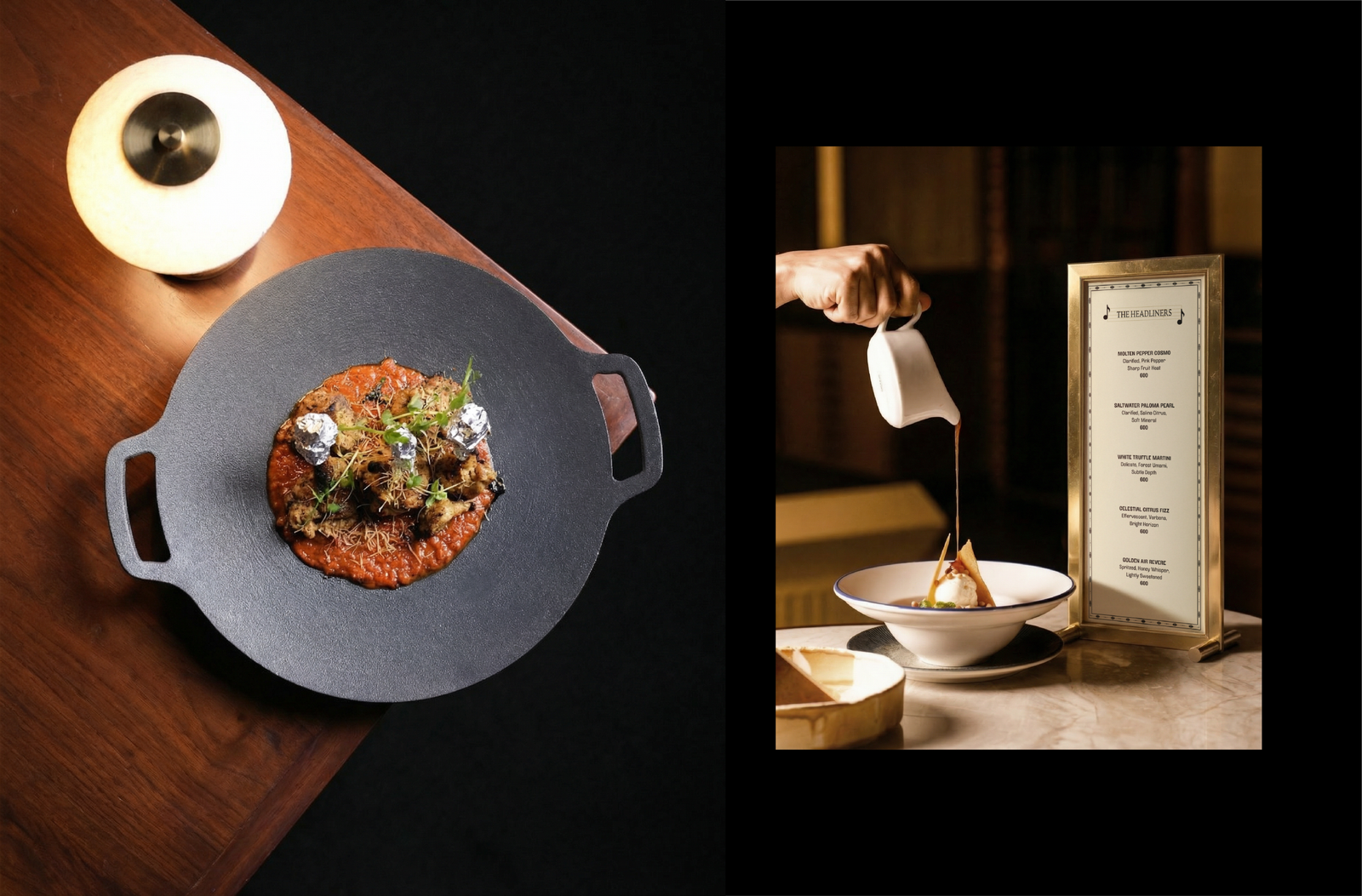
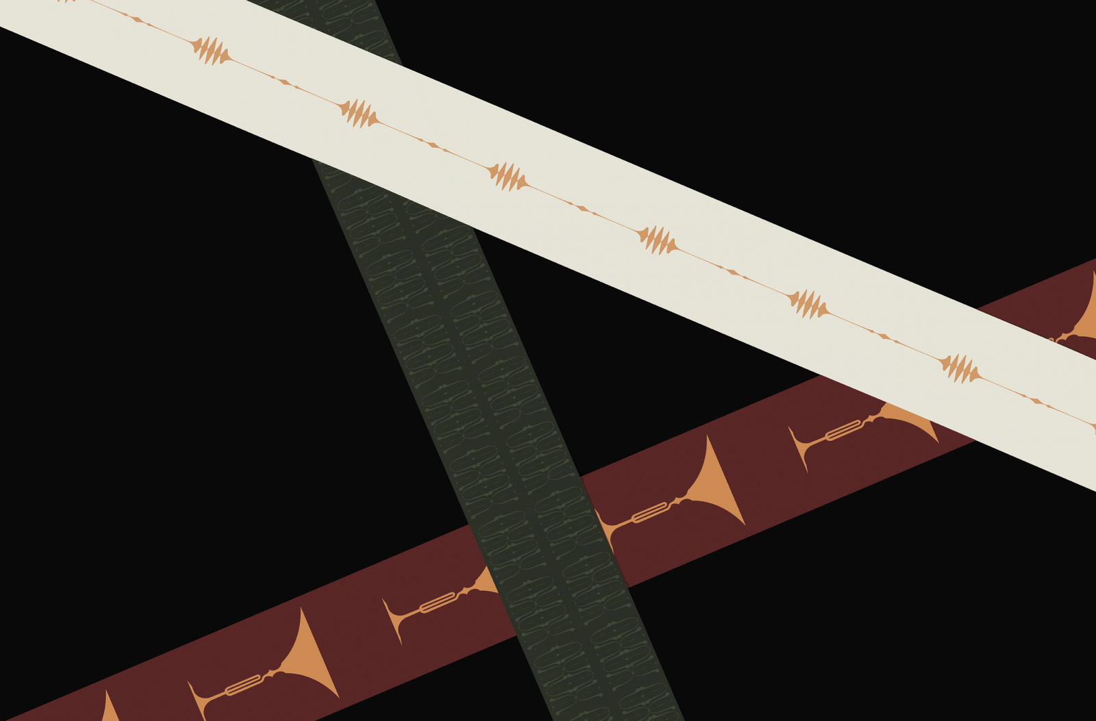
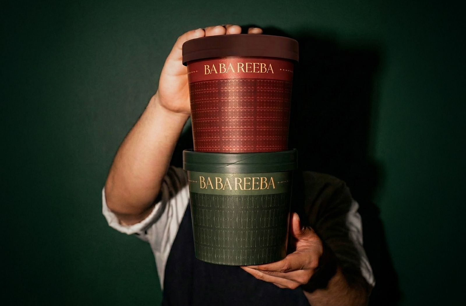
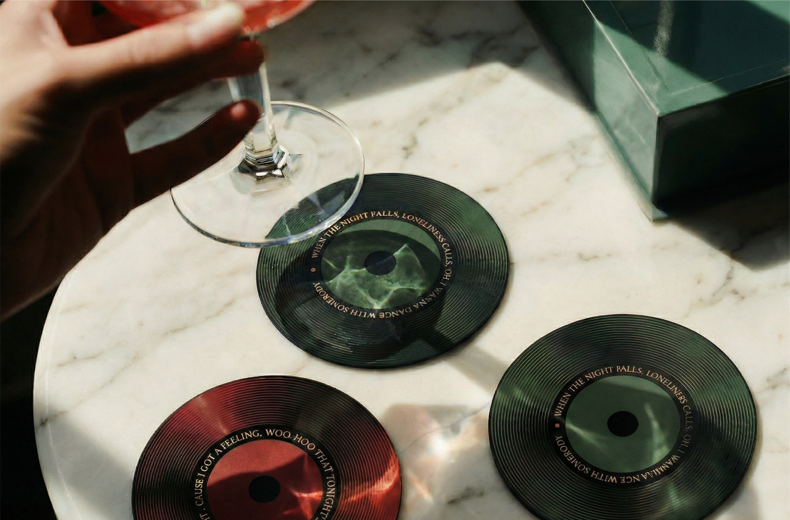
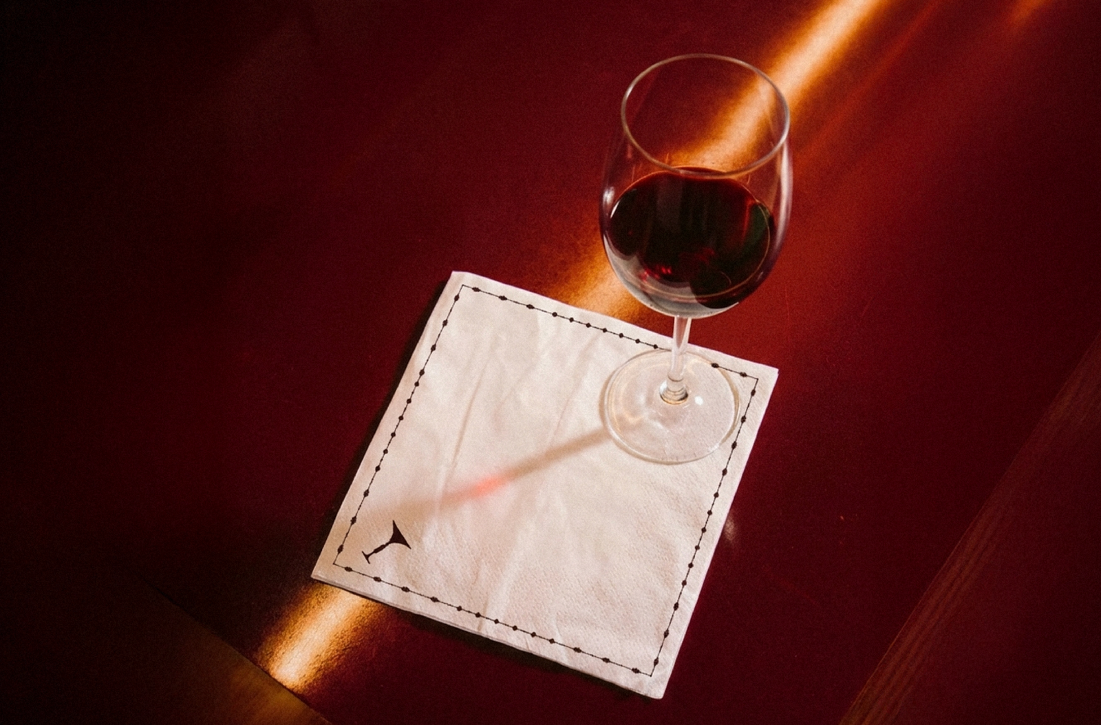
The branding translates the musical concept into tangible design elements, with the logo acting as the opening chord, merging a martini glass, a trumpet-like stem, and a rooftop-inspired frame into one cohesive and expressive mark. This visual language extends across every touchpoint, from vinyl-inspired bar menus and horn-shaped food menus to signage that echoes suspended notes and coasters designed like miniature discs, creating a consistent identity that feels like a continuous, well-composed rhythm.
Services
Company
Socials
Services
Company
Socials
© The Neat Trick 2026
<Made extra neat, so it's not that tricky>
Terms & Conditions
