
Pendulo
Services
Nomenclature | Visual Identity | Spatial Design
The Challenge
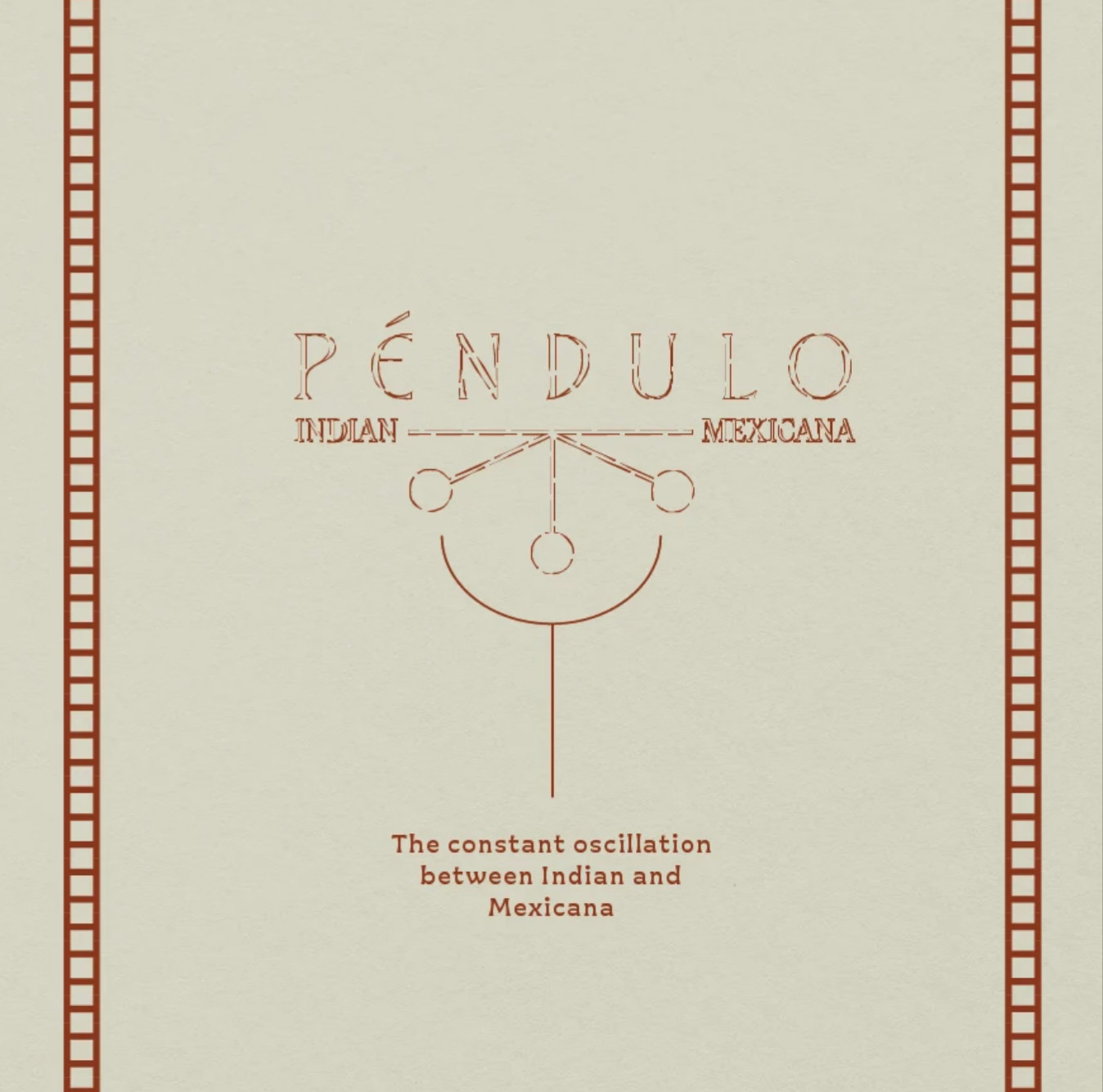
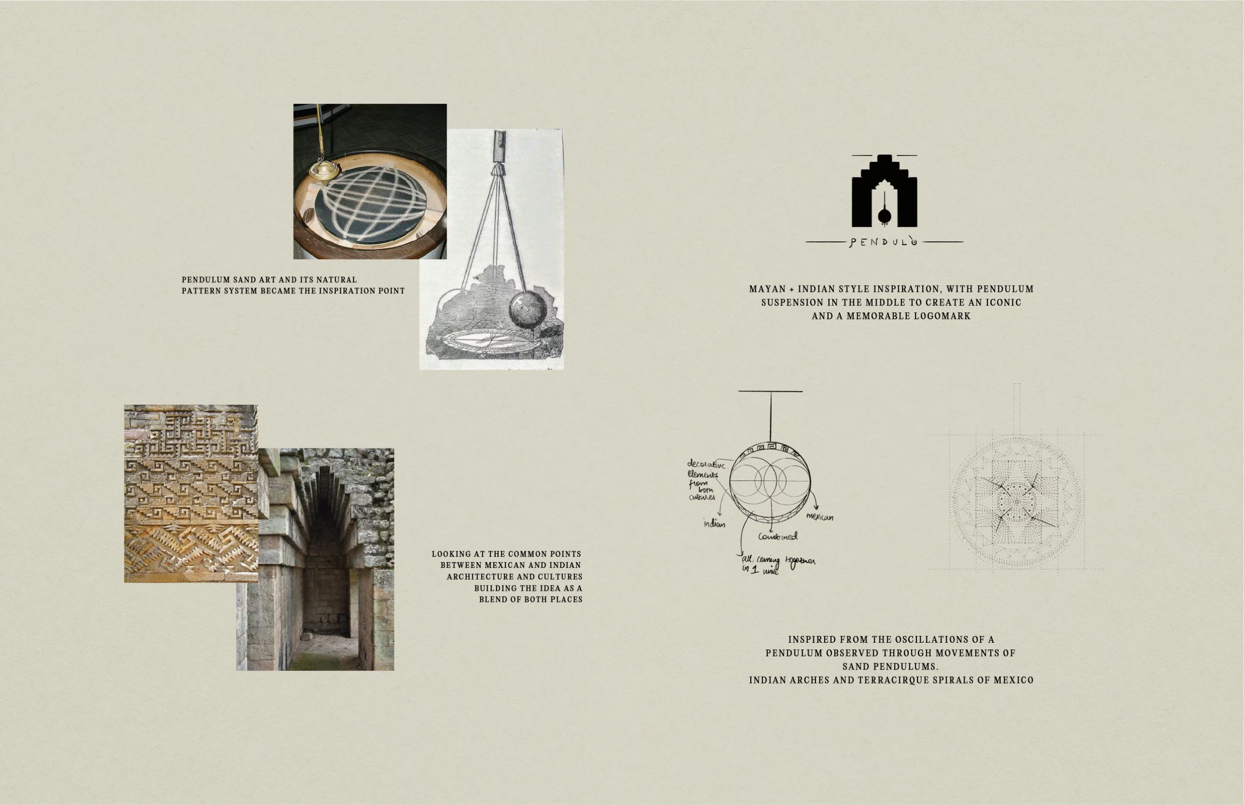
Pendulo finds its name and identity in the hypnotic oscillation of the Foucault pendulum — a timeless symbol of rhythm, balance, and cultural interplay. From nomenclature to spatial storytelling, our approach was to craft a brand world that moves with the same seamless cadence as the food and experience itself.
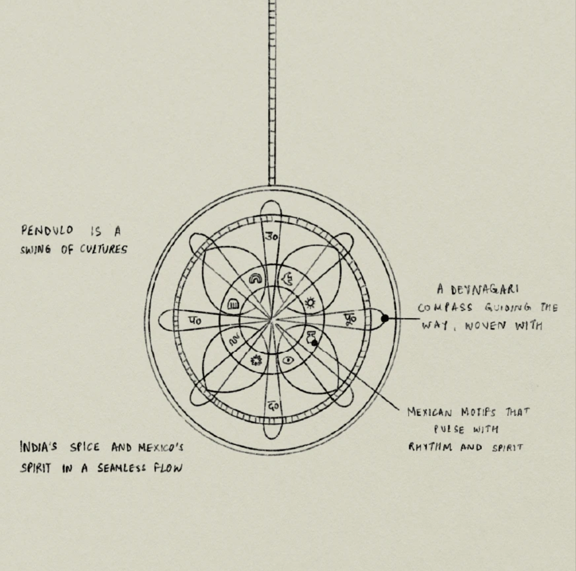
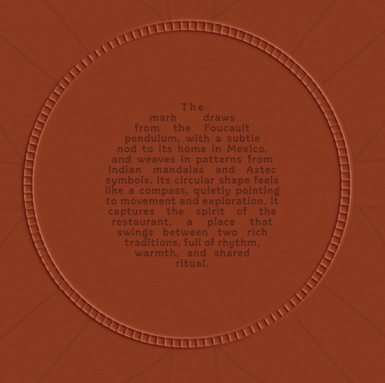
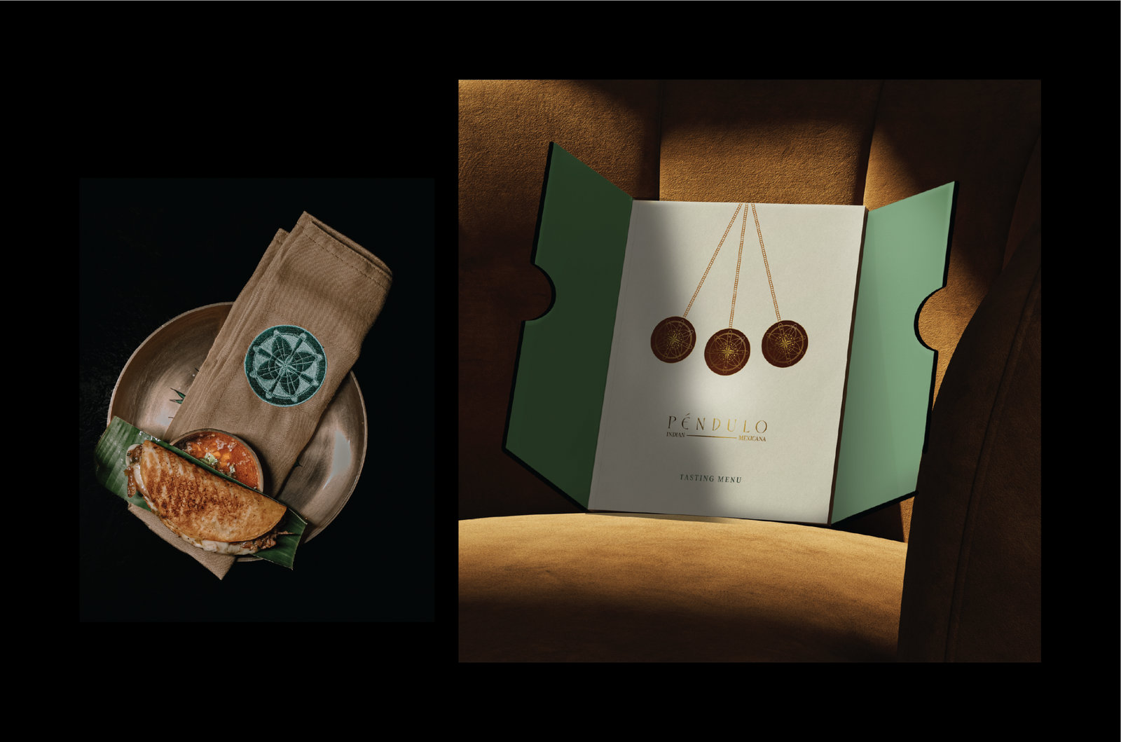
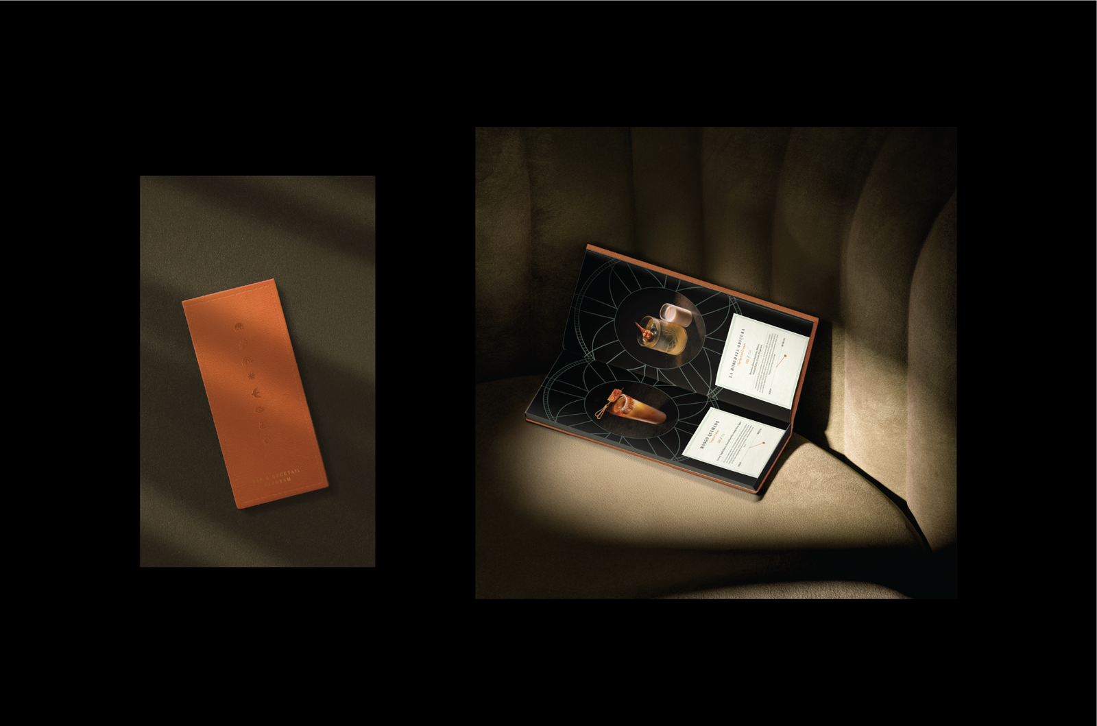
Our core idea began with the pendulum’s swing — constant yet ever-changing. This became a metaphor for dialogue between two traditions, India and Mexico. Visual inspiration was drawn from Devanagari script and vibrant Mexican motifs, both rich in geometry, rhythm, and symbolism. The design language emerged as a study in motion, repetition, and cultural symmetry.
Symbol of Rhythm and Heritage
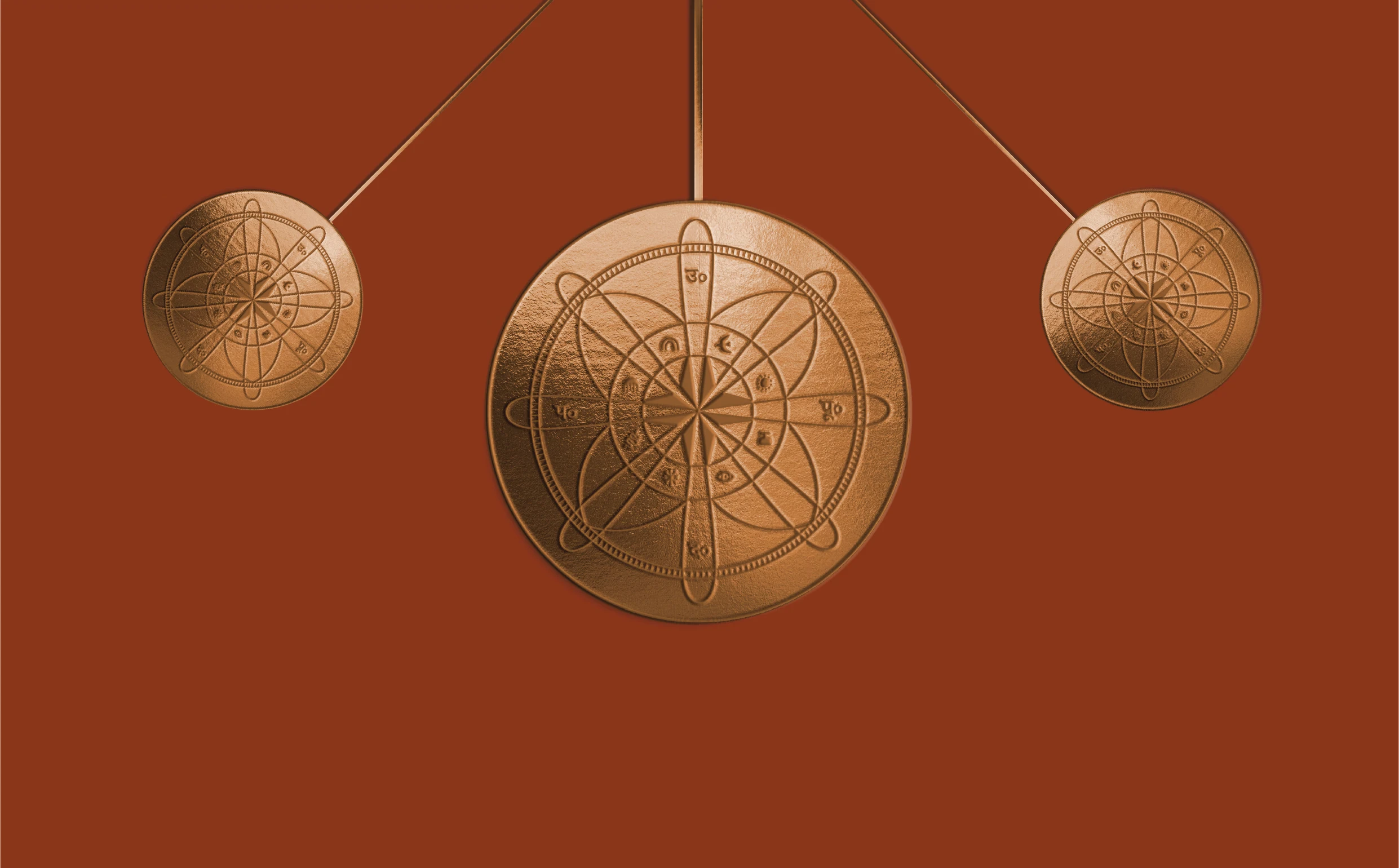
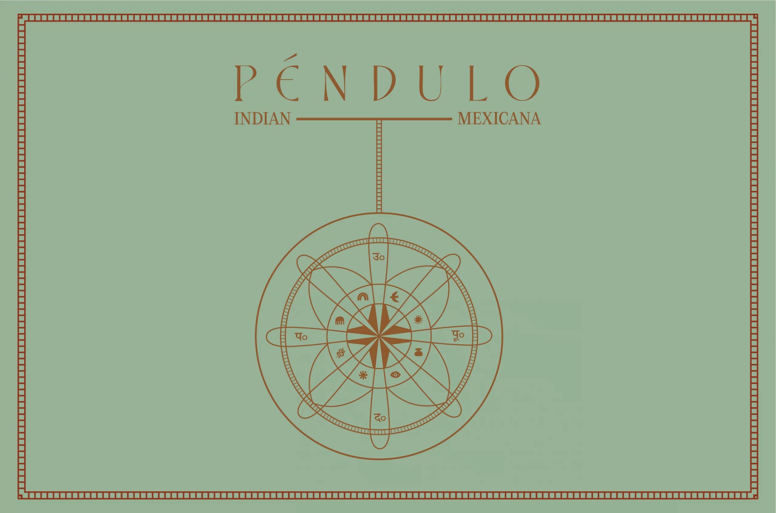
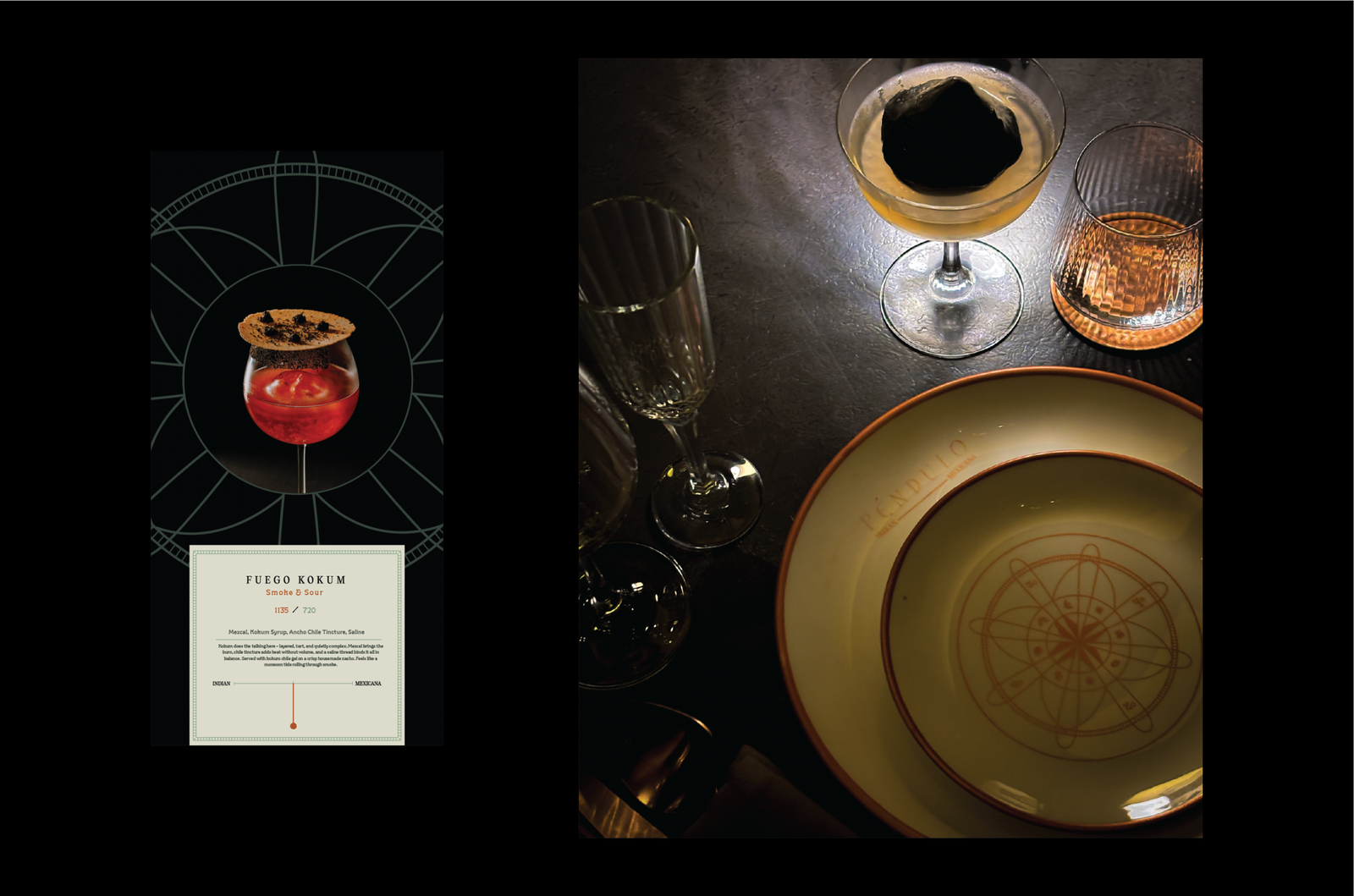
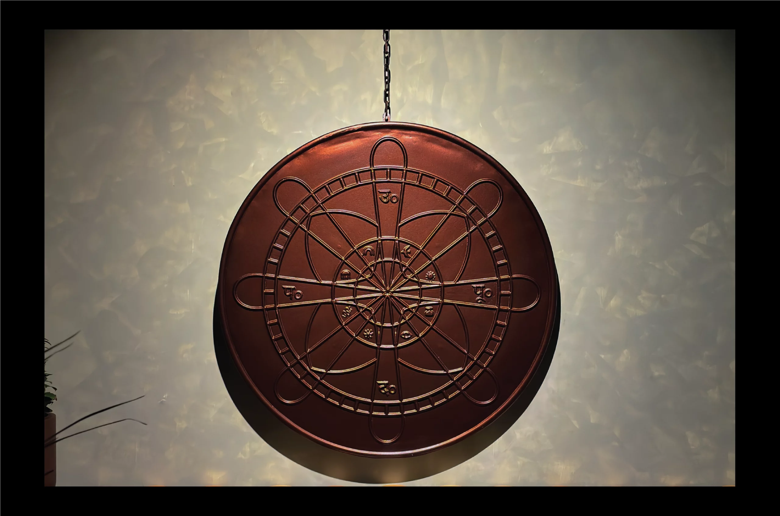
At the heart of the identity is a pendulum mark: elegant Devanagari forms meeting bold Mexican flourishes, framed within the pendulum's orbit. A symbol not just of cuisine, but of rhythm, heritage, and exchange. Within its circular frame, the four cardinal directions appear in Devanagari-उत्तर, पश्चिम, दक्षिण, पूर्व -- anchoring the mark firmly in Indian roots while celebrating global reach.
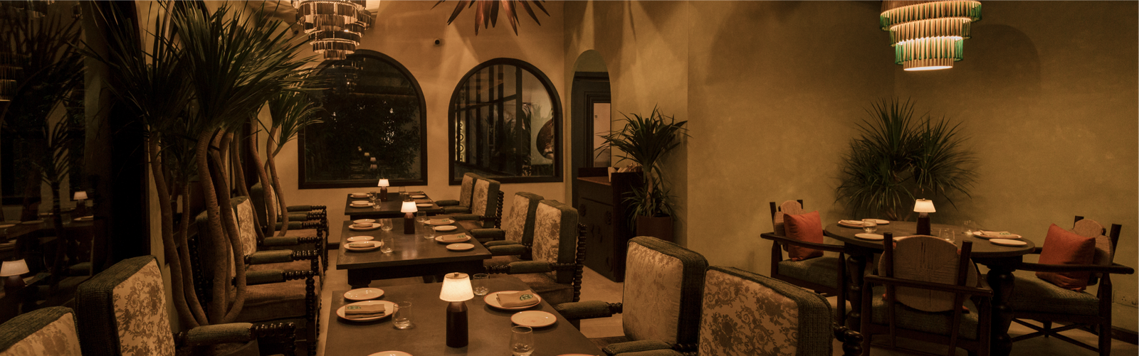
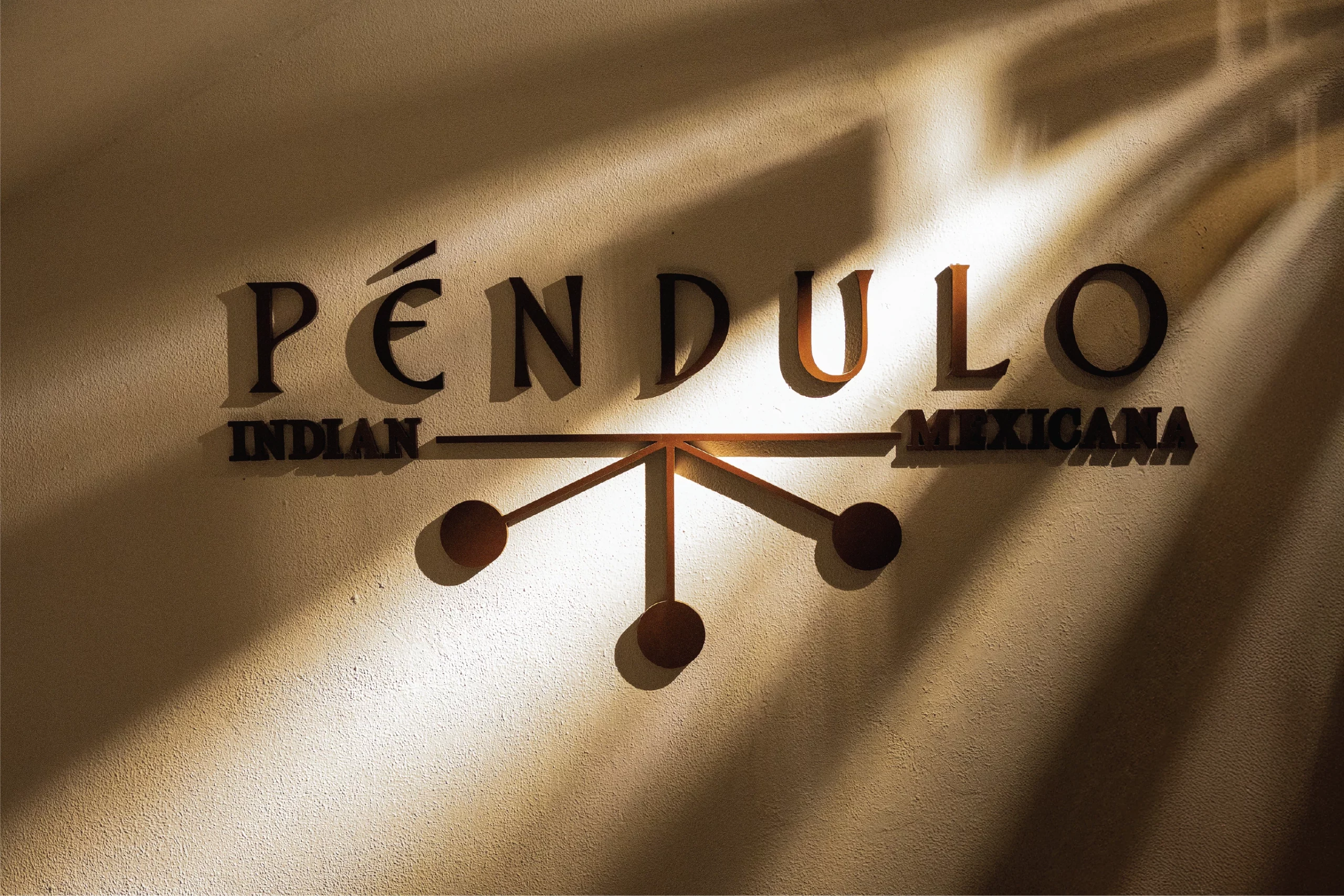
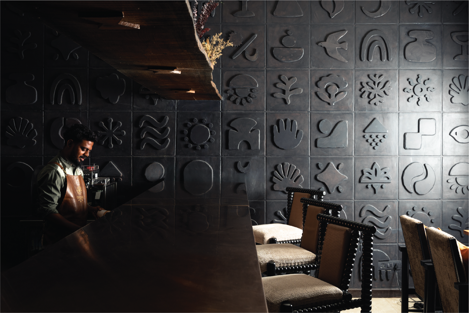
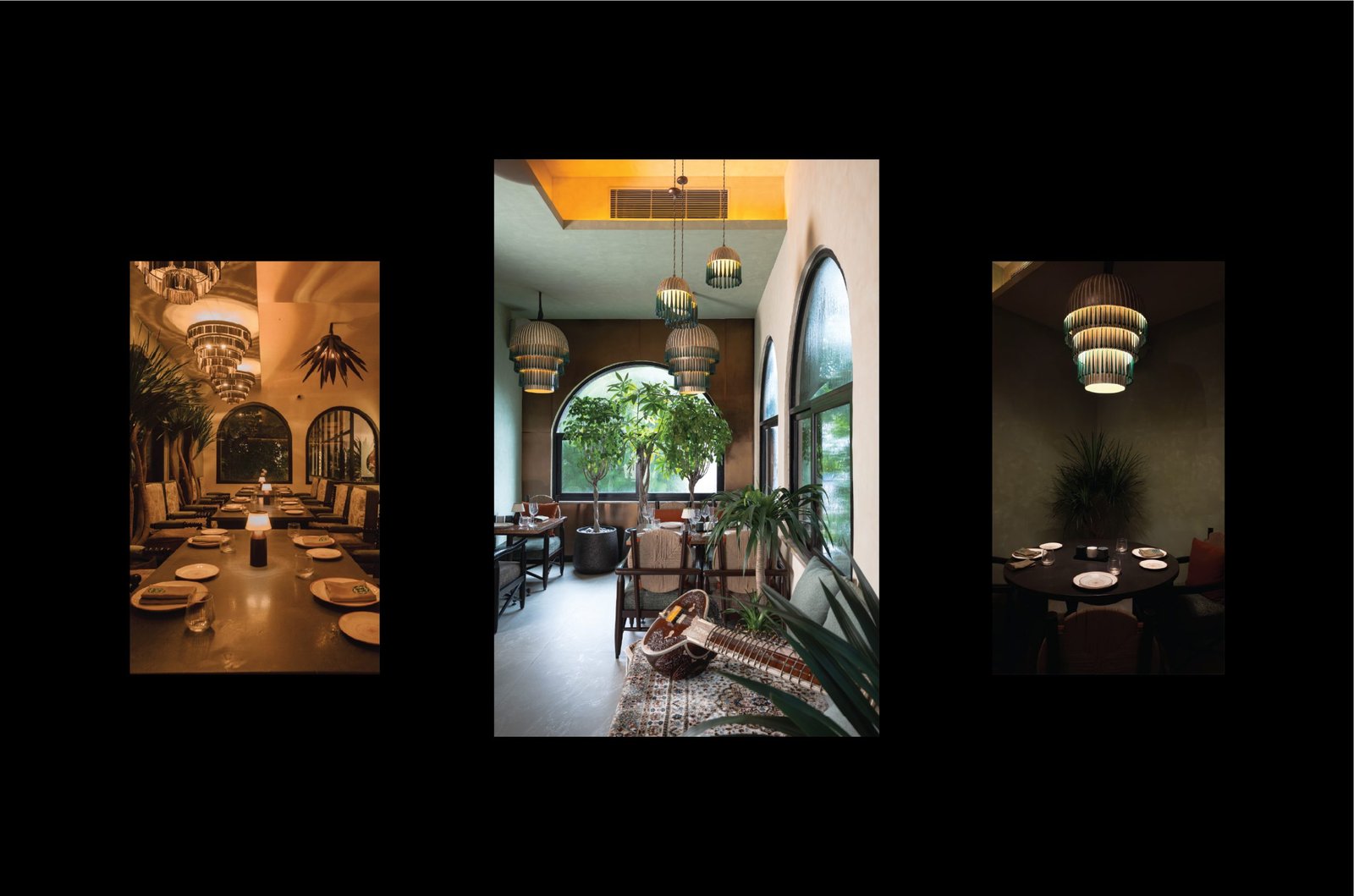
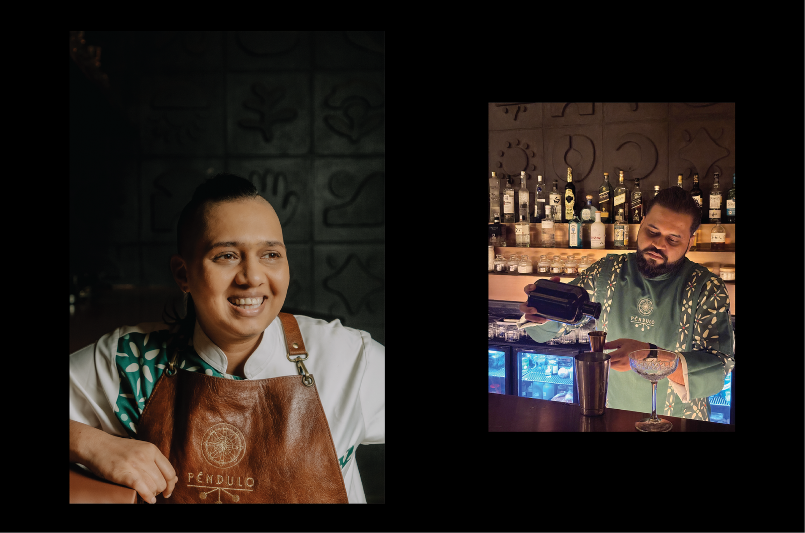
Walls carry hand-painted Mexican motifs, that animate the space. At the center, a living pendulum installation anchors the entrance — a sculpture of rhythm and time that embodies the restaurant's name and concept. Lighting, color palettes, and textures were orchestrated to echo the constant interplay of cultures.

Services
Company
Socials
Services
Company
Socials
© The Neat Trick 2026
<Made extra neat, so it's not that tricky>
Terms & Conditions
