
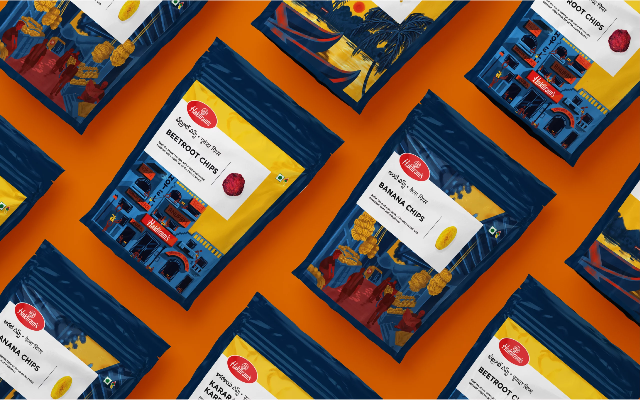
South Indian Snacks
Services
Visual Identity | Packaging
FMCG
The Challenge
Haldiram’s South Indian range had to be more than a snack—it needed to feel like a cultural experience. For Indian consumers, it had to evoke nostalgia; for global audiences, it had to feel aspirational and authentic. The real challenge? Designing packaging that was rooted in tradition but modern enough to travel the world—resonating just as well on a local shelf as it would in an international aisle.
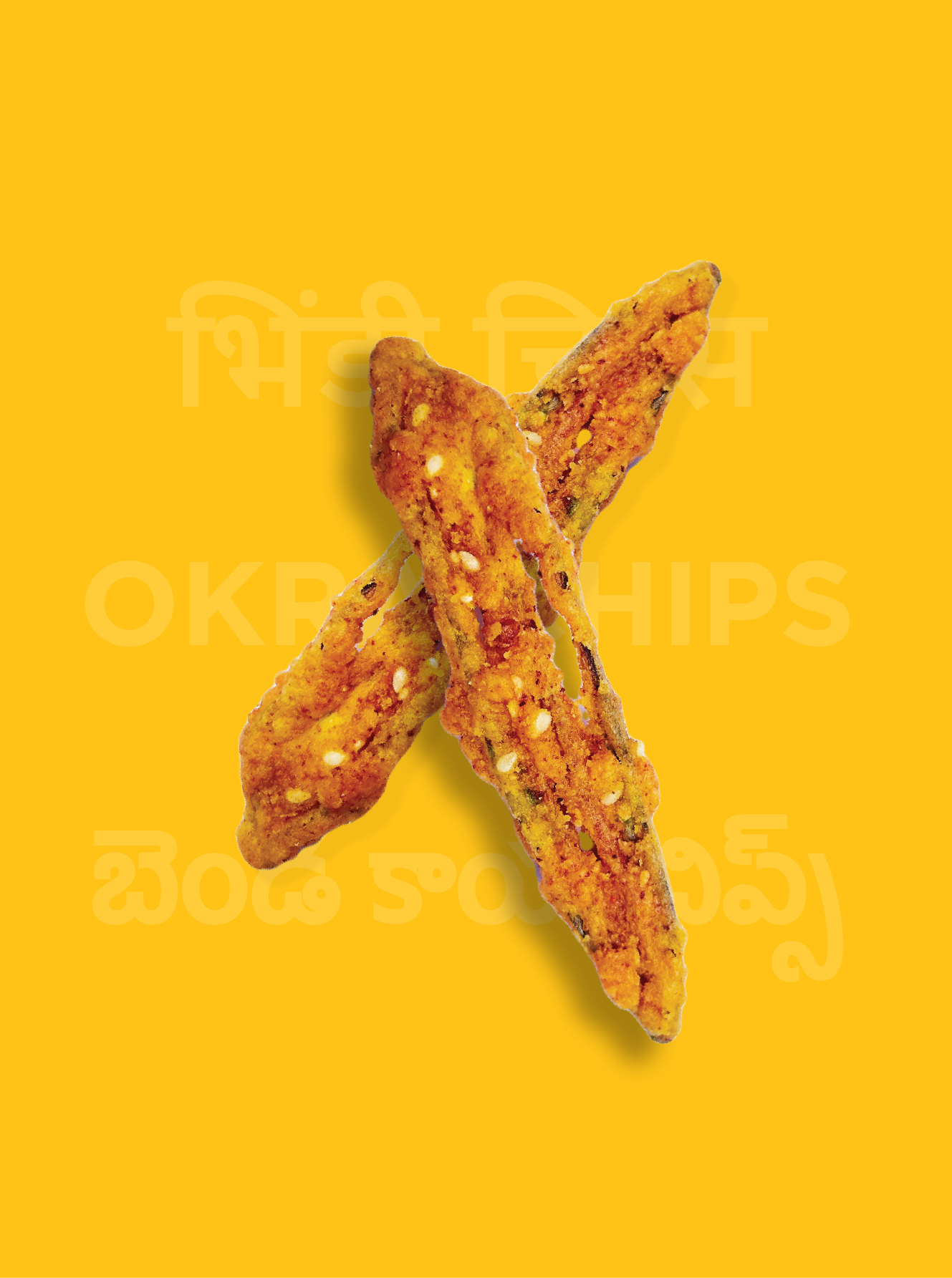
“A bite of South India”
Use packaging to offer an immersive cultural journey
Position Haldiram’s new South Indian range as more than just a snack—it’s a cultural experience that connects with both nostalgic Indian consumers and a global audience seeking authenticity.

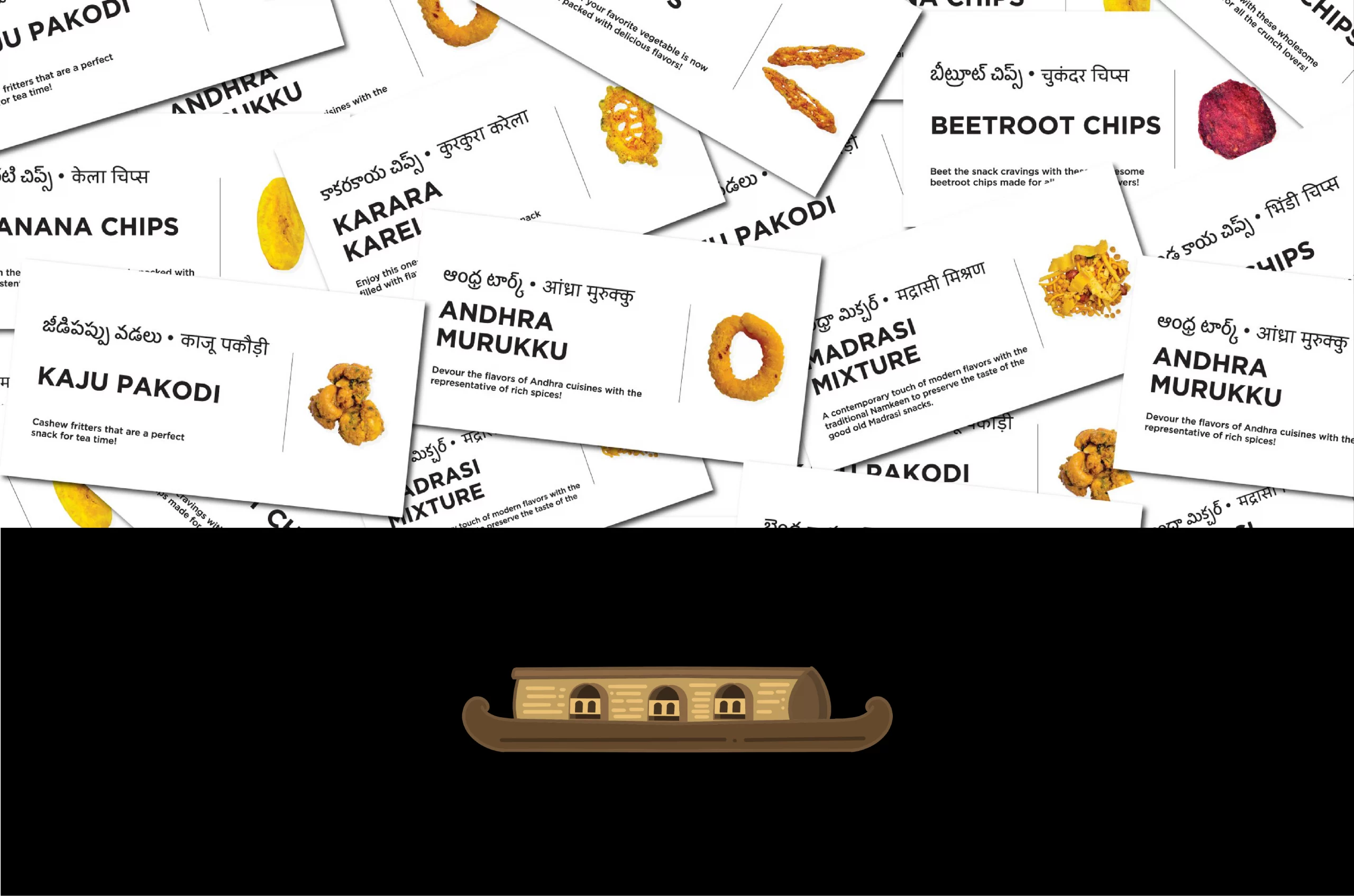
Painted Pantries of the South.
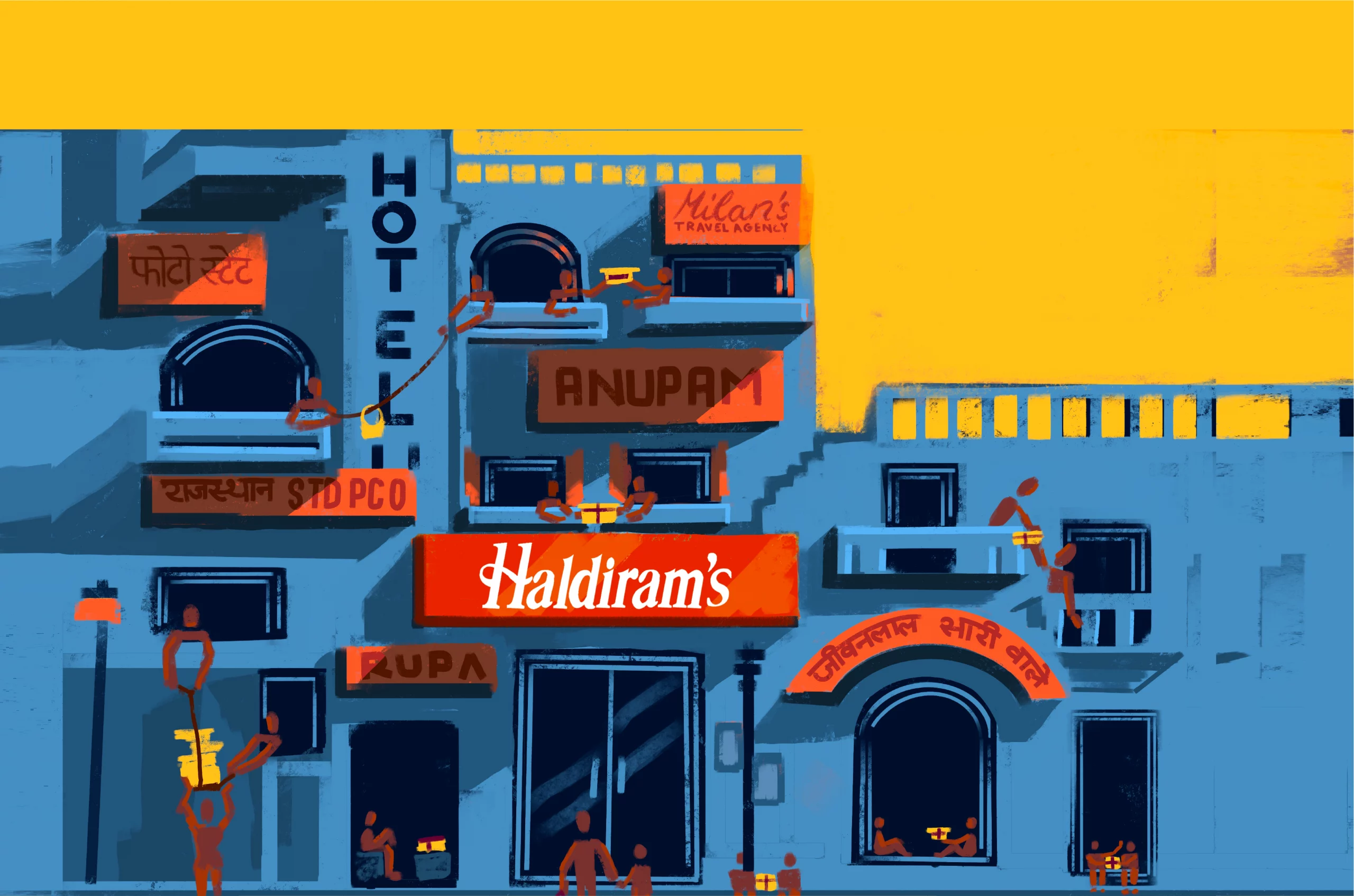
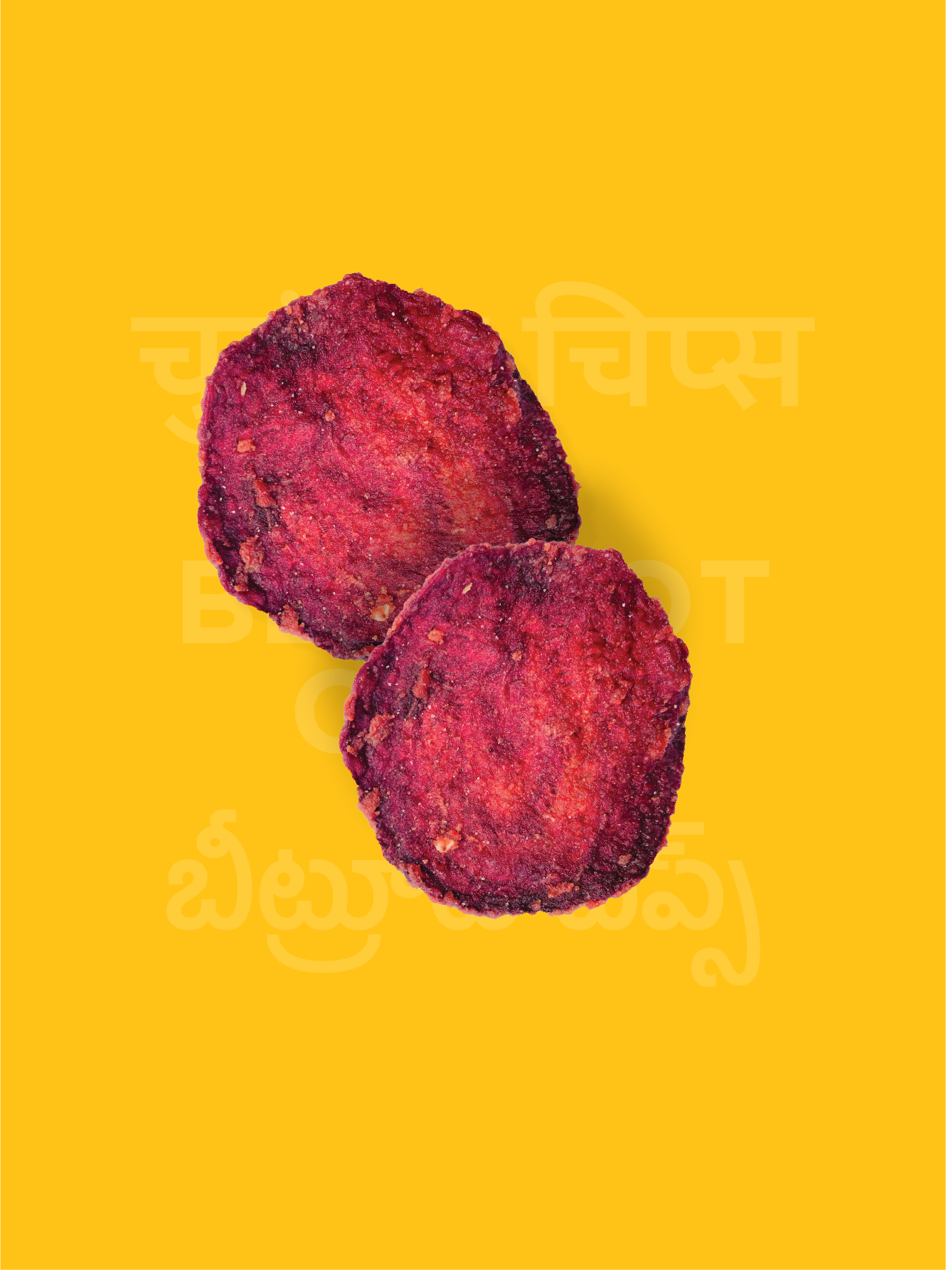
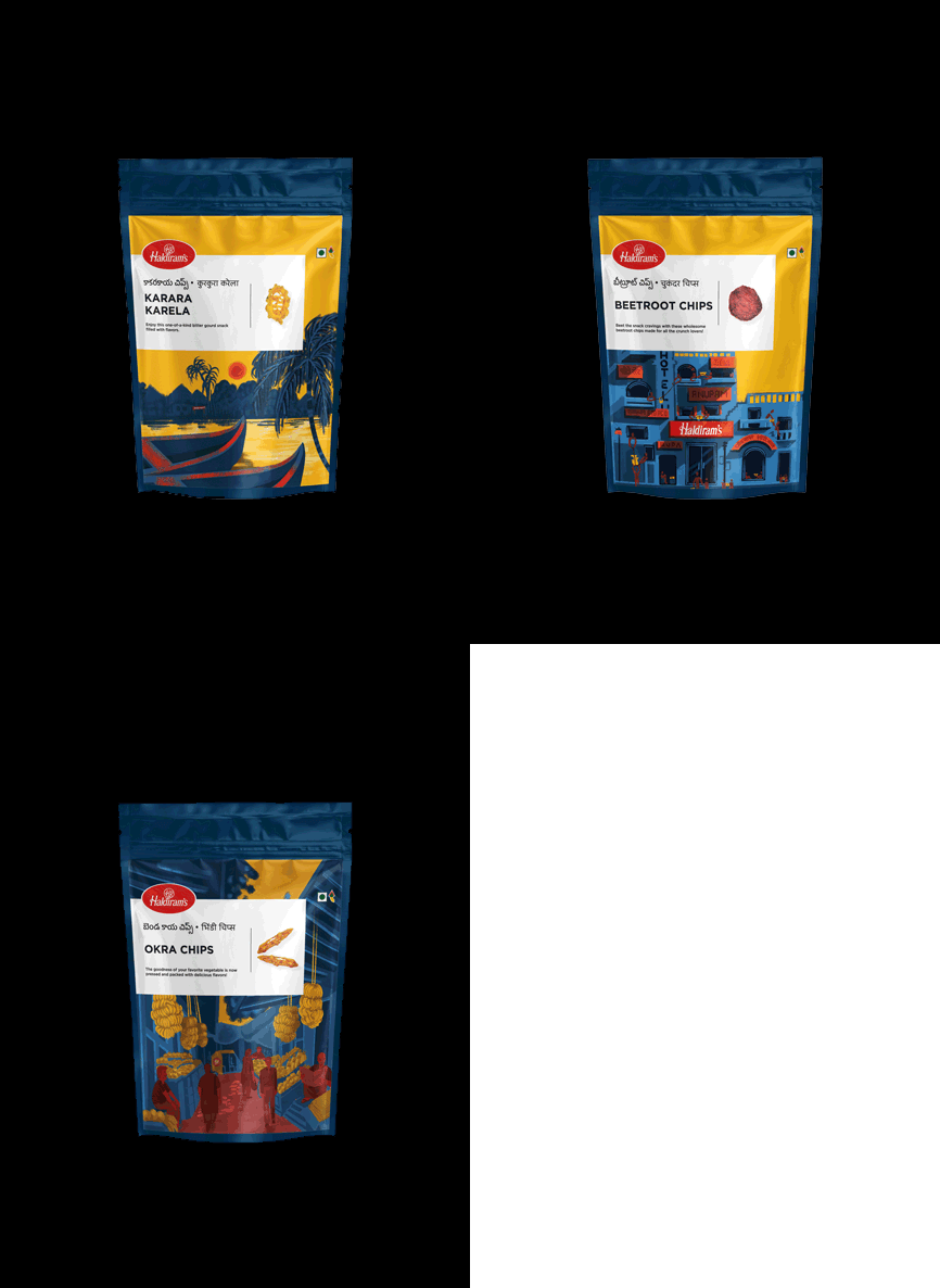
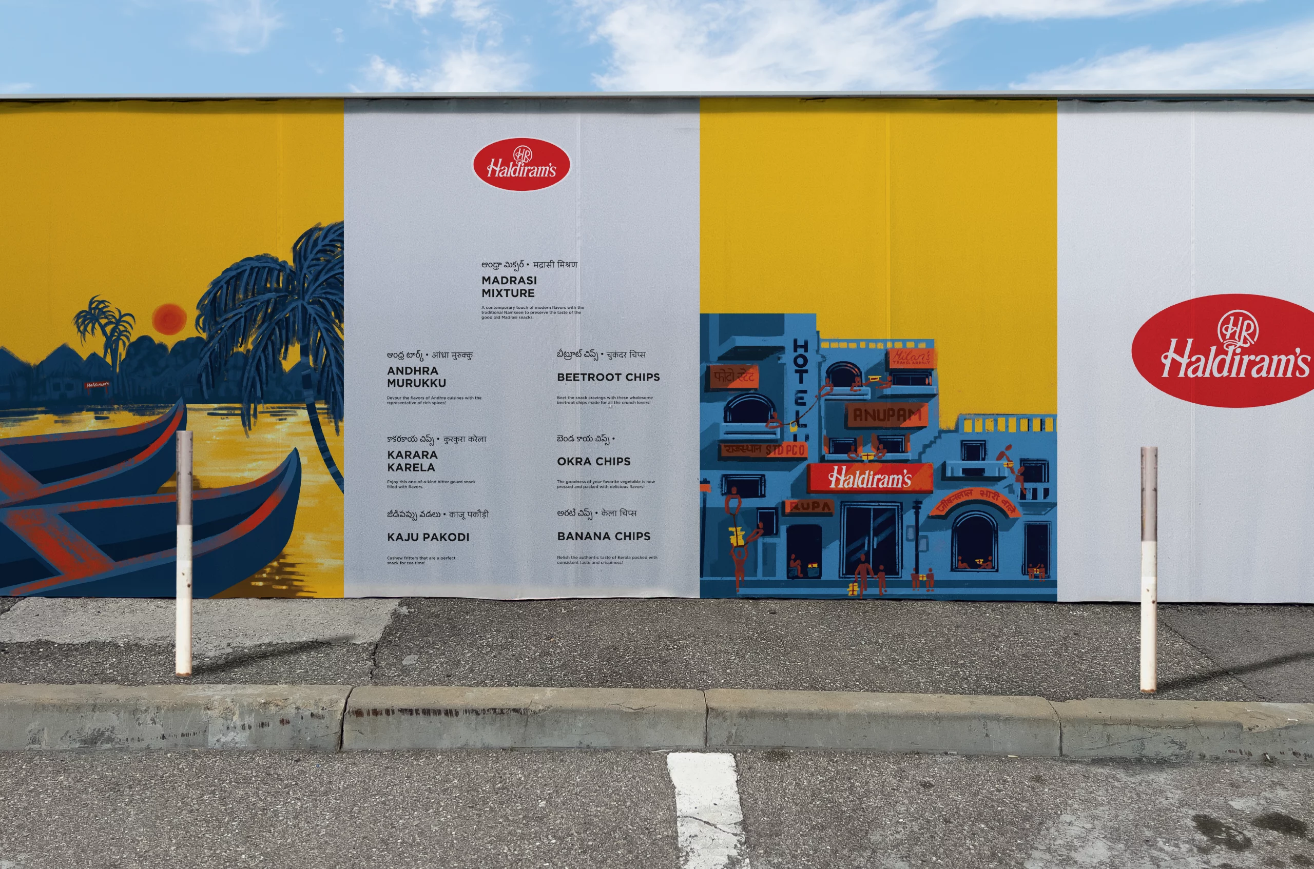
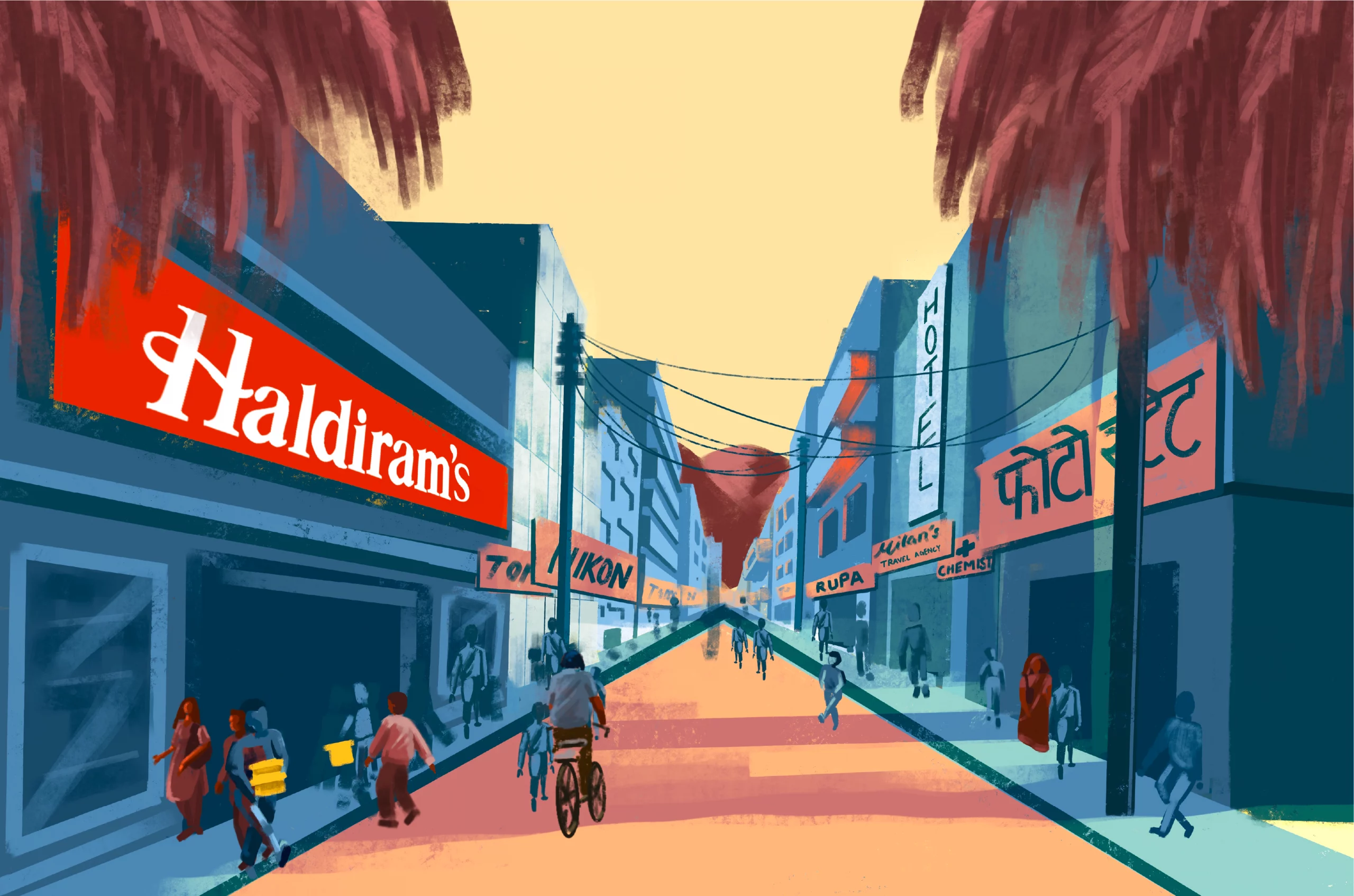
We developed a visual language rooted in artistic tradition, employing hand-painted illustrations that celebrate South India's distinctive architectural and cultural landscapes. Each package features meticulously rendered scenes of Kerala's tranquill backwaters, bustling marketplaces, and colonial-era neighborhoods, creating windows into the regions that inspired these flavours.
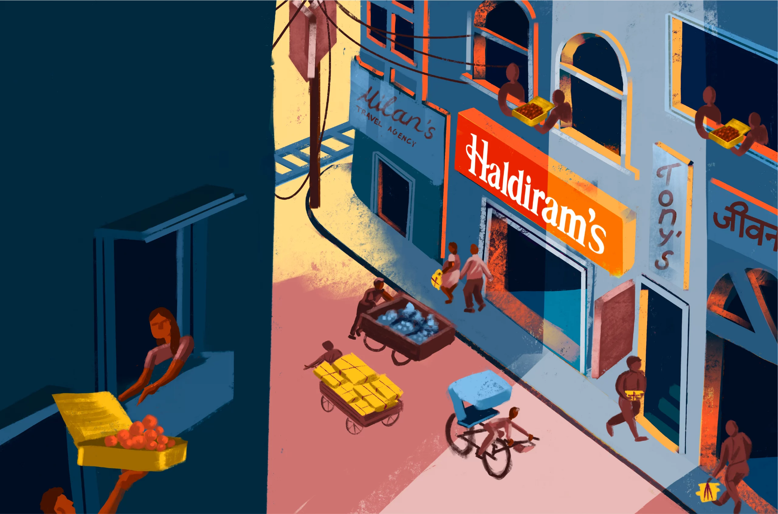
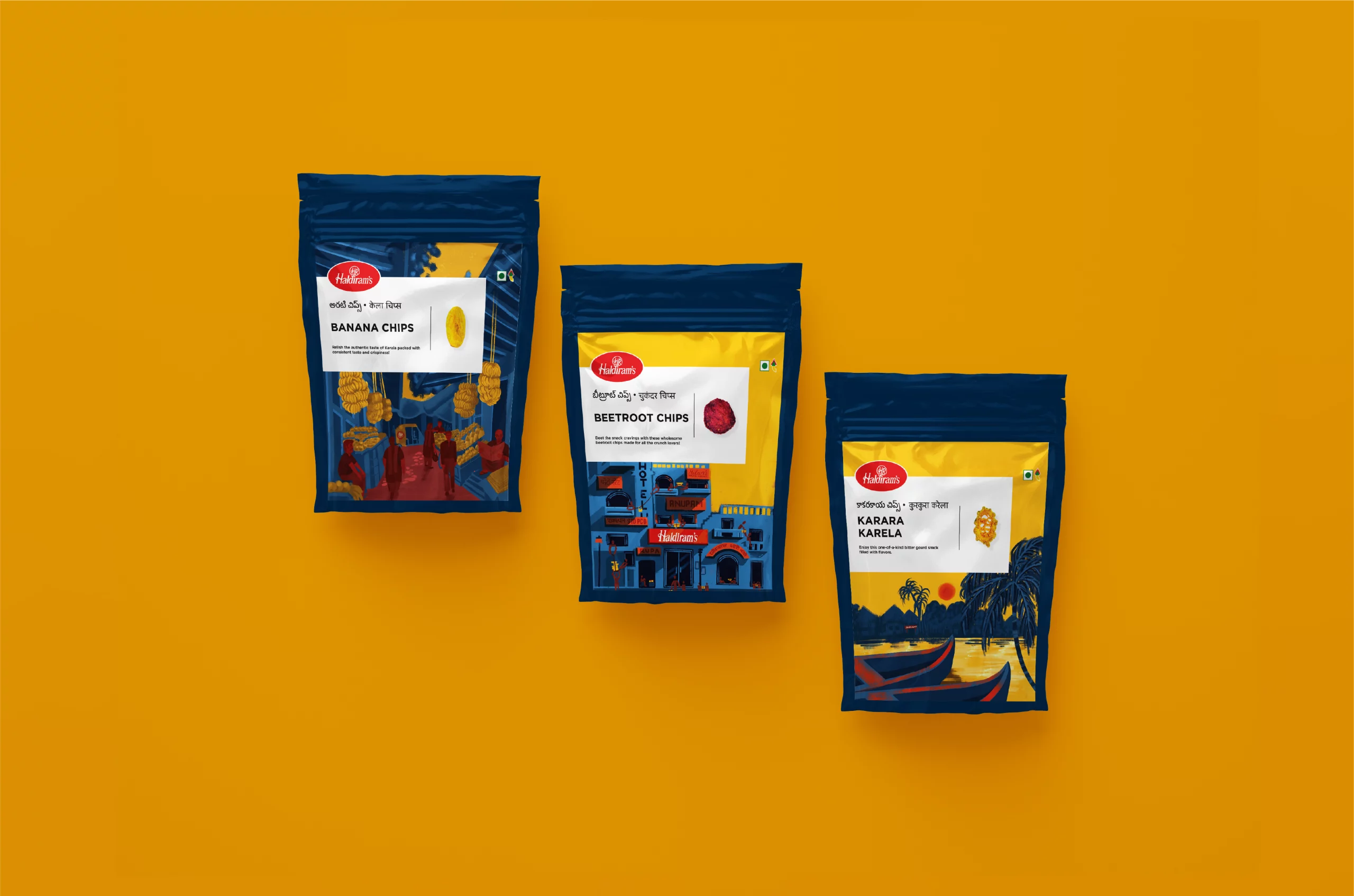
Emotional Resonance Across Borders
Familiar and nostalgic for Indian consumers. Aspirational and culturally rich for global audiences. Packaging that travels well, without losing its roots.
Services
Company
Socials
Services
Company
Socials
© The Neat Trick 2026
<Made extra neat, so it's not that tricky>
Terms & Conditions
