
Dinamita
Services
Visual Identity | Packaging Design
Alcobev
The Feminine Detonation
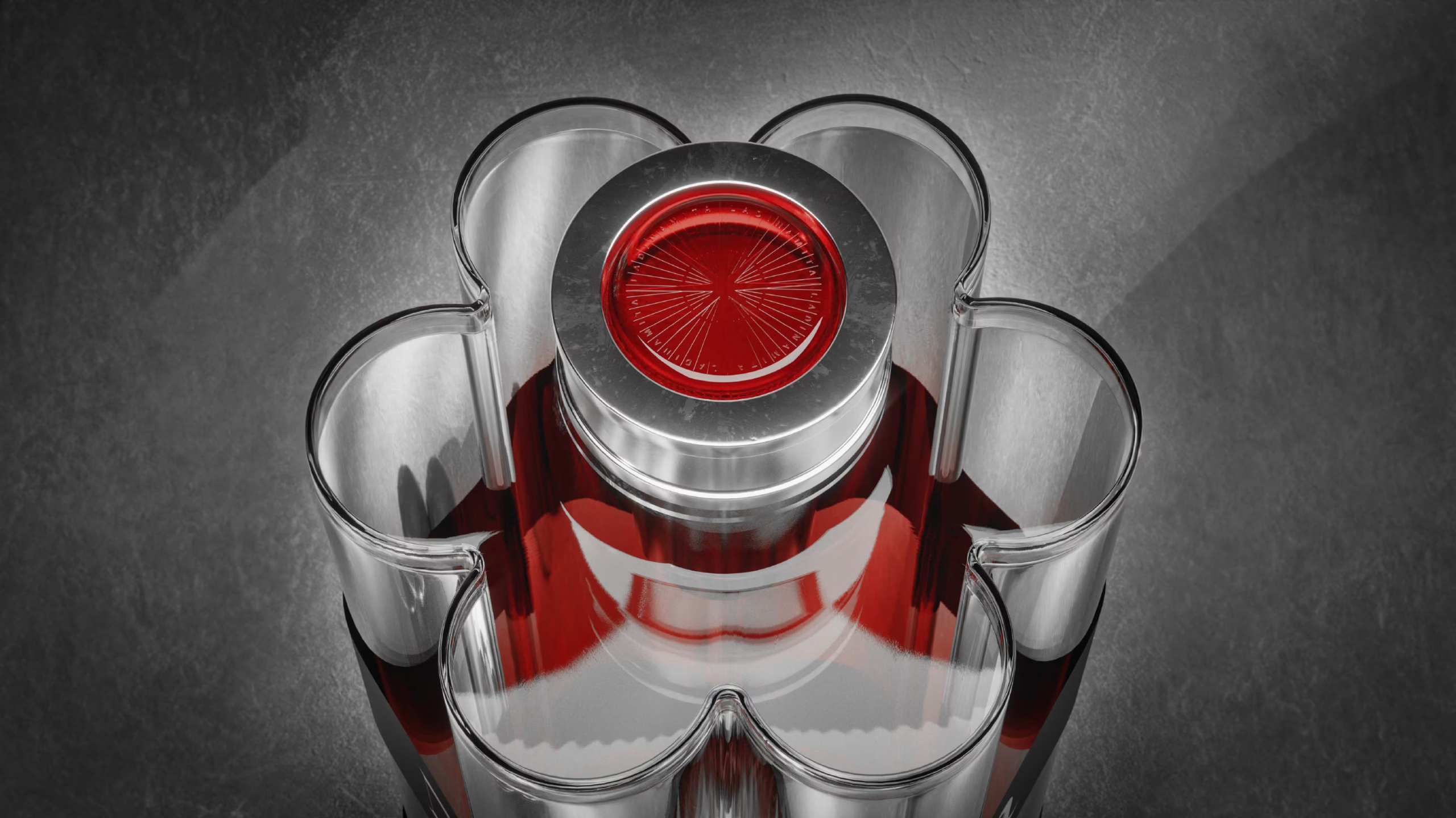
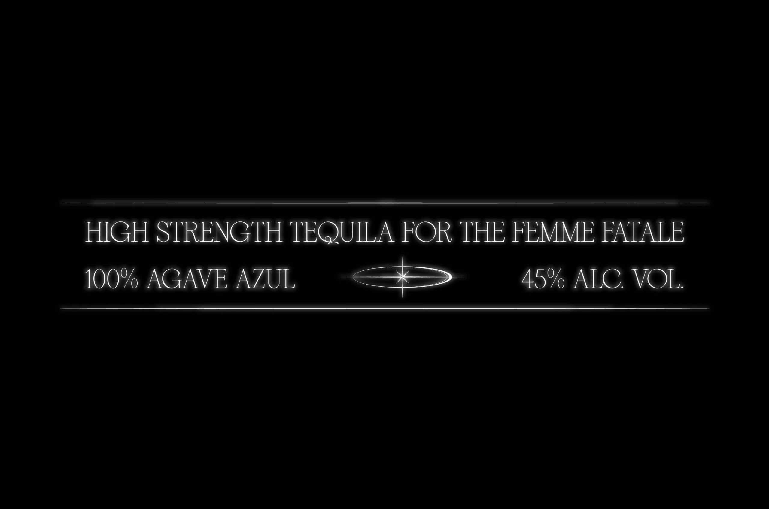
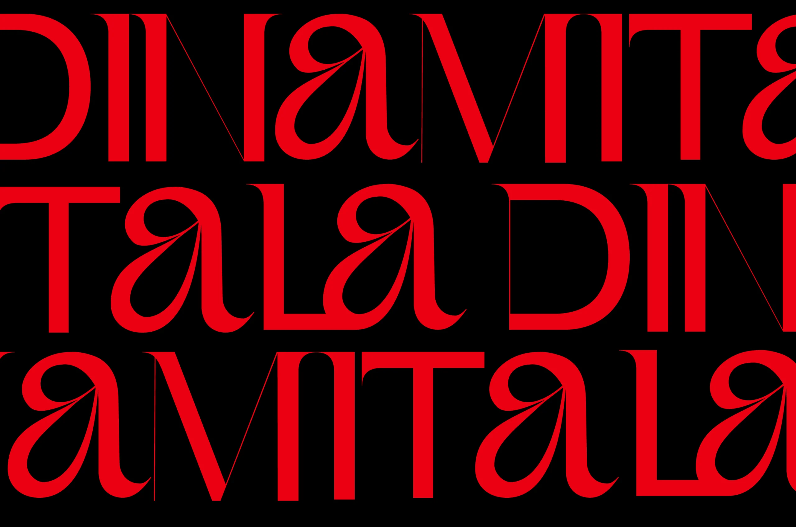
Not just another tequila. A calculated disruption. Dinamita - a concept project we designed - doesnʼt enter the masculine spirits arena—it rewrites the rules of engagement. Spanish for “dynamite”, this isnʼt a brand requesting space at the table. It's a female-forward explosion that renders the existing table irrelevant.


Sunflowers with Teeth
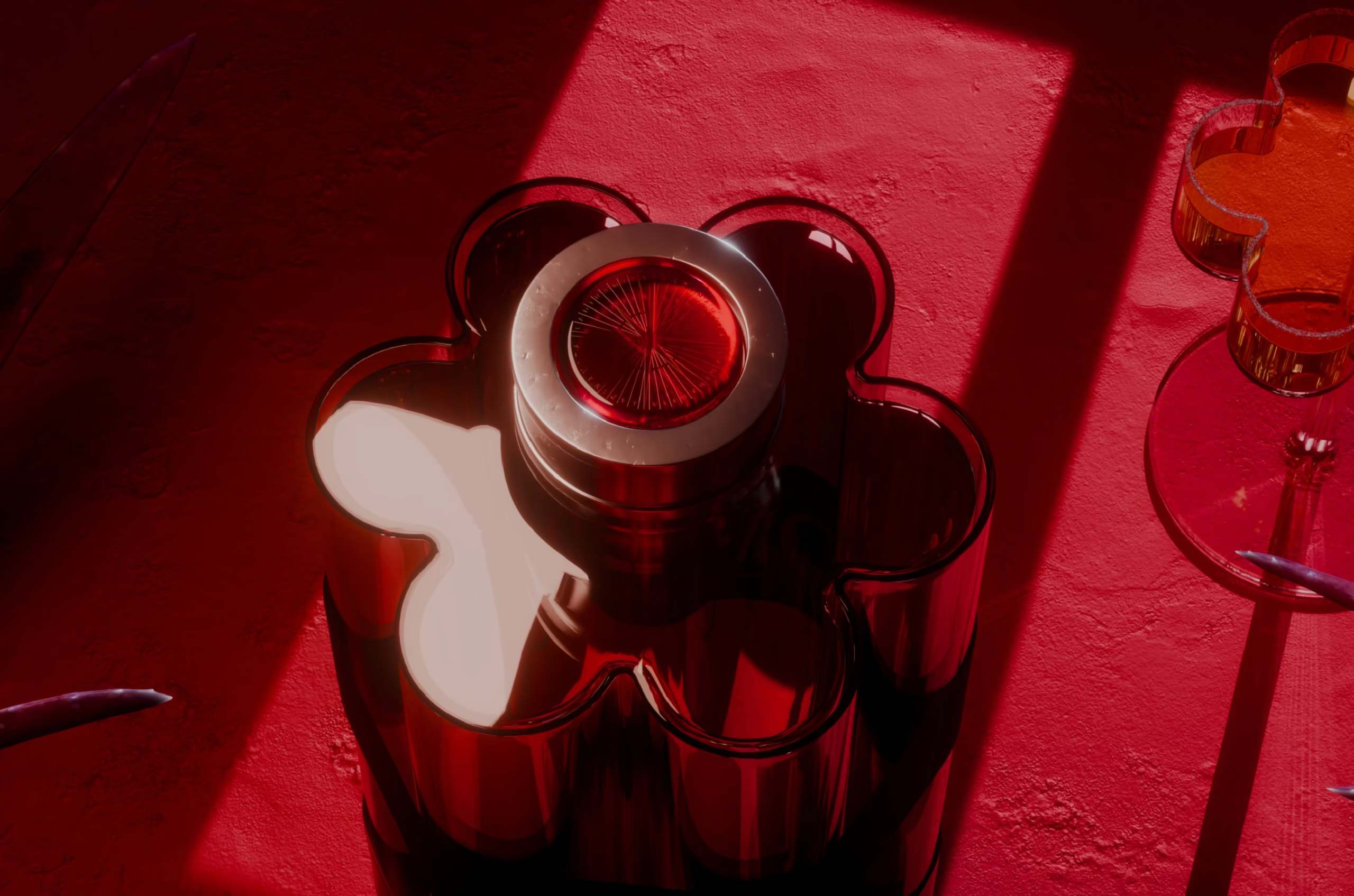
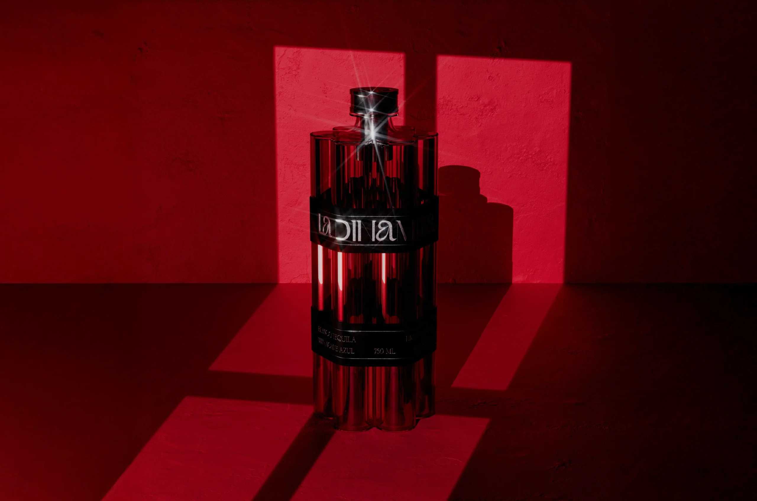
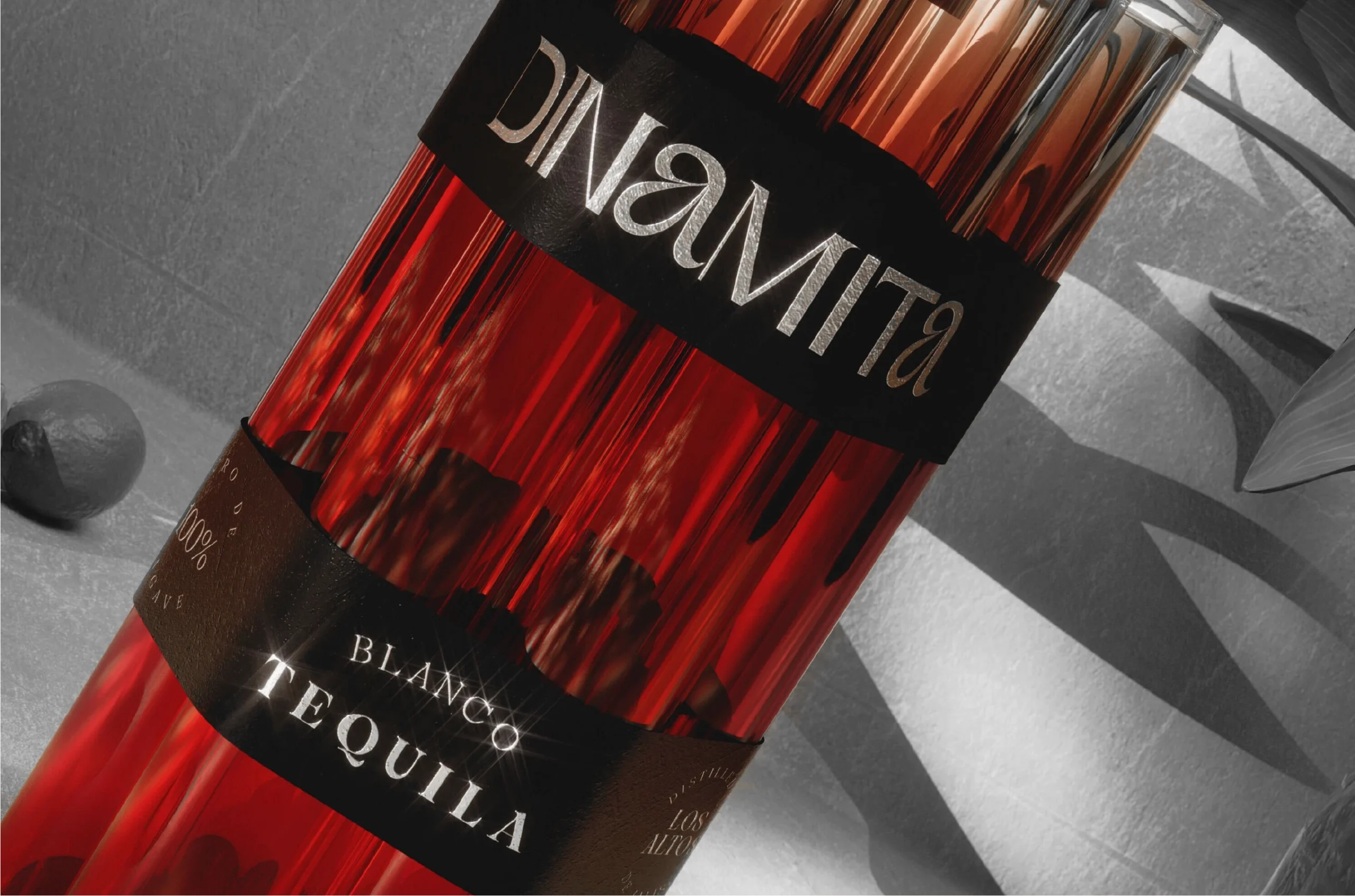
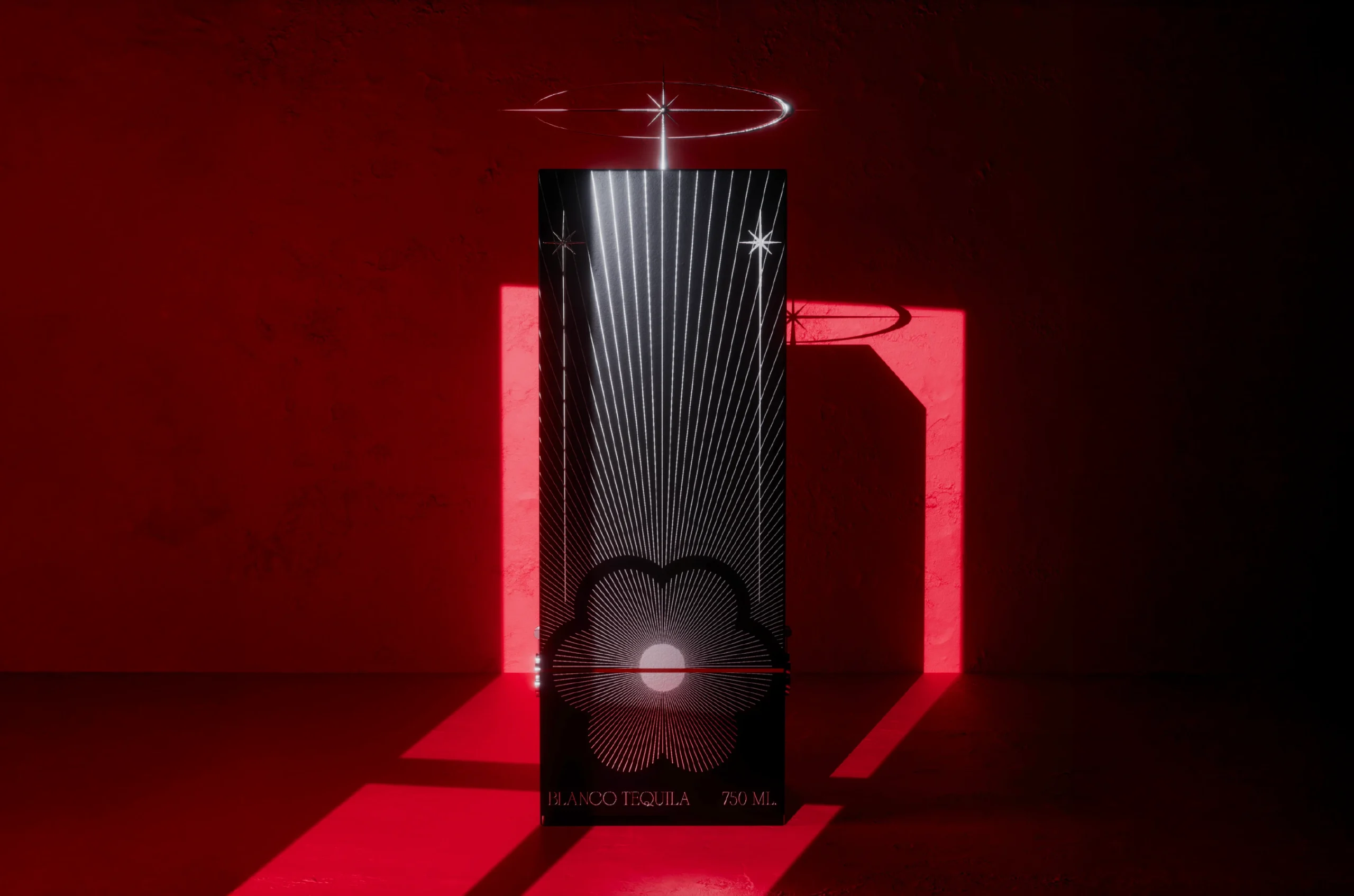
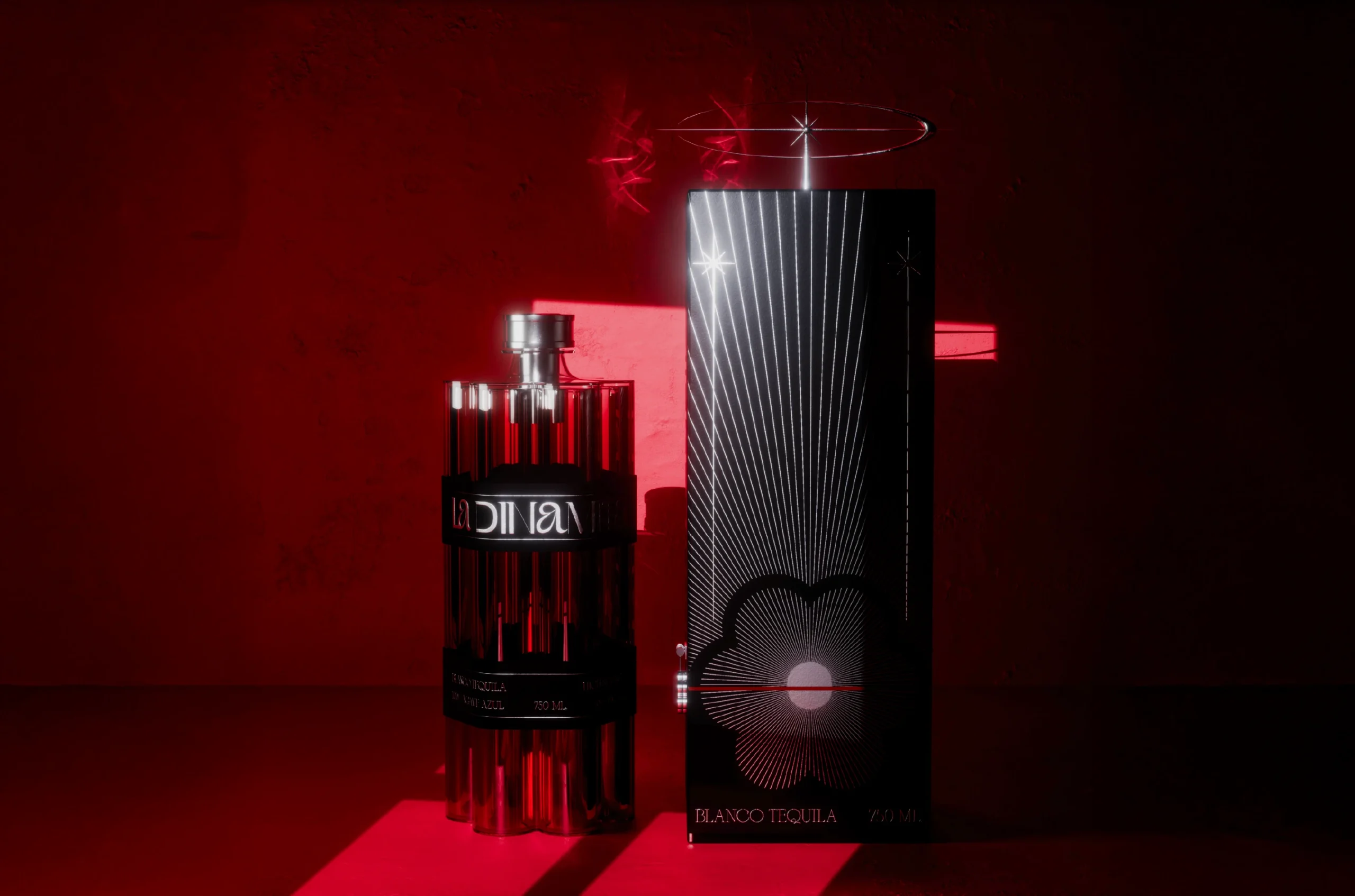
The bottle design turns softness into strategy. A cylindrical form that simultaneously evokes a sunflowerʼs delicate stem and a stick of dynamite waiting for ignition.
Multiple chambers create a silhouette that refuses conventional shelving. This isnʼt packaging—itʼs architecture with intentions. Premium not through expected signals, but through deliberate rejection of them.
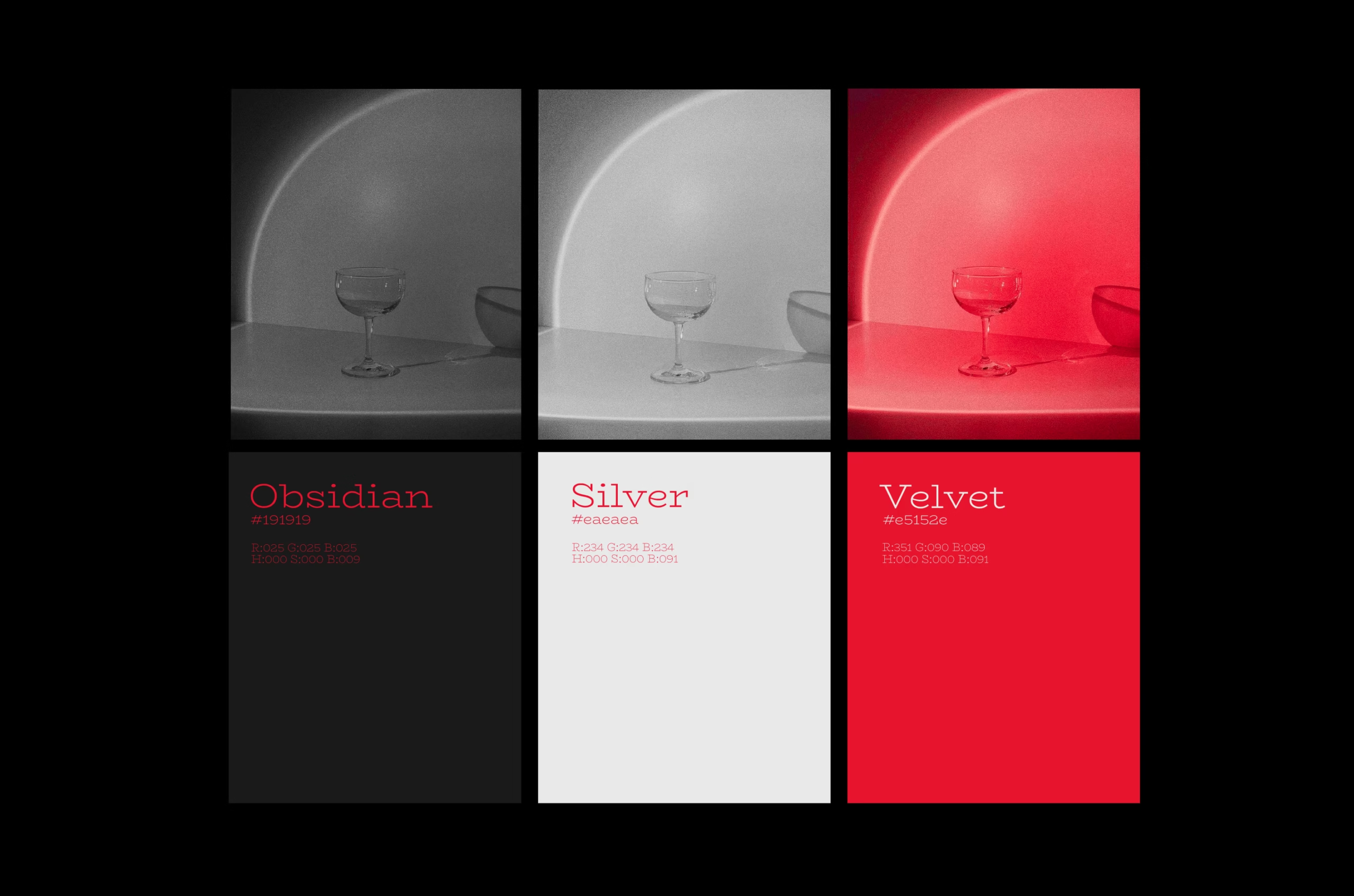
The Beautiful Sabotage
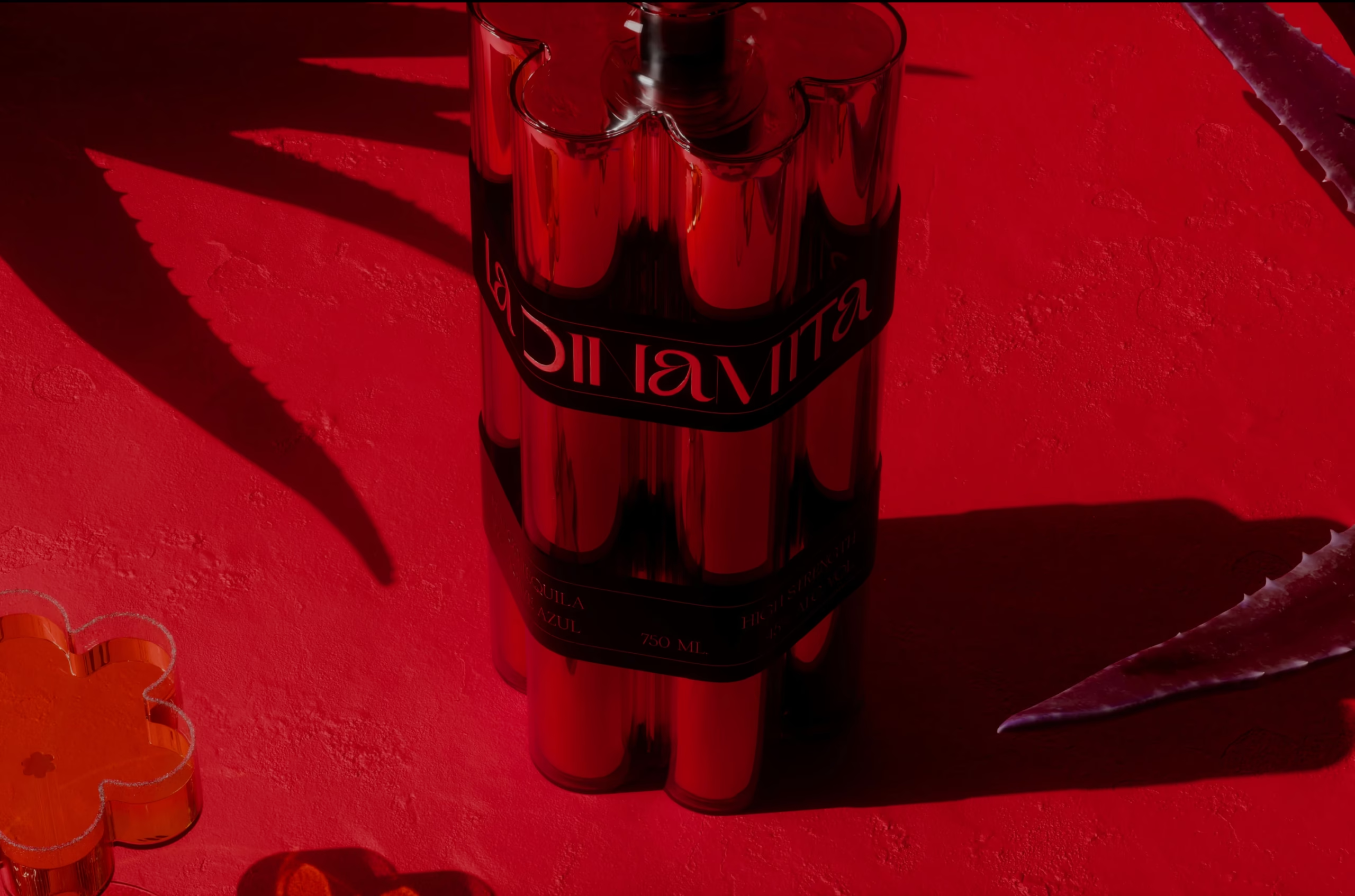
In a market where masculinity is currency, Dinamita commits elegant subversion. No apologies, no compromise, no dilution of concept. The explosiveness isnʼt just in the name; itʼs engineered into every curve and chamber.
This isnʼt about inclusion in an existing conversation. Itʼs about starting an entirely new one where different rules apply.
Some spirits ask for your attention. This one simply assumes it.
Services
Company
Socials
Services
Company
Socials
© The Neat Trick 2026
<Made extra neat, so it's not that tricky>
Terms & Conditions
