
Burgrill
Services
Rebradning | Packaging | Website Design
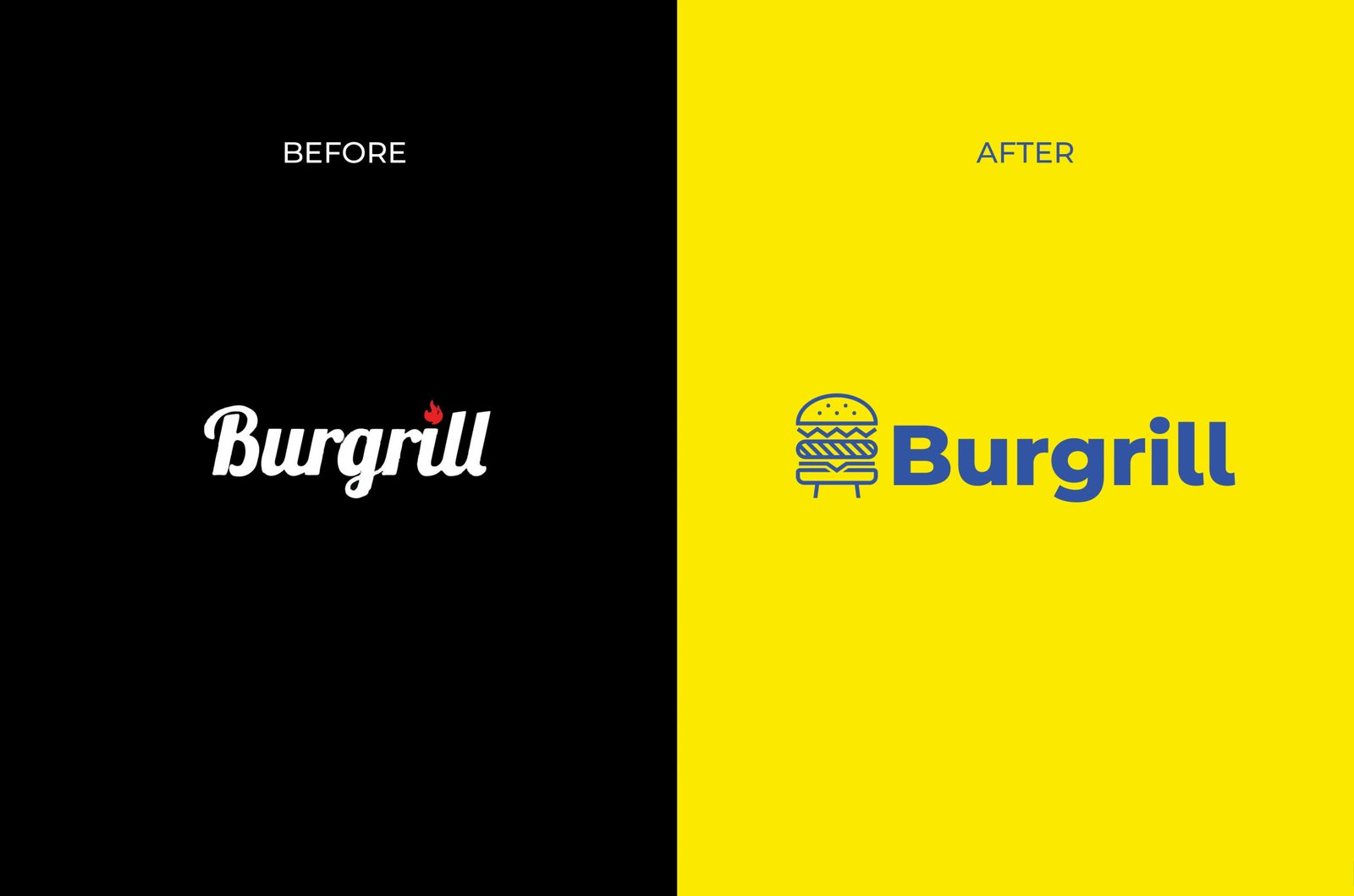
From Monochrome to Main Course
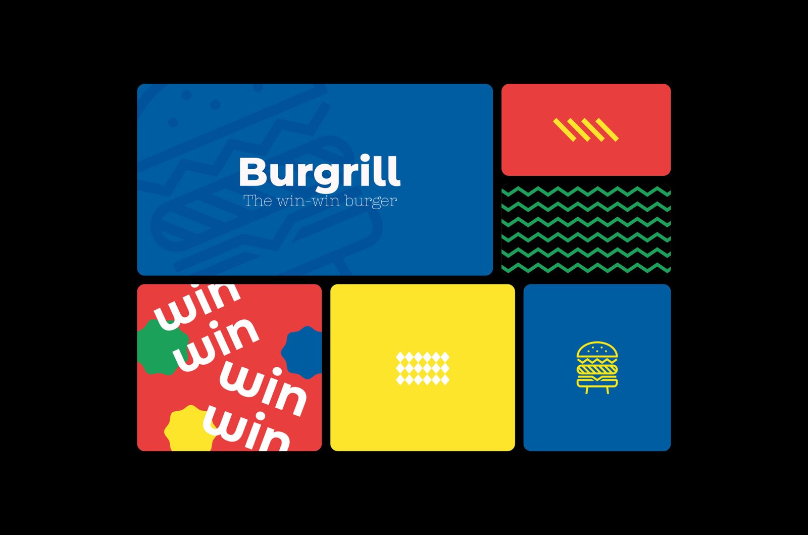
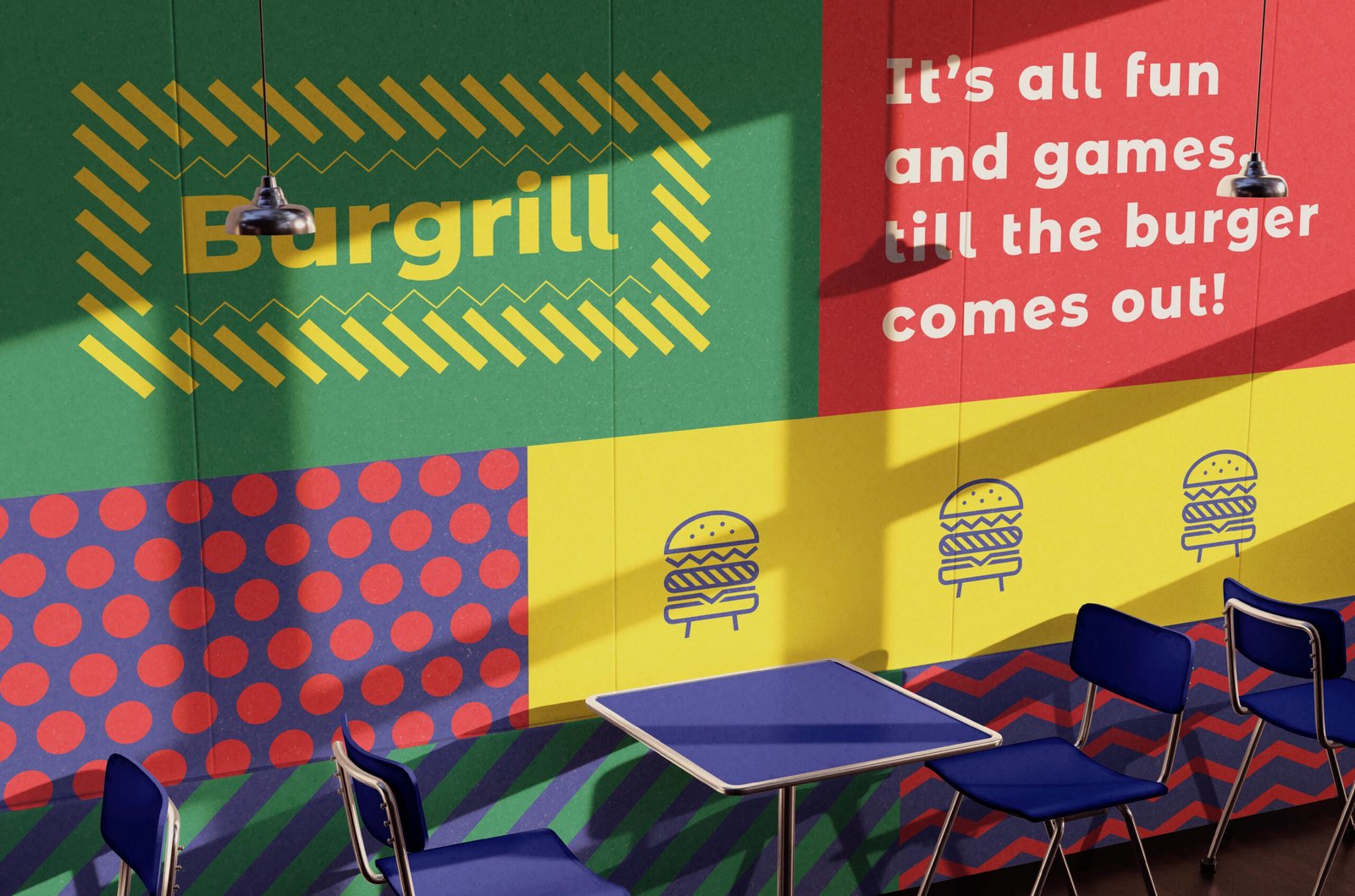
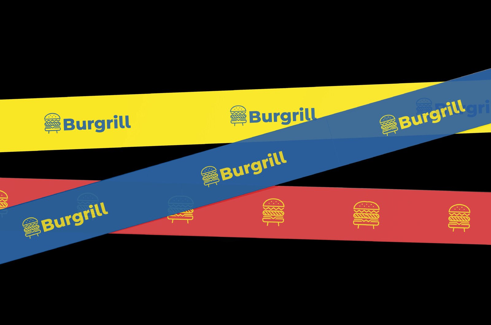
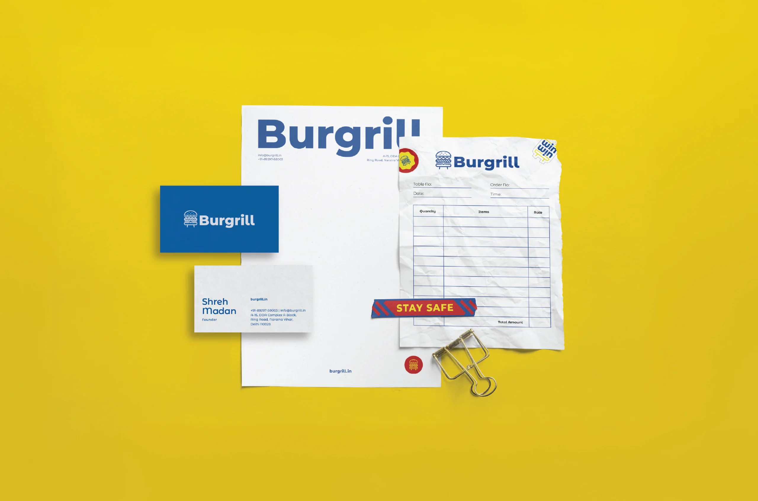
The classic American diner got a color upgrade. Out went the stark blacks, in came sunshine yellows and electric blues – because who said grilled goodness needs to look serious? We gave Burgrill's visual identity the kind of makeover that makes both the youth and their mothers nod in approval.
The Anatomy of Craving
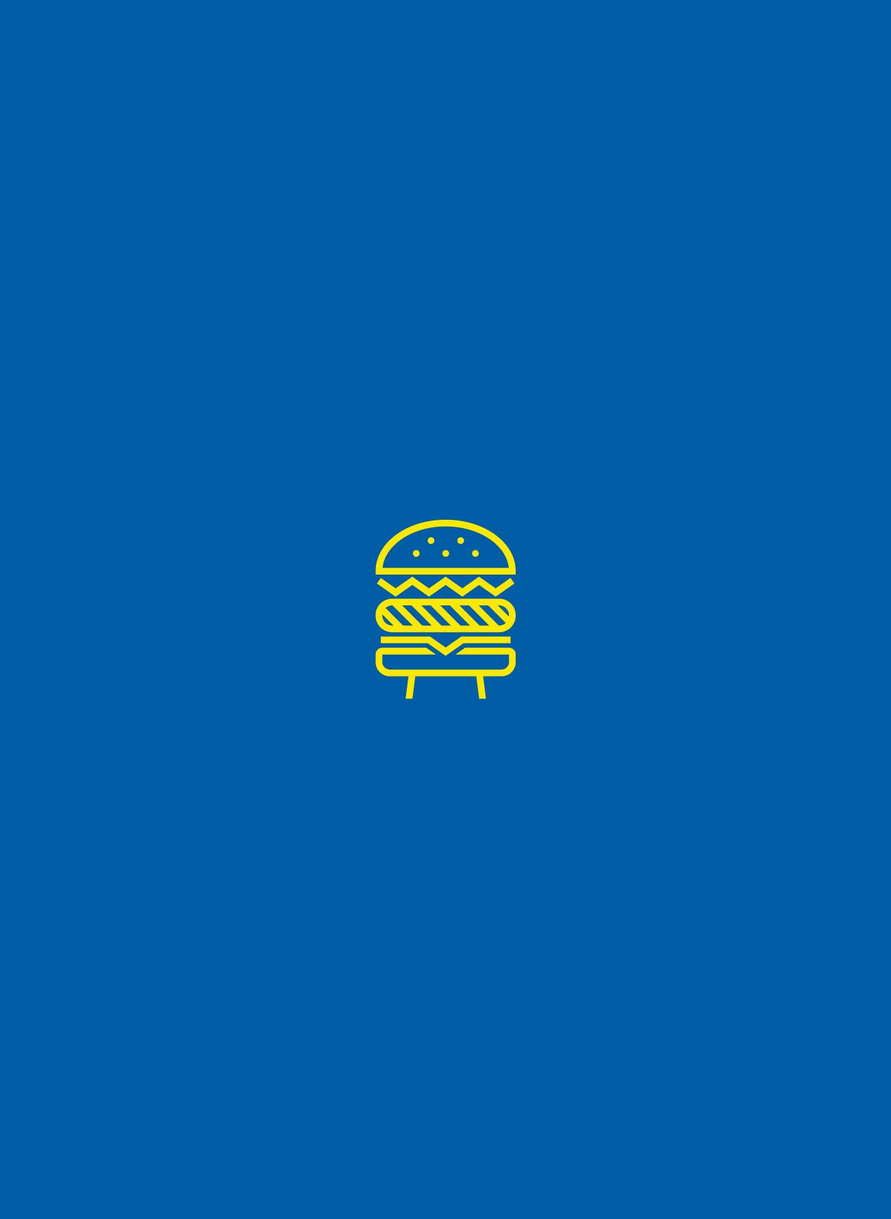
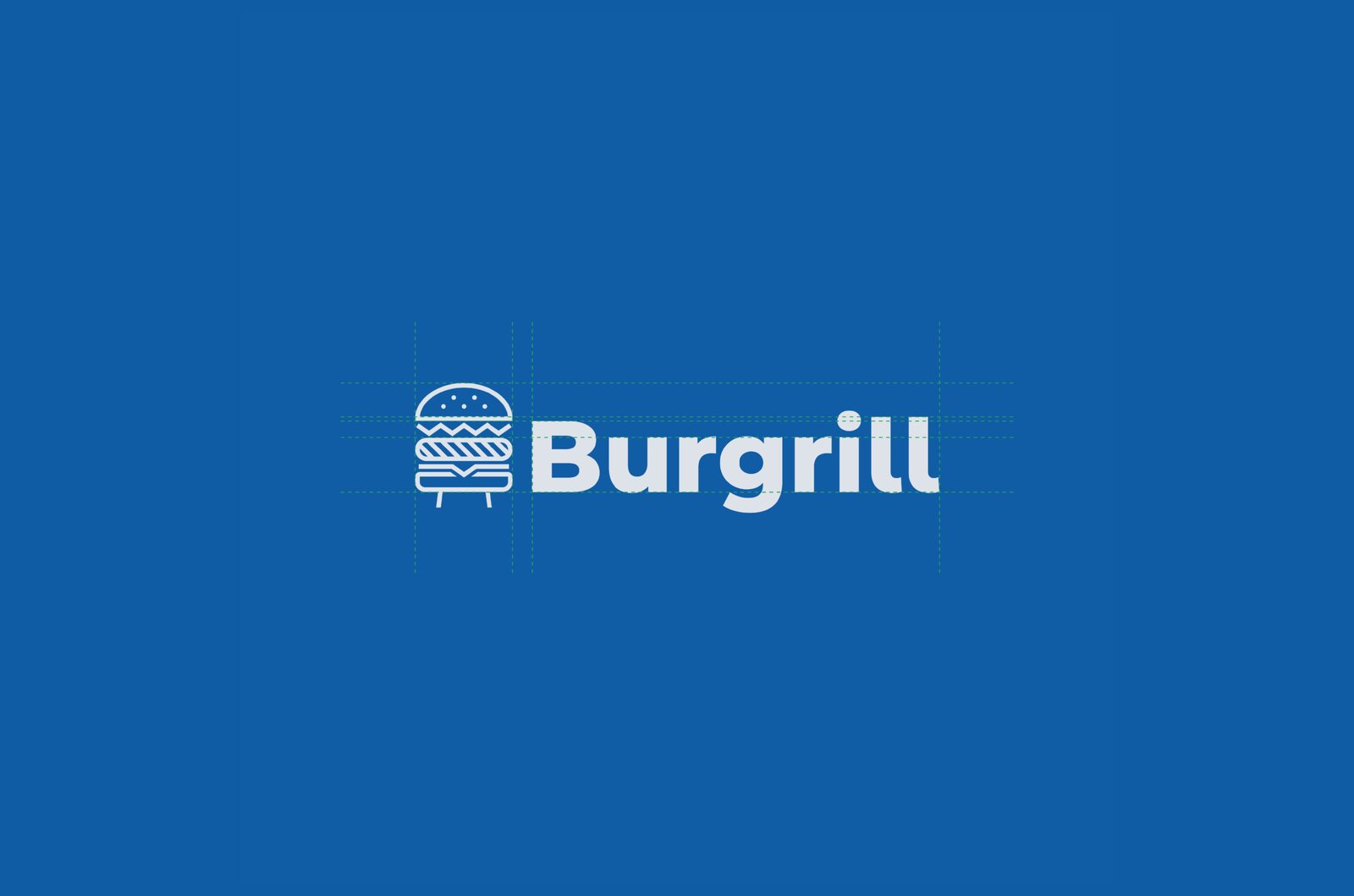
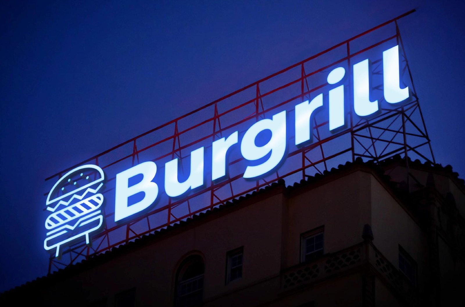
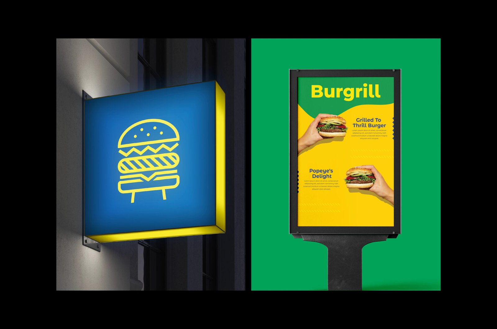
We dissected their icon into the building blocks of burger brilliance: a top bun that tips its hat, fresh greens that mean business, a patty that promises satisfaction, and a bottom bun that doubles as a grill on stilts. Simple, iconic, and instantly recognizable – especially in cities where icons speak louder than words.
Healthy,
Not Preachy
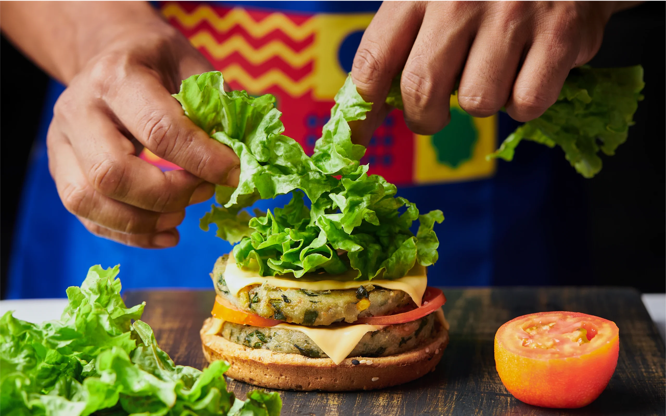
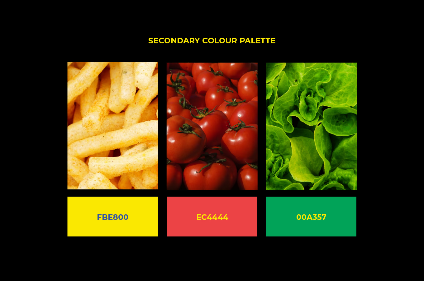
Burgrill isn't trying to be your salad bar. They're the burger joint that grills instead of fries, uses whole wheat instead of white, and makes their sauces from scratch. We crafted a design language that celebrates this sweet spot between indulgence and intelligence.
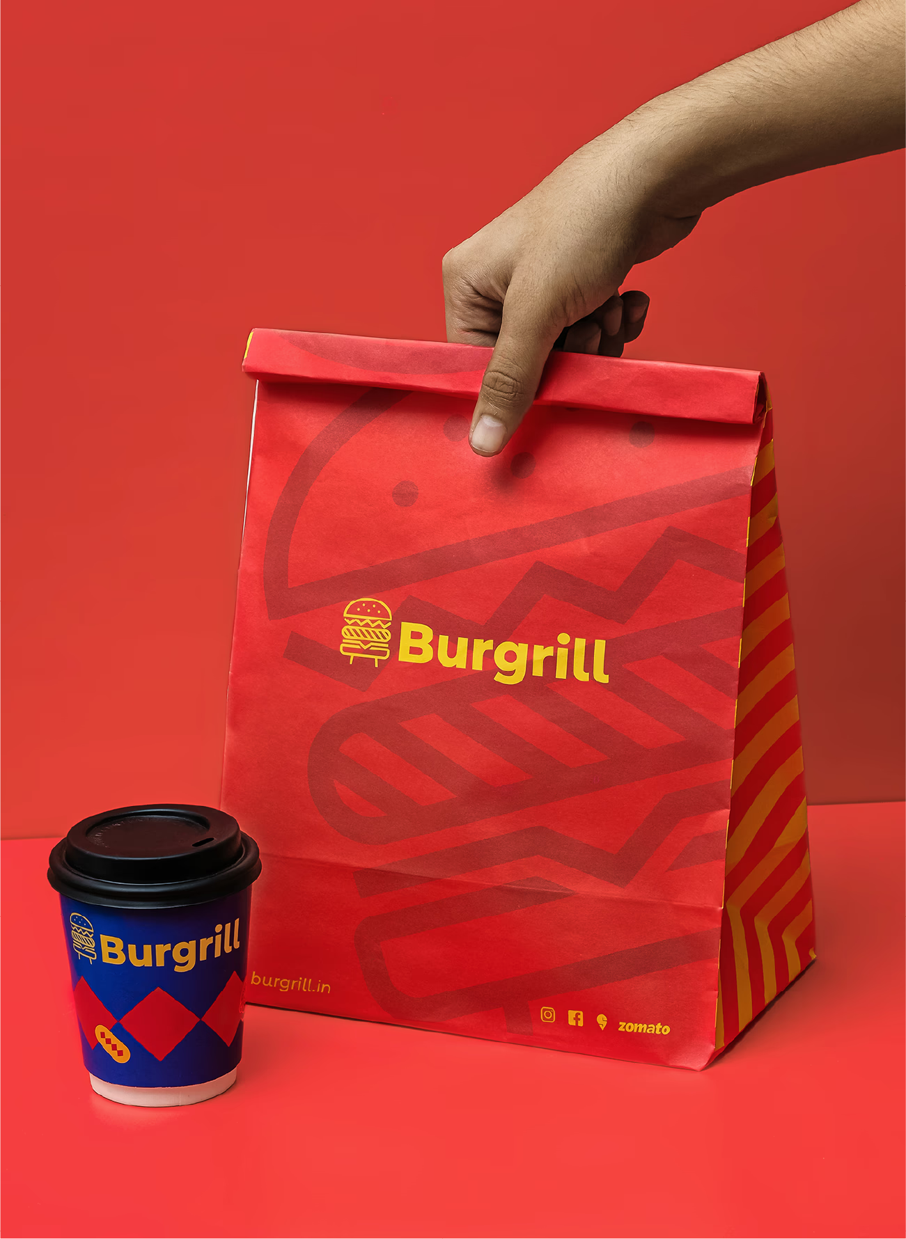
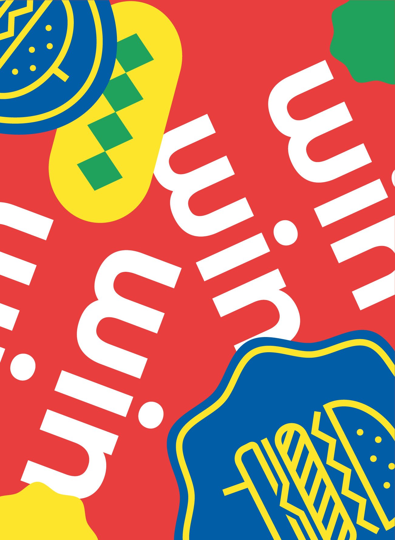
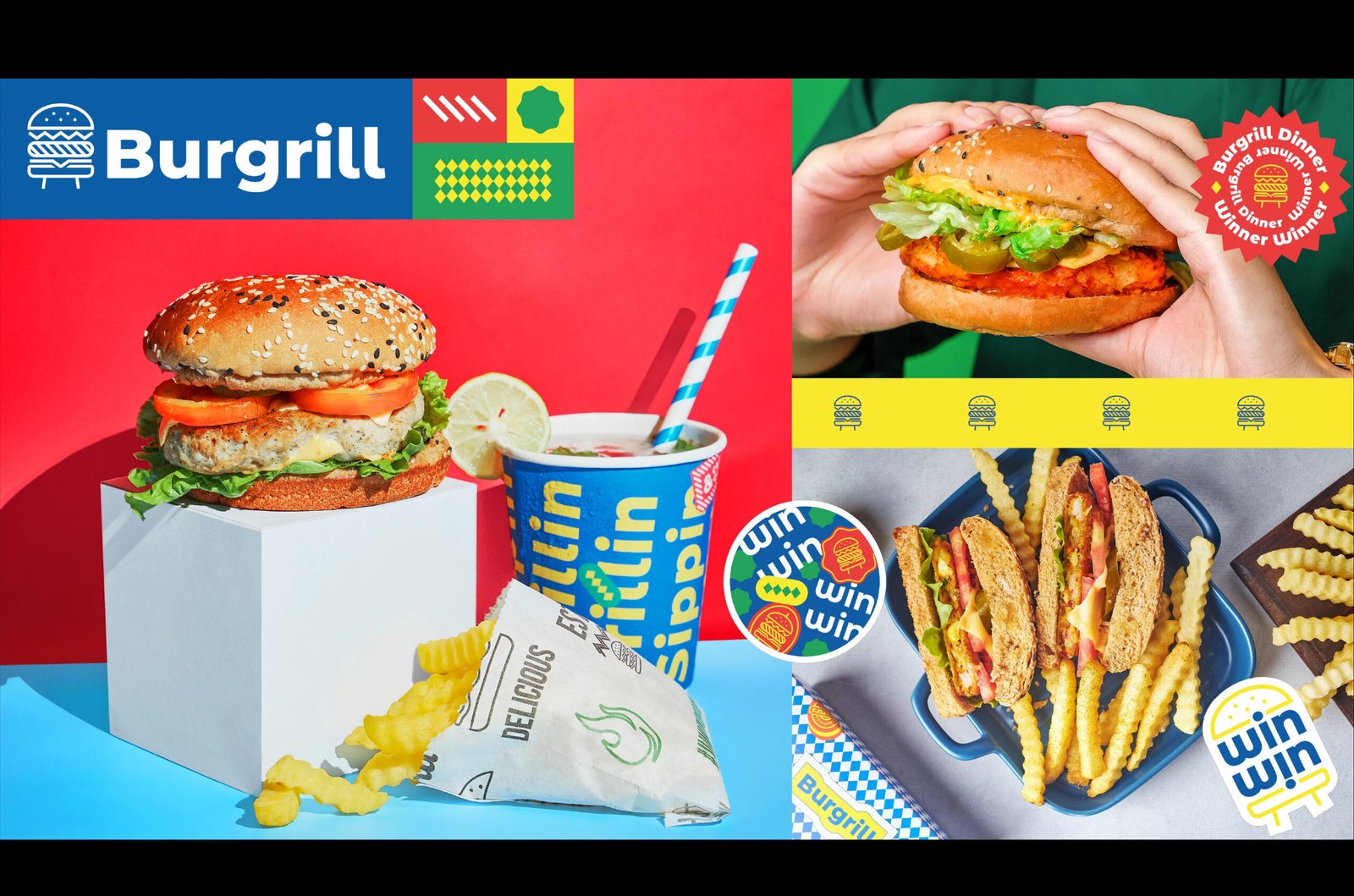
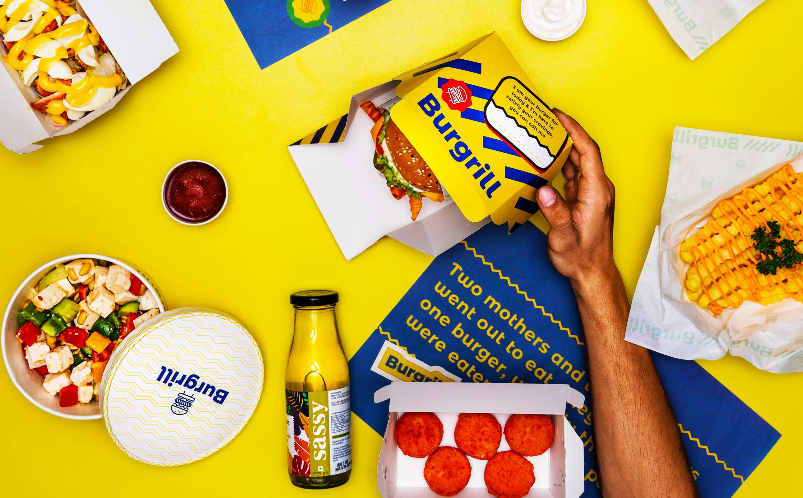
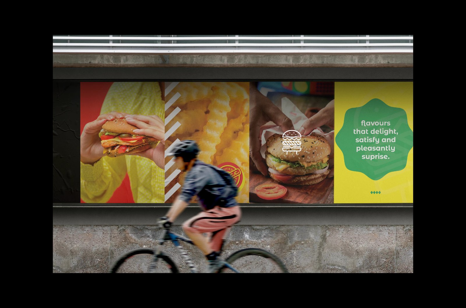
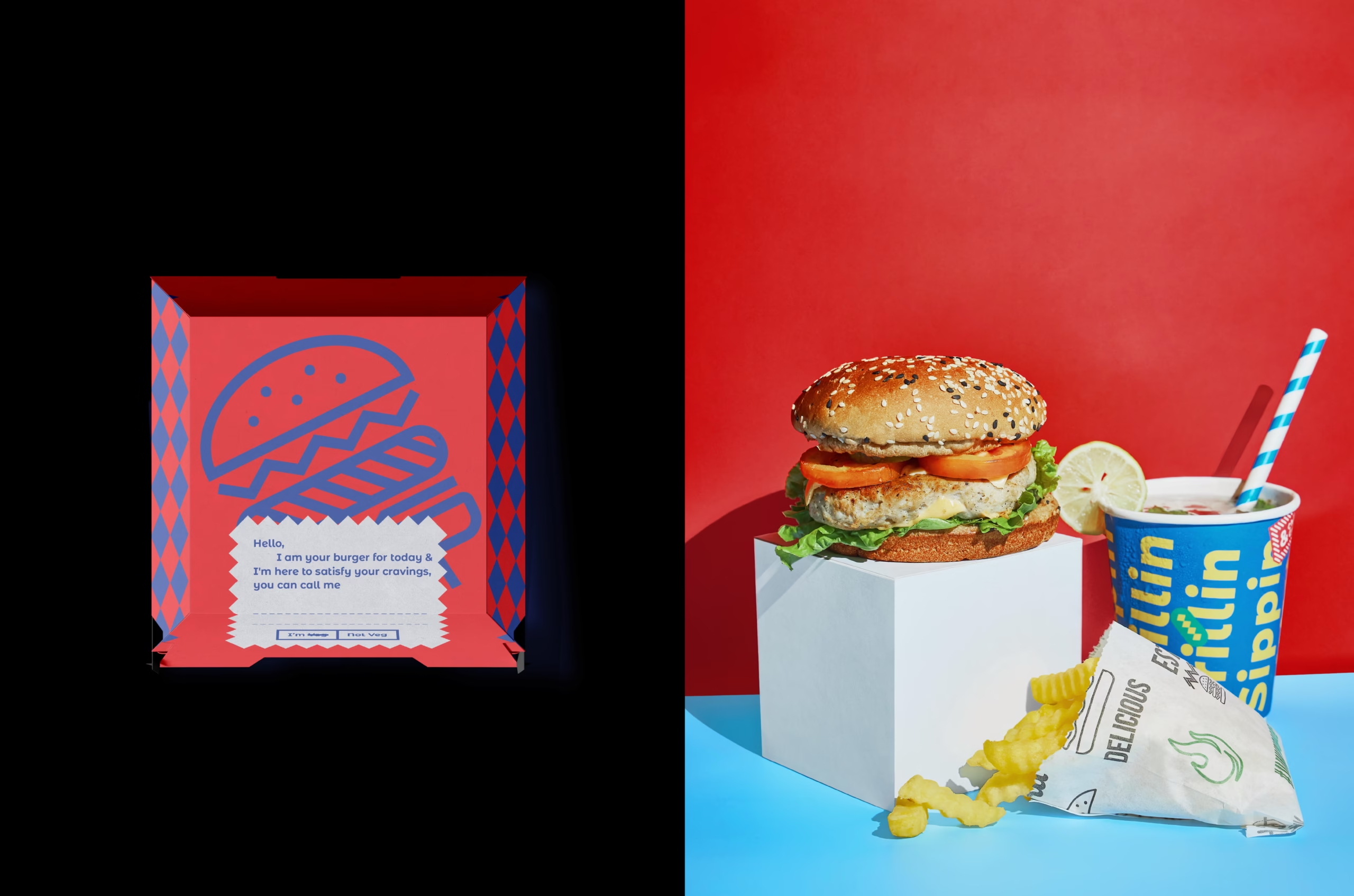
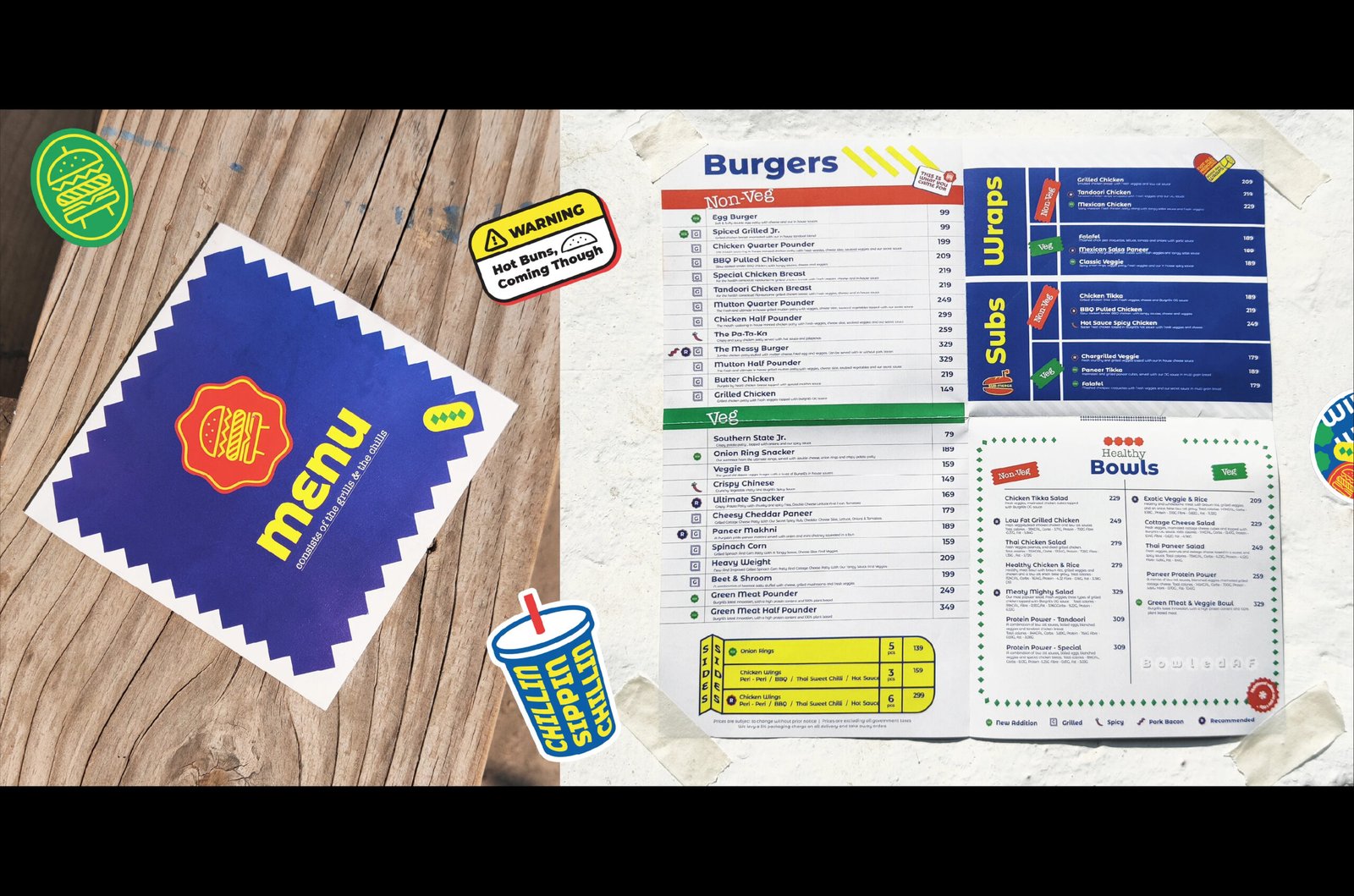
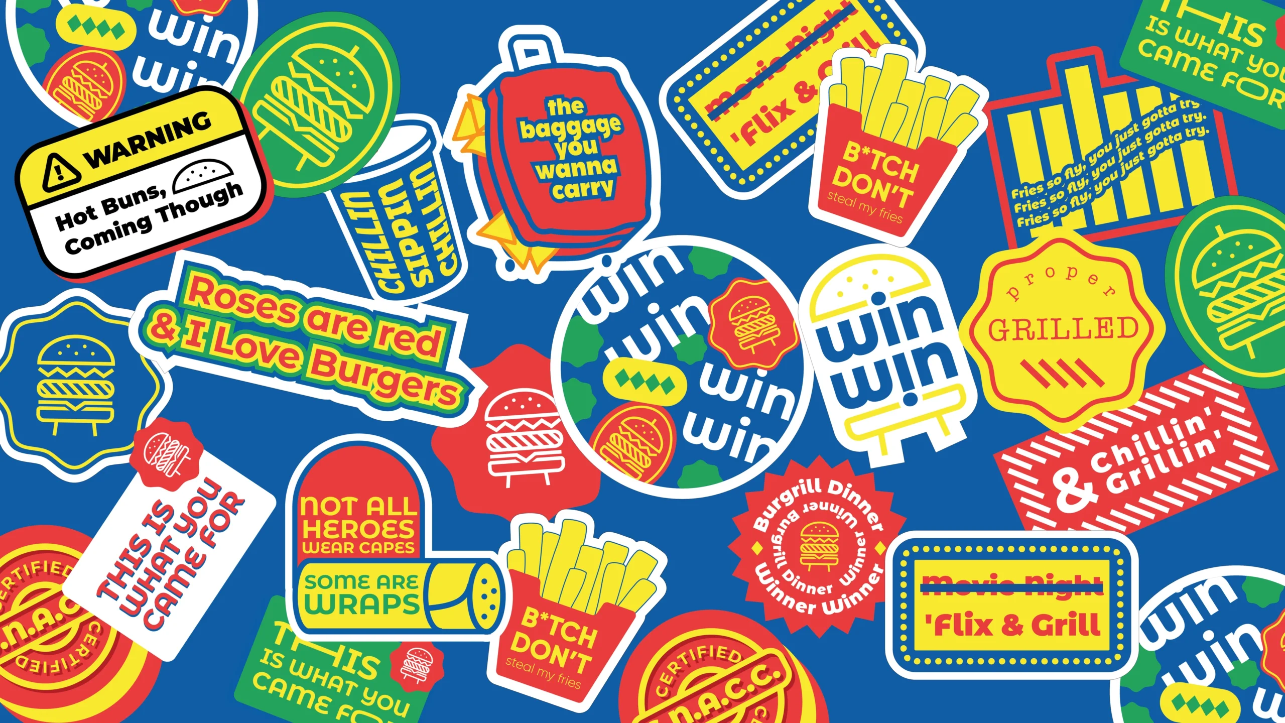
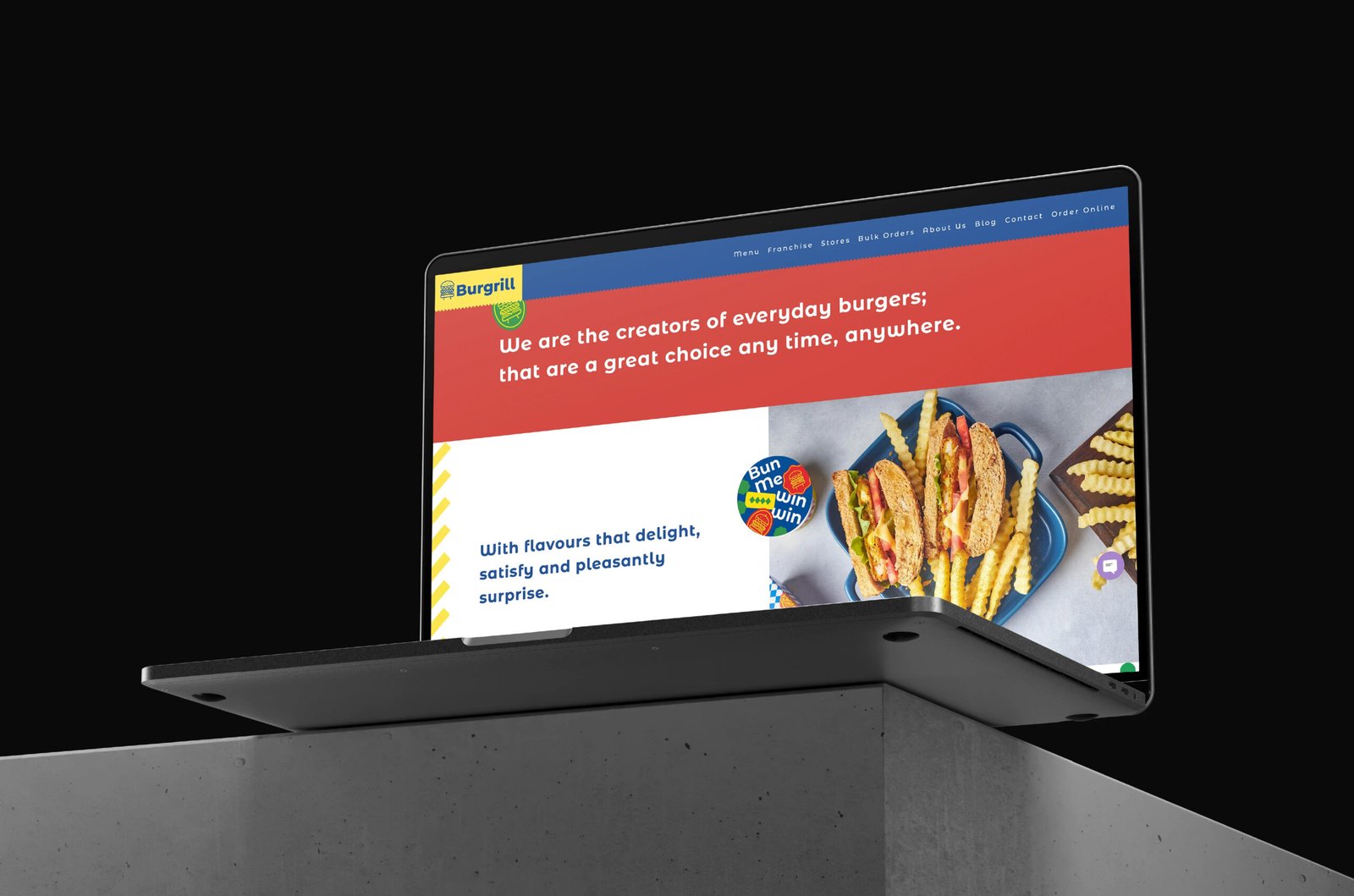
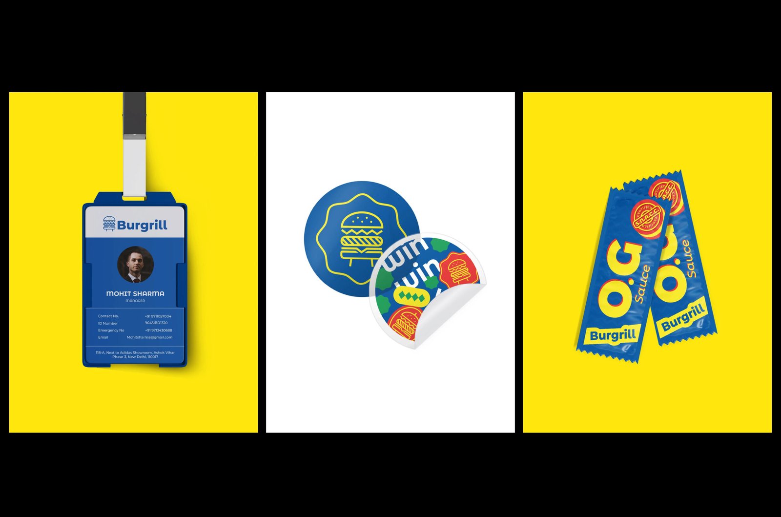
We also introduced a playful system of stickers, illustrations, and typography that spreads across packaging, menus, and digital spaces like sauce on a good burger – generously and with purpose. Each element adds to the story of fresh, conscious food served with a side of fun.
Services
Company
Socials
Services
Company
Socials
© The Neat Trick 2026
<Made extra neat, so it's not that tricky>
Terms & Conditions
